
Newsletter Archive
Recent macro monday newsletter editions, organized by date.
Reviewing Bitcoin's Popular Stock-to-Flow Model
We set out to answer a simple question: does stock-to-flow tell us something real about Bitcoin, or does it only look powerful because it wraps a good story in precise numbers? What we found is that the scarcity story is compelling and may capture a real long-run relationship, but the model's famous price targets broke down once they met the real market. The practical takeaway is narrow but useful: give stock-to-flow modest weight as a way to think about shrinking new supply, and zero weight as a price target or a reason to size a position.
June 1st, 2026
Bottom Line
We set out to answer a simple question: does stock-to-flow tell us something real about Bitcoin, or does it only look powerful because it wraps a good story in precise numbers? What we found is that the scarcity story is compelling and may capture a real long-run relationship, but the model's famous price targets broke down once they met the real market. The practical takeaway is narrow but useful: give stock-to-flow modest weight as a way to think about shrinking new supply, and zero weight as a price target or a reason to size a position.
Thesis
The question behind this edition is not whether Bitcoin is scarce. It is. The question is whether that scarcity can be turned into a reliable price model. Plan B's stock-to-flow work became famous because it did two things at once: it translated the loose idea of "digital gold" into one simple number, and it attached that number to forecasts that looked unusually scientific, with headline fit statistics of 95% and 99.7%. We wanted to separate those two claims. What our research kept pointing back to is a balanced conclusion: stock-to-flow is a strong explanatory story about Bitcoin's hardness, but a weak tool for predicting where price will go on any useful timetable.
Evidence
What is scarcity here, and why did the idea spread so fast?
We should start with the basic concept, because the model's appeal begins there. Stock-to-flow measures hardness: the size of the existing pile divided by the amount of new supply created each year. In plain English, a high ratio means the pile is already so large, and the annual trickle of new supply so small, that producers cannot suddenly flood the market and dilute the asset. That is the intuition behind gold's long monetary history, and it is the same intuition Plan B applied to Bitcoin.
That framing matters because it gives Bitcoin's scarcity a concrete shape. Gold has traditionally been the benchmark hard money because its stock-to-flow sits around the low-to-mid 60s, meaning annual mine supply is tiny relative to the existing hoard. Bitcoin's issuance schedule is fixed in code, and every four years the halving cuts new issuance in half. That means Bitcoin's stock-to-flow roughly doubles each cycle: about 12 after the 2016 halving, about 28 in 2020, about 65 after the 2024 halving, and roughly 127 by May 2026. By this one measure, Bitcoin now screens as about twice as scarce as gold.
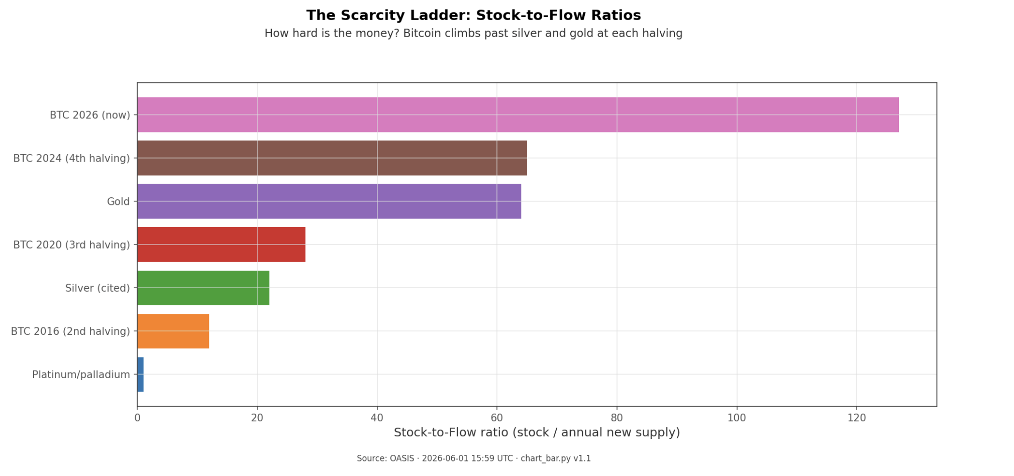
This is why the story traveled so far. It took a fuzzy slogan, "Bitcoin is digital gold," and turned it into a single number that could be ranked beside gold and silver. It was easy to explain, easy to share, and easy to remember: limited supply plus falling new issuance should mean a higher value over time. Our reading of the sources suggests that simplicity mattered as much as the math. A reader did not need a finance background to understand the claim.
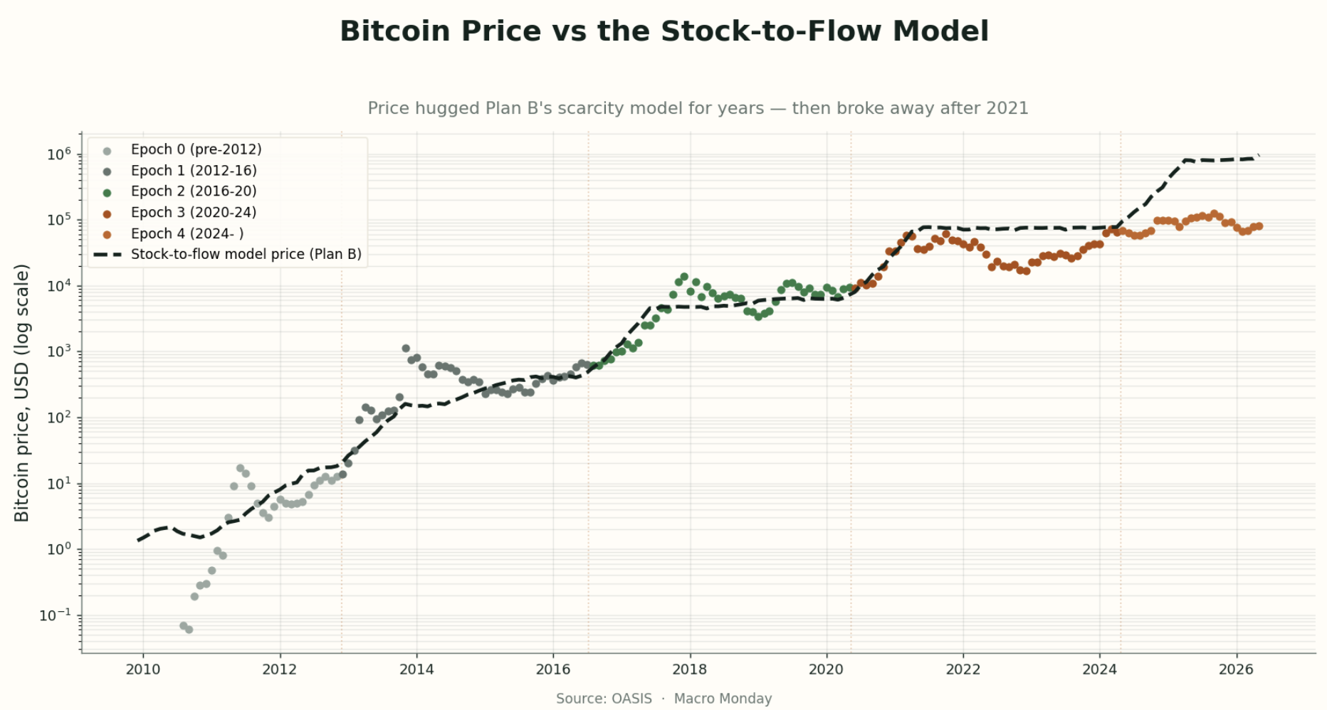
The timing helped too. The model arrived just before the 2020-21 institutional wave, when large investors were already looking for a cleaner way to talk about Bitcoin as a hard asset rather than a speculative toy. The pseudonymous quant persona behind Plan B, plus the now-iconic rainbow-colored chart, gave the idea a strong social wrapper. And the statistics gave it authority. A model showing a 95% fit in the original version and 99.7% in the later cross-asset version does not just sound interesting; it sounds settled.
The model's claim was bigger than the story
The next question we asked was what the models actually claimed, in plain terms. The original stock-to-flow model, published in March 2019, did not just say that scarcity matters. It said Bitcoin's market value could be explained by scarcity alone. Formally, it fit a regression of log market value on log stock-to-flow with an R-squared of 95%, and it projected that after the 2020 halving Bitcoin would be worth about $1 trillion in market value, or roughly $55,000 per coin.
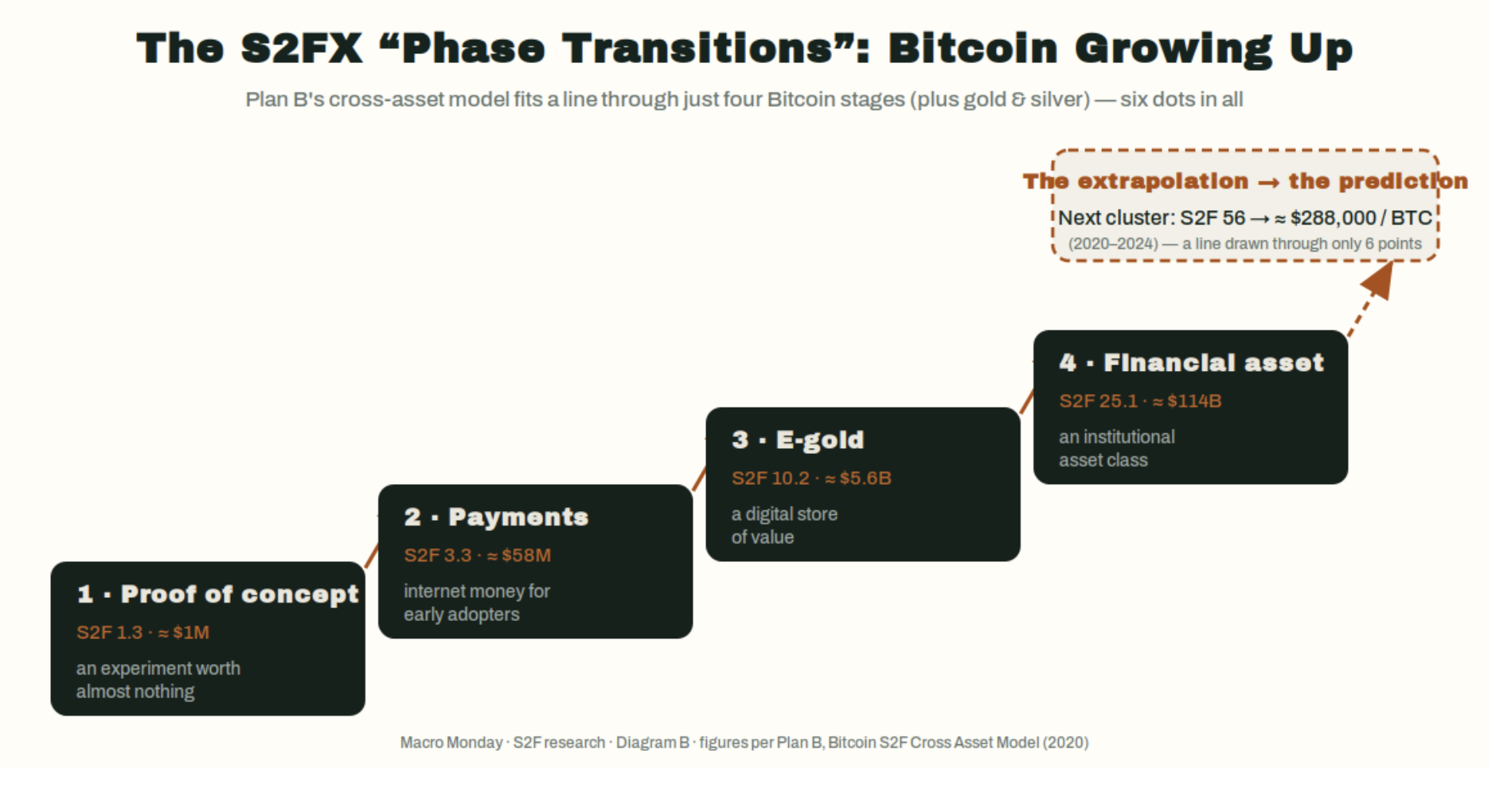
That was already a bold claim. It implied that one supply-side variable could explain most of Bitcoin's value. But the later cross-asset version, S2FX, made an even bigger leap. Instead of keeping Bitcoin on its own timeline, it lined up four Bitcoin phase clusters next to gold and silver as if they were points on one common ladder. In that version, Bitcoin moved from proof-of-concept to payments to e-gold to financial asset. The regression's reported fit rose to 99.7%, and the model's next target jumped to about $5.5 trillion in market value, or roughly $288,000 per Bitcoin during the 2020-24 cycle.
We can see why readers found this persuasive. The progression has a strong narrative rhythm. Bitcoin does not just get scarcer; it "grows up" into a new monetary role each cycle. The famous chart gave that thesis a single visual center: a line running through Bitcoin's history that made past rallies look like confirmations rather than surprises.
Plan B's response to the obvious market-efficiency objection also deserves fair treatment. Critics argued that if Bitcoin's supply path is public and fixed, the market should already price it in. His answer was not irrational. He argued that the market may systematically overestimate Bitcoin-specific risks, such as miner stress after halvings or broader failure scenarios, so as those feared outcomes fail to appear, the risk premium fades and price rises toward the model. We do not need to accept that as proven to see that it is at least a coherent defense.
That is an important distinction for this piece. The steelman is not "the model hit every number." It did not. The steelman is that the model points to a real supply mechanism, then adds a plausible behavioral explanation for why a public schedule might still matter in price.
Why the near-perfect fit should make readers more careful, not less
The problem is that a compelling mechanism is not the same thing as a reliable model. When we moved from the story to the model construction, the weaknesses became hard to ignore.
The first weakness is statistical. Both Bitcoin's price and Bitcoin's stock-to-flow rise over time. When two series trend upward together for long enough, a simple regression can produce a very high fit even if the underlying connection is weak or meaningless. That is the core spurious-regression critique. In one sharp summary from the critique literature, the regression may be doing little more than estimating Bitcoin's historical growth trend.
The second weakness is that when researchers try to strip out that shared time trend, the magic largely disappears. In the critique cited in our research, the stock-to-flow coefficient is no longer statistically significant once time fixed effects are included, with a reported p-value around 0.39. A separate critique found that plain circulating supply tracks market capitalization about as well as stock-to-flow does, and that after correcting for autocorrelated residuals, the stock-to-flow term is effectively zero. In plain language: once the time trend is handled more carefully, the model stops looking uniquely informative.
The third weakness is conceptual rather than statistical. The model looks only at supply. Price does not. Price is always the meeting point of supply and demand. A pure scarcity metric can tell us that new supply is shrinking, but it cannot tell us whether demand will surge, stall, or collapse. That omission matters because the largest real price moves are often demand-driven.
The fourth weakness is the gold comparison itself. Gold is the benchmark hard asset precisely because its stock-to-flow has been stable and high for a very long time. Yet gold's market value did not stay remotely stable alongside that ratio. Over roughly the past century, its stock-to-flow sat near 60 while its value ranged from about $60 billion to about $9 trillion, roughly a 150-fold swing. That does not mean scarcity is irrelevant. It means scarcity alone is not a law of value.
The fifth weakness sits inside the cross-asset model. Its famous 99.7% fit came from six points: four hand-grouped Bitcoin clusters plus gold and silver. That is too small and too curated a sample to carry the weight many readers put on it. The result may be interesting as a framing device, but it does not amount to proof.
The cross-asset visual helps explain both the attraction and the problem. It is elegant. It is memorable. But it also asks the reader to accept that these selected clusters and metals belong on one regression line, which is a much larger assumption than the chart's neatness suggests.
This is where the balanced reading becomes important. We should not confuse "there is a plausible supply mechanism" with "the model's coefficients and targets are trustworthy." The first claim may survive. The second is much harder to defend.
The real track record was strong until it wasn't
The hardest test for any model is not whether it tells a compelling story, but whether its forecasts hold up after readers start relying on them. Here the picture changes meaningfully.
For a while, stock-to-flow genuinely looked vindicated. From roughly 2015 through late 2021, Bitcoin's price tracked the model line closely enough that each rally looked like fresh proof. The 2020 halving was followed by a run to Bitcoin's roughly $69,000 peak in November 2021, which seemed close enough to the original post-halving ~$55,000 call to reinforce confidence rather than weaken it.
The trouble came when the targets got more explicit. Plan B's separate short-term floor model called for $98,000 by November 2021 and $135,000 by December 2021. Bitcoin instead closed those months near $49,484 and $47,299. Those are not narrow misses. They are misses by about half.
That miss mattered for two reasons. First, it broke the aura of precision. Second, it forced a distinction between the failed floor model and the supposedly still-intact long-term stock-to-flow model. Plan B explicitly conceded "Nov98K & Dec135K miss = FLOOR MODEL FAIL ... S2F MODEL INTACT." Critics reasonably read that as moving the goalposts, especially because earlier messaging had implied that a sub-$100,000 December 2021 price would invalidate the stock-to-flow thesis.
Then came the 2022 collapse. Bitcoin fell to about $16,612 in December 2022, a drawdown that is much easier to explain through demand destruction than through a supply schedule that had not changed. This is exactly the scenario the critics had in mind. A model that only tracks shrinking issuance has no way to see a demand-driven bear market coming.
The later outcome did not repair the forecast record. Bitcoin did eventually trade above $98,000, but not until 2025, years late, and it never reached the cross-asset model's $288,000 target for the 2020-24 cycle. The eventual peak cited in our research was about $123,521 in September 2025. That is materially above the floor targets, but still far short of the cross-asset projection and too late to count as a clean success.
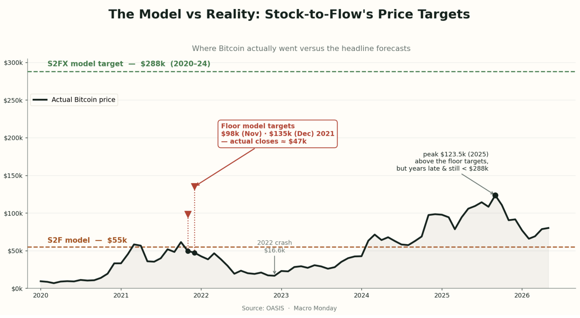
This is the paragraph where the tension has to be named plainly. On one side, the early fit and post-halving rally gave stock-to-flow a real appearance of confirmation. On the other, the dated targets failed, the 2022 collapse exposed the missing demand side, and the cross-asset target never arrived. Those signals do not share a clean "the model works" story. If we have to lean one way, our research leans toward the track record being too weak to justify treating stock-to-flow as a forecasting tool.
The steelman is real, but it leads to humility, not vindication
Still, the case against stock-to-flow is not complete without the strongest defense. Our research found one argument critics cannot dismiss lightly: cointegration.
In simple terms, cointegration asks whether two series that wander over time still maintain a stable long-run relationship. That is different from saying they merely trend up together. The steelman is that Bitcoin market value and stock-to-flow may be genuinely linked in this long-run sense. Nick from BTConometrics argued that the relationship appears cointegrated and could not be falsified. More strikingly, Marcel Burger, who initially criticized stock-to-flow as spurious, later ran three cointegration tests expecting to reject the link and could not. He publicly apologized for dismissing it too quickly.
That matters. An adversarial replication failing to debunk the relationship is not nothing. It raises the possibility that there is a real long-run association here, not just a visual coincidence on a chart.
The mechanism also remains believable. Halvings are real. They mechanically cut new issuance in half. Holding demand constant, that is a genuine supply shock. And Plan B's efficient-market rebuttal remains logically coherent: a public model can still appear to "work" if the market persistently overprices Bitcoin's risks and gradually unwinds that premium as feared breakdowns fail to occur.
But this is where the piece has to stop short of over-correcting. Cointegration is not proof of causation. The data history is still short, on the order of a decade or a bit more, with only a few halvings to learn from. And even if the long-run relationship is real, it says little about short-term price and did nothing to save the failed floor model. So the strongest defense of stock-to-flow still ends in humility. It may point to a real long-horizon scarcity link, but it does not rescue the model as a timing or target-setting tool.
That is the balanced answer the owner asked for. Readers should give equal weight to two truths at once. The scarcity mechanism is not nonsense, and the long-run relationship may be more than a mirage. At the same time, the model's precision is overstated, its construction has real weaknesses, and its public targets have already failed in ways that matter.
Implications
What the findings suggest is a cleaner way to use stock-to-flow. Use it as a language tool, not as a valuation tool. It helps explain one true thing about Bitcoin: new supply keeps shrinking on a known schedule, and that is part of why Bitcoin can plausibly carry a hard-money premium. But that is a very different claim from saying the next halving points to a specific price. For readers, the practical line is straightforward: stock-to-flow can help separate a scarcity narrative from a price forecast. Give it modest weight when thinking about Bitcoin's monetary character, and no weight when deciding on targets, timing, or position size.
What to Watch
Whether future stock-to-flow commentary stays in the narrow lane of scarcity and market structure, or starts turning back into dated six-figure target claims.
Whether the next cycle produces evidence of a stable long-run link again, while remembering that even a long-run link would still not validate short-term price forecasts.
Whether demand-side shocks, such as another sharp risk-off phase, once again dominate the price path despite Bitcoin's mechanically shrinking new supply.
Whether readers and analysts keep the key distinction clear: scarcity may help explain why Bitcoin can carry a premium, but scarcity alone has not proved able to forecast where that premium will trade.
Look out for next week’s newsletter for further insight into the forces shaping today’s markets.
A Framework for Understanding the Oil Market
We set out to build a practical framework for reading oil, and the research kept pointing back to a simple structure: a US-led supply base, an Asia-led demand base, four distinct regional markets, and a small set of price levers led by OPEC spare capacity, inventories, the dollar, and the crude-to-products margin channel. The strongest evidence is that supply has re-centred from OPEC to the United States, with OPEC's share of world production falling from 35.2% in 2000 to 27.5% in 2024 while US total liquids output more than doubled from 9.1 to 22.8 mb/d, even as demand has re-centred toward China and India. For readers, the point is that oil is easiest to misread when we start with the headline scare; the more reliable sequence is to start with the market's structure and levers, then ask whether a geopolitical event is actually converting into a measurable supply shock.
Bottom Line
We set out to build a practical framework for reading oil, and the research kept pointing back to a simple structure: a US-led supply base, an Asia-led demand base, four distinct regional markets, and a small set of price levers led by OPEC spare capacity, inventories, the dollar, and the crude-to-products margin channel. The strongest evidence is that supply has re-centred from OPEC to the United States, with OPEC's share of world production falling from 35.2% in 2000 to 27.5% in 2024 while US total liquids output more than doubled from 9.1 to 22.8 mb/d, even as demand has re-centred toward China and India. For readers, the point is that oil is easiest to misread when we start with the headline scare; the more reliable sequence is to start with the market's structure and levers, then ask whether a geopolitical event is actually converting into a measurable supply shock.
Thesis
We began with a broad question: what is the cleanest way to understand the oil market without collapsing into daily noise or one-cause stories? What we found is a framework that is simpler than the flow of headlines but more demanding than the usual narrative. The market is anchored by a few supply centers, a few demand centers, three pricing benchmarks, and two chokepoints, but price does not respond to all of them equally. Our work kept pointing back to buffer variables and transmission channels: OPEC spare capacity as the main volatility gate, US shale as the slow-response cap on sustained spikes, inventories as a deviation-from-normal signal, the US dollar as a macro overlay, and the crack spread as the path from crude into retail fuel. We then used that framework to stress-test oil history and, only at the end, to evaluate Iran and the Strait of Hormuz as a case study in when a familiar market narrative is wrong and when it becomes literally true.
Evidence
The map is smaller than it looks
The first question we were trying to answer was basic: what, concretely, is the global oil market? The structural map is compact. On the supply side, the three anchor producers are the United States, Saudi Arabia, and Russia. In 2024, US total liquids output reached 22.84 mb/d, with 13.23 mb/d of crude, versus roughly 9.9 mb/d for Russia and 9.2 mb/d for Saudi Arabia. On the demand side, the three anchor consumers are the United States at about 20.4 mb/d, China at 16.2, and India at 5.4.
The pricing side is similarly concentrated. WTI remains the North American benchmark, Brent the main seaborne global benchmark, and Dubai/Oman the benchmark for crude sold into Asia. The physical plumbing is narrow enough that two chokepoints dominate transmission risk: the Strait of Malacca at 23.7 mb/d in 2023 and the Strait of Hormuz at 20.9 mb/d, or about one-fifth of world oil use. That matters because any supply disruption or geopolitical stress has to show up somewhere, and these nodes are where the market registers it.
This is the first discipline of the framework. Oil may look like one global tape, but the useful starting point is not "price went up, why?" It is "which node moved?" The answer usually sits with a benchmark, a supply anchor, or a chokepoint rather than with the headline itself.
The center of gravity moved: supply to the US, demand to Asia
The next question was what changed in the market's center of gravity. On supply, the answer is the US. OPEC's share of world production fell from 35.2% in 2000 to 32.9% in 2010 and 27.5% in 2024, even though OPEC broadly held output flat. What changed was non-OPEC growth, and especially US growth. US total liquids output rose from 9.06 mb/d to 22.84 mb/d over that same span, making the US the world's largest producer by 2024 and the largest crude producer at 13.23 mb/d, ahead of Russia at 9.89 and Saudi Arabia at 9.23.
On demand, the answer is Asia. China's oil consumption rose from 2.33 mb/d in 1990 to 16.37 in 2024, about a seven-fold increase. India's rose from 1.17 to 5.60 mb/d, about a five-fold increase. OECD Europe, by contrast, stayed roughly flat, moving from 13.78 to 13.47 mb/d over the same period. The United States remains the single largest consumer at about 20.4 mb/d, but China has closed the gap materially, moving from well under half the US level in 2010 to roughly four-fifths by 2024.
OPEC's output (blue) stayed roughly flat while non-OPEC supply (orange) — led by US shale — drove nearly all the growth in world production; OPEC's share of the total fell from about 35% in 2000 to 27.5% in 2024. The shift of demand toward Asia is the second half of the same re-centring.
That double re-centring matters because it changes how to read risk. The market is no longer dominated by an OPEC-only supply story or a West-only demand story. It is better understood as a US-led supply expansion meeting Asia-led demand growth. That is also why chokepoints matter so much: the biggest structural dependency in the system is not US consumption, but Asia's need to import large volumes of crude through narrow sea lanes.
One headline price, four different regional machines
We then asked what sits underneath the single headline oil price. The answer is four regional markets that are linked, but not interchangeable.
The Americas are the self-sufficient machine. They are anchored by US production and price off WTI, which trades at a discount to Brent. The spread has averaged about -$5.85 to Brent, which is the market's way of pricing a region that broadly covers its own crude needs but still faces transport and export constraints. Put simply, WTI tends to be cheaper because US barrels are abundant and have to be moved out to the world market. This region is comparatively insulated on physical supply.
Europe is the mature import-dependent machine. It prices off Brent and pays the seaborne benchmark because it is structurally short crude. Its demand profile is mature rather than fast-growing, and after 2022 it became more dependent on replacement seaborne flows after losing much of its prior Russian supply path.
Asia-Pacific is the demand-and-refining engine. It prices off Dubai, carries about 35% of global refining capacity, and imports heavily because its demand far exceeds its production base. China alone nets roughly 11 mb/d of crude imports. This region is where the physical consequences of a Gulf disruption matter most.
The Middle East is the export-hub and balancing machine. The Gulf producers collectively pump about 24 mb/d and, crucially, hold much of the world's spare supply. Their oil is sold into other regions, especially Asia, and much of that flow runs through Hormuz. That is why the most consequential linkage in the whole map is the Middle East-to-Asia axis: the world's largest holder of spare capacity selling to the largest and fastest-growing import market through the least easily bypassed route.
This framing helps when we get to Hormuz. If Asia is the import engine and the Gulf is the export valve, then a Hormuz event is not first a generic fear story. It is first a regional flow story that may or may not widen into a global price shock.
What really moves oil prices
Once the regional structure was clear, we turned to the levers that actually move price. The strongest one in the framework is OPEC+ spare capacity. What we found is that it matters most as a volatility gate rather than a simple level setter. The only sustained period it fell below the 2 mb/d tight threshold was 2003-08, when it averaged 1.45 mb/d and the market ran into the super-spike toward roughly $147. The two loose-buffer regimes, the late 1990s and 2020, line up with the two major price routs. Over 1993-2026 the long-run mean is about 3.73 mb/d. The relationship to price is negative, meaning tighter spare capacity usually goes with higher oil prices, but the bigger practical point is simpler: when the cushion is thin, the market has less room to absorb a shock; when the cushion is large, shocks are easier to contain.
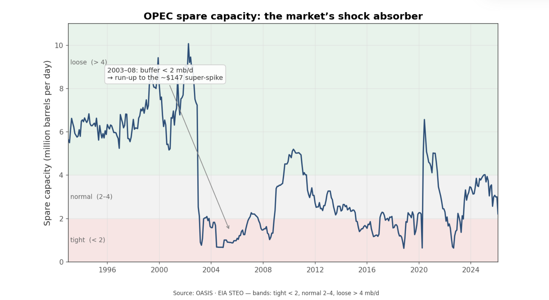
Spare capacity is the market's shock absorber. The most violent oil moves tend to happen when that buffer is already thin — the only sustained stretch below 2 mb/d, in 2003–08, ran straight into the ~$147 super-spike.
The next lever is US shale. The work here asked whether shale changed oil from a fixed supply market into a more elastic one. The evidence says yes. Rig-count changes lead production with a statistically meaningful relationship, and output per active rig nearly tripled from about 9,600 to 25,800 bbl/d between 2010 and 2024. In plain language, shale made US supply more responsive. A price shock no longer has to stay in place for years to invite new production; it can draw a domestic response within a few quarters.
Russia under sanctions was the third upstream test. Here the findings were more cautionary than dramatic. Russian output fell only modestly, from around 10.4 to 10.0 mb/d between 2021 and 2026, while the barrels Europe stopped buying were absorbed by Asia. We should read that as a flow-map story more than a supply-destruction story. It is a useful warning because the market often confuses route disruption with production loss. Sometimes they overlap, but not always.
Inventories and the dollar add the macro layer. The OECD-wide commercial stock signal matters more than the weekly US print. In a monthly decomposition of WTI returns, OECD stock changes carry a clear negative relationship with price, while US weekly stocks are only marginally useful on their own. The dollar is the strongest single measured driver in that model: when the dollar strengthens, oil usually becomes more expensive in local-currency terms for the rest of the world, which tends to weigh on demand and price. Even then, about 90% of the variance remains unexplained. That is a standing warning built into the framework: even a serious model leaves most month-to-month oil movement unexplained.
Finally, we wanted one downstream channel that links crude to the end user. The 3-2-1 crack spread does that. It measures the gross margin from turning three barrels of crude into two of gasoline and one of diesel. It averages about $10.6/bbl over 1986-2026, with a typical range of roughly $2-24, and moves cyclically with product tightness and refinery utilization. In simpler terms, it is the margin bridge between crude and the fuels households and businesses actually buy. That makes it the key translation layer from crude-market stress into pump-price pressure.
Taken together, these levers answer a question readers often ask implicitly: what should we weight heavily, and what should we discount? The framework's answer is spare capacity first, then the shale response function, then broad inventory deviations and the dollar, with the crack spread as the channel into products. The weekly US stock print matters much less than its visibility suggests.
History gives two durable rules
With the structural map and levers in place, we wanted to know whether history actually respects the framework. Across six episodes since the 1980s, two patterns dominated.
The first is that OPEC spare capacity governs amplitude. The most violent events formed on thin buffers. In 2008, WTI peaked at $144.41 and then collapsed to $35.88 by early 2009. In 2022, WTI rose to a $120.34 peak. In both cases the market was running on roughly 1-2 mb/d of spare capacity. In 2020, by contrast, the crash drove the buffer loose to around 4.2 mb/d.
The second pattern is that geopolitical spikes reverse unless barrels actually disappear. The 1990 Gulf War is the cleanest example. Iraqi and Kuwaiti output fell by about 4 mb/d combined, WTI jumped from roughly $16 to $40 in three months, and Saudi Arabia ramped from 6.4 to 8.1 mb/d to backfill the loss. Six months later WTI was 10.5% below its invasion-week level. The 2022 Russia/Ukraine shock showed a similar round trip. WTI rose 25% the week after the invasion and peaked near $120, but six months later it was only 1.1% above its invasion-week level because Russian barrels were rerouted rather than removed. Most tellingly, a model that included a broad geopolitical-risk index attributed just 0.4% of WTI's movement to it in that episode. In plain language, the war mattered, but geopolitical fear on its own explained almost none of the price move once the actual supply path was accounted for.
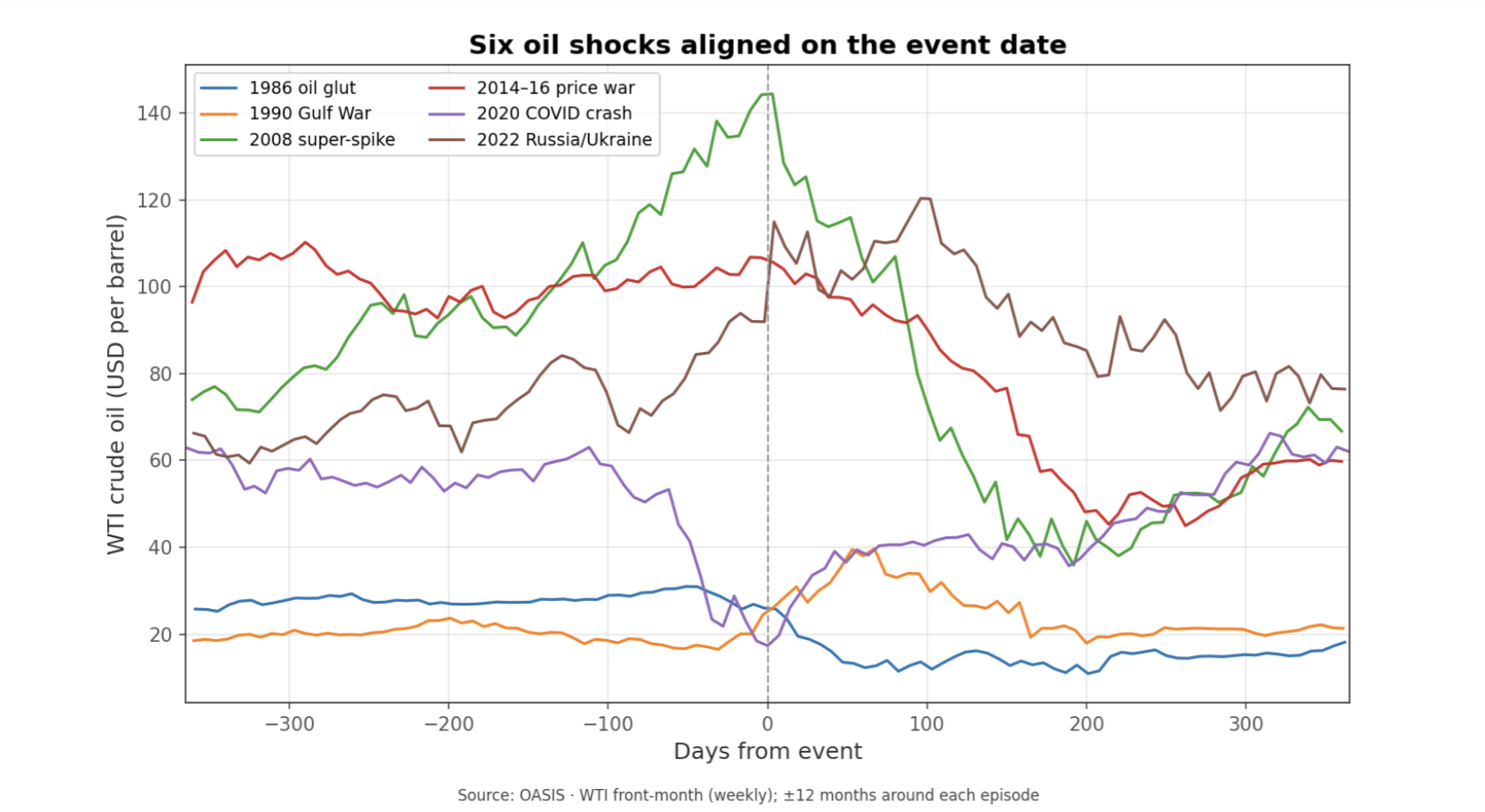
History leaves two working rules: thin spare capacity makes moves more violent, and geopolitical spikes tend to fade unless barrels are truly removed from the market.
That leaves us with a strong prior before we even turn to Hormuz. If the market is reacting to a geopolitical scare but barrels still flow, the move should tend to round-trip within months. If a violent move persists, the reason is usually not the headline in isolation but the physical supply channel the event touched. And across these episodes the unexplained share stays large — 89–98% of the weekly moves in the major post-2008 shocks — which should keep us modest about any tidy narrative.
Hormuz is the right final test
Only after building the framework did we turn to Iran and the Strait of Hormuz as the closing case study. The first point is structural importance, and on that the data are straightforward. About 20.9 mb/d moved through Hormuz in 2023, around 20.4% of global liquids output, making it the second-busiest chokepoint by raw volume and the one with the fewest practical alternatives. On importance, the narrative is right.
The second point is how the 2026 disruption is best measured. Official transit-volume series are published with a long lag, so the scale of the throughput collapse is read more reliably from price and shipping signals than from headline flow counts — and on those signals the disruption is unmistakable, with tanker traffic through the strait reported down more than 80% at the peak.
The third point is the distinction between a threatened closure and a realized one. In June 2025, the common narrative was that Iran and Hormuz were driving oil higher. WTI spiked about 23% and then round-tripped within two weeks. Brent-WTI narrowed to about +$2.46, below its +$5.19 24-month average, and Dubai showed no Asian premium. That is what a fear spike looks like when the physical system does not break.
The 2026 closure looked different. Brent-WTI widened sharply, peaking near +$18 in April and averaging roughly +$11 over the disruption window. Dubai, however, did not gain an Asian premium. Its discount to Brent blew out to -$13.7 in March and -$24.4 in April. That is a crucial finding because it inverts the naive script. The market response was not Asia bidding Gulf crude higher. It was Gulf crude being stranded behind the strait, depressing the Gulf marker relative to the globally deliverable Atlantic benchmark. In other words, the spread pattern confirms a real disruption, but by showing trapped supply rather than a classic scarcity premium in Dubai.
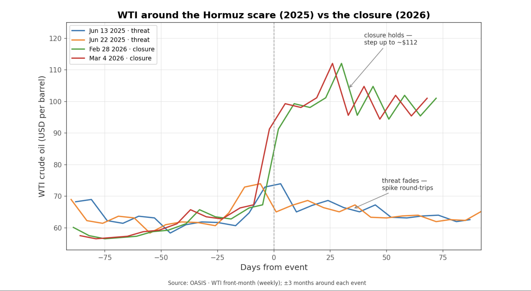
The two June 2025 scare dates (blue, orange) spike and round-trip within weeks; the two 2026 closure dates (green, red) step up to roughly $112 and hold. A threat that faded versus a closure that realized.
The supply data align with that reading. Over the recent 12 months, WTI's tightest relationships were with OPEC production at -0.95 and OPEC spare capacity at -0.94. OPEC output fell from 30.78 mb/d in February 2026 to 20.16 by May, and spare capacity collapsed from 3.01 to 0.03. The US dollar and US production explained essentially nothing over that window. Put simply, the oil market was moving with Gulf supply conditions, not with US supply or currency conditions. This is the key interpretive point: in 2026, we cannot cleanly pit "Hormuz" against "fundamentals," because the closure is itself the supply fundamental. The shock shows up as lost deliverable Gulf output and vanished usable spare capacity.
The fuller statistical picture reinforces the same lesson. In a decade-long monthly model (2015–2026), OPEC production accounts for 12.3% of WTI's movement, OECD inventories 3.7%, Russia 2.1%, and a direct "Hormuz event" term just 0.85% — with roughly 80% unexplained. That small event share should not be over-read: it swings from well under 1% to about 8% depending on how the model is built, because the Hormuz term is statistically entangled with the OPEC supply collapse the closure caused. The honest takeaway is the range, not any single figure — and the mechanism matters more than the percentage: the closure moved price through the supply channel, not as a standalone headline premium.
So the balanced answer is clear. When Hormuz is only threatened, the "Iran drives oil prices" story usually overstates the evidence. When Hormuz is actually closed, the story becomes correct, but correct as a physical Gulf-supply shock rather than as a pure geopolitical premium. And even there, we should remember that roughly 70-90% of month-to-month oil movement stays statistically unexplained. The framework helps us read the event better, but it does not turn oil into a one-variable market.
Implications
What the research suggests is a practical reading order for oil. Start with the structure: who produces, who consumes, which benchmark is moving, and whether the key regional spreads are confirming a real seaborne disruption. Then check the levers: spare capacity, broad inventory deviations, the dollar, and whether shale can respond over the next few quarters. Only after that should we decide whether a geopolitical narrative deserves to be treated as a genuine fundamental shock. For readers tracking macro transmission, the crack spread remains the useful bridge from crude to consumer prices, while the Hormuz case study leaves a clear operating rule: fade the familiar scare until spread and supply data confirm conversion, but once production and deliverability actually break, treat the move as a real supply event rather than a temporary headline premium.
What to Watch
Brent-WTI versus its roughly +$5 norm; sustained widening is the cleanest real-time sign that a Gulf or seaborne disruption is becoming global rather than staying local.
Dubai-Brent; a sharply deeper Dubai discount can signal stranded Gulf supply. It is a monthly gauge, so it confirms a shift more slowly than the daily Brent-WTI spread.
OPEC production and spare capacity together; if output falls and spare capacity compresses toward zero, the market is no longer pricing fear but an actual supply constraint.
OECD commercial stocks relative to normal, not just the weekly US crude print; the broad inventory deviation carries more signal than the headline Wednesday number.
Humility on any single-cause story; roughly 70-90% of oil's month-to-month move stays statistically unexplained, so treat any precise "X% was Hormuz" attribution with skepticism.
Look out for next week’s newsletter for further insight into the forces shaping today’s markets.
The Four Eras of Liquidity
This week we examined whether the four-era framework used to describe modern monetary history - the gold-standard period before 1971, the post-Nixon fiat era from 1971 to 2008, the post-financial-crisis QE era from 2008 to 2020, and the post-COVID era from 2020 to today - actually shows up in market data.
May 18th 2026
Bottom Line
The four-era framework does show up in market data, and the post-COVID era stands out as the most money-sensitive market period on record, with stocks now responding about three times more strongly to global money supply — the broad measure of money in the economy, including cash, bank deposits, and the credit banks create when they lend — than in earlier eras. Practically, that changes which liquidity measure matters most, which assets tend to move together, and how to read a record high like today's.
Thesis
We began with a basic question: is the four-era framework a real feature of markets, or just a tidy historical story? What we found is that the breaks are real enough to use, and each era carries a distinct pattern in how liquidity and assets interact. The headline finding is simple: markets have become more responsive to the global money supply over time, with the strongest link in era 4, the post-COVID period that began in March 2020. This week, we want to share that map at a high level because it helps explain the current regime.
What Changed
A couple of weeks ago we looked at the shape of the US economy through GDP. This week we shift from economic structure to monetary structure: not what the economy is made of, but the money-supply backdrop that increasingly shapes market behavior.
What changed is that the four-era framework now has direct research backing. We tested it across stocks, bonds, gold, Bitcoin, and home prices, and the relationships clearly changed across eras.
Evidence
The eras are real
We organize modern market history into four eras: pre-1971 when the dollar was still tied to gold, 1971-2008 after Nixon broke that link, 2008-2020 when QE became a defining policy tool, and 2020-present when the COVID response reset the liquidity regime.
We wanted to know whether the data could find those breaks on its own. It largely did. A statistical break-detection routine picked up the 2008 turn in G5 central-bank balance sheets at 2008-10-01 and the 2020 turn at 2020-04-01. Global money supply also identified the 2020 break within 2.6 months.
That tells us the framework is not just a neat narrative. The measurable series bend around the same turning points. Era 1 remains untestable directly because the liquidity data do not reach back far enough.
Money has mattered more in every new era
The clearest high-level finding is that each new monetary era made stocks more responsive to the global money supply. In era 2, a 10% rise in global money supply lined up with about an 11% rise in the S&P 500 on average. In era 3, that became about 21%. In era 4, it became about 30%. That is the progression from 1.09 to 2.12 to 3.05.
Put plainly, the money supply has gone from an important backdrop to a much stronger force inside the equity regime. The fit also stays unusually high across eras, explaining about 88% to 95% of long-run S&P 500 movement depending on the period. Gold and bonds follow the same direction too: their coupling with liquidity also strengthens from era 2 through era 4.
From era 2 to era 4, the S&P 500 became far more sensitive to global money supply growth. Think of it this way: a 10% rise in global money supply lined up with roughly 11% stock gains in the earlier measurable era, about 21% in the QE era, and about 30% in the post-COVID era.
In era 4, the kind of money matters
Consider an analogy: think of money as the water in a swimming pool, and asset prices as the boats floating on top. In era 4, the boats are still being lifted by rising water, but we have to be careful about which waterline we are measuring.
There are two useful layers. Central-bank balance sheets track the money central banks create directly. Broad money supply tracks that base plus deposits, credit creation, and near-cash moving through the wider system. In era 4, those two layers decoupled: central-bank balance sheets shrank under QT while money supply kept expanding.
That distinction helps explain the S&P 500's latest all-time high. On 2026-05-11, SPX reached 7,408. Through the money-supply lens, that high looks supported, with about 88% of the long-run fit explained and the index only slightly below trend. Through the central-bank-balance-sheet lens, the fit is weak and the market looks more stretched. The disagreement is the finding: in era 4, money supply is the more useful liquidity measure.
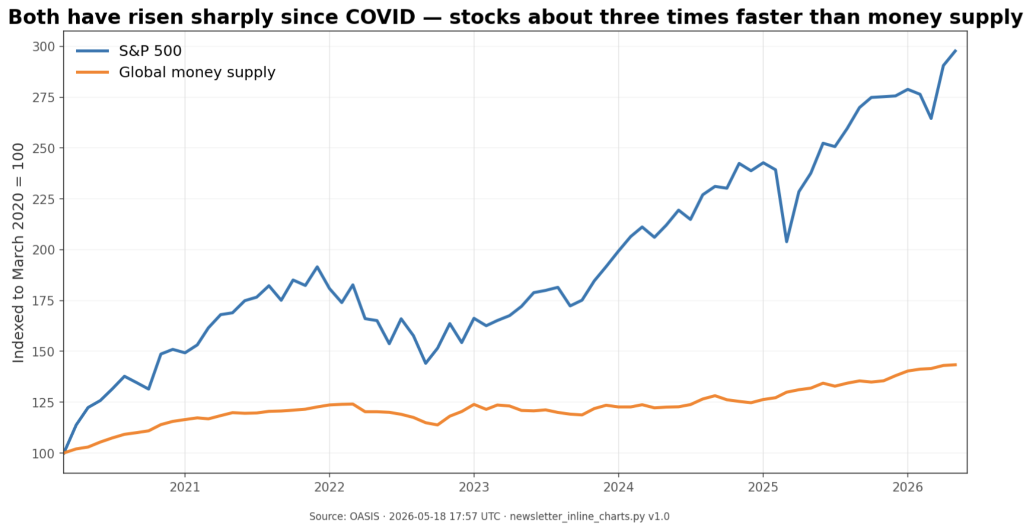
Since March 2020, both global money supply and the S&P 500 have risen sharply. The stock market has risen about three times faster than the money supply over this stretch — which is almost exactly what the era-4 sensitivity (a tripling) would predict. That gap is the elasticity, not a sign of detachment.
Each asset moves on its own clock
Not every asset absorbs liquidity at the same speed. Stocks in era 4 show a real but not overwhelming connection - moving together more often than not with global money supply in the same month (about +0.36). Bonds move on that same clock too, but with a stronger, more reliable monthly connection in price terms (about +0.52).
Bitcoin looks different. At the same-month level it does not show a convincing era-4 link, but with a roughly three-month lag it does. Home prices are slower still: the strongest era-4 link shows central-bank balance sheets leading US home prices by about five months.
That is one of the most useful practical findings from the study. Liquidity matters broadly in this regime, but timing matters almost as much as direction.
Bonds may be the cleanest signal of all
The strongest relationship in the whole matrix was not a price series at all. It was the size of the international bond market relative to global money supply. In era 4, bond-market size and global money supply grew almost in lockstep quarter to quarter, with a correlation of +0.888.
That pattern also carries a clean era fingerprint. In era 2, the BIS bond-market-to-global-money-supply ratio grew about +7.20% per year. In era 3, it fell about -3.10% per year. In era 4, it is growing only about +0.34% per year.
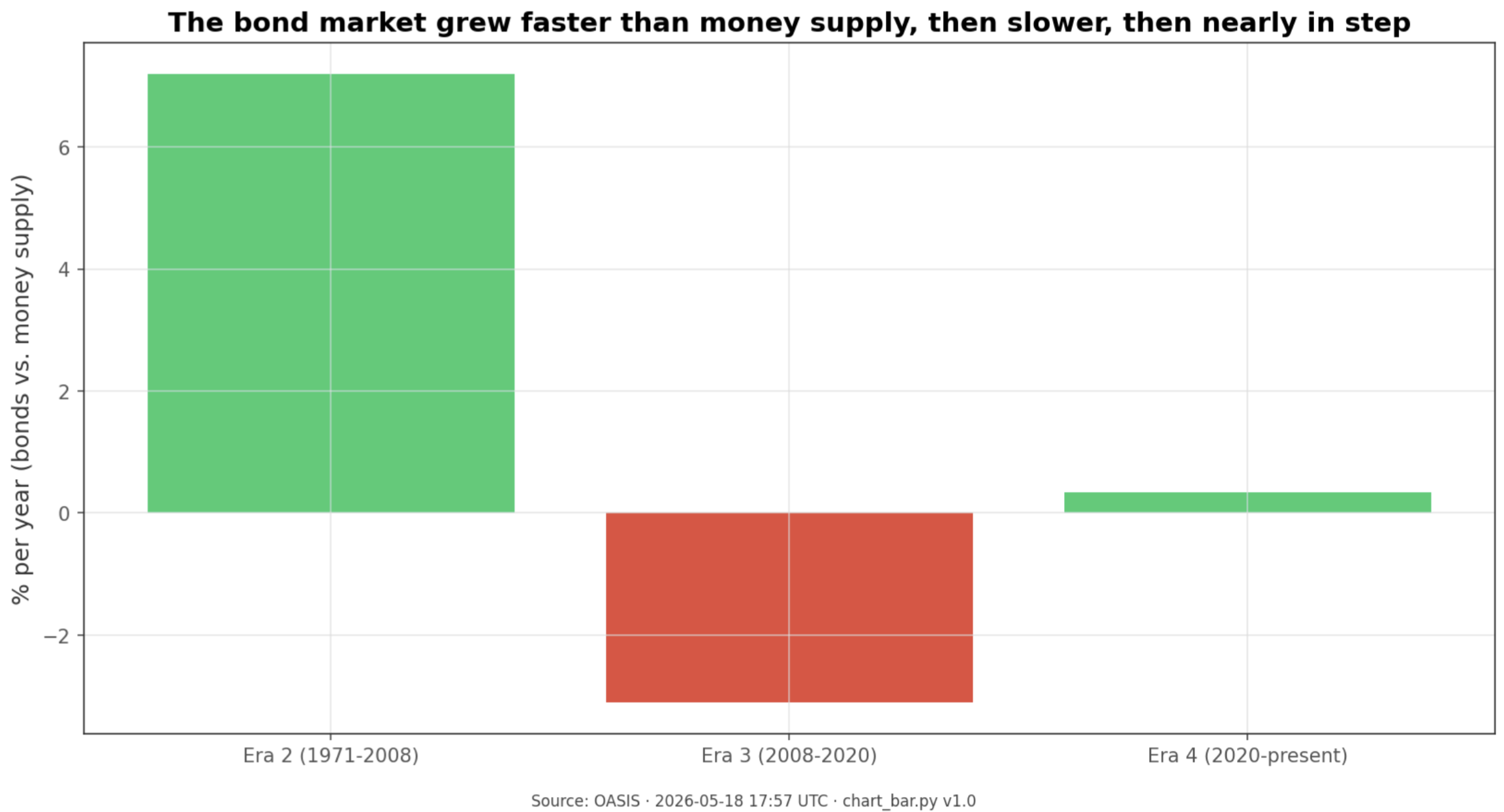
The size of the world bond market grew faster than the money supply in the 1971–2008 era, slower than the money supply during the QE years of 2008–2020, and then almost exactly in step from 2020 onward. Three completely different relationships — one for each era.
What to Watch
Whether the broad money supply keeps rising while central-bank balance sheets stay flat or keep shrinking; if it does, the era-4 decoupling between narrow and broad liquidity remains intact.
Whether new SPX highs continue to arrive alongside a rising global money supply; that would support the view that 7,408 is liquidity-supported rather than detached.
Whether the 12-month momentum in the global money supply keeps pointing to expansion or starts to cool; era 4 asset behavior has been materially different across those regimes.
Whether Bitcoin continues to respond with a delay rather than immediately after liquidity shifts; the three-month lag is the key test of the liquidity-beta story.
Whether bond-market size and the global money supply keep growing in near lockstep; a meaningful break there would be an early sign that the regime itself may be changing.
Look out for next week’s newsletter for further insight into the forces shaping today’s markets.
Strategy's Q1 Credit Scale-Up
Strategy's Q1 2026 cycle was less about the earnings print than about market access: $11.7B raised year to date, STRC scaled to $8.5B in nine months, and management now claims 60% of the US preferred new-issue market. The clearest evidence is the preferred side itself, with $5.6B raised YTD entirely through STRC and cumulative preferred notional at $12.13B. For readers tracking Bitcoin-linked capital formation, the point is simple: Strategy is now large enough to matter inside the preferred market, not just around its own balance sheet.
May 11th 2026
Bottom Line
Strategy's Q1 2026 cycle was less about the earnings print than about market access: $11.7B raised year to date, STRC scaled to $8.5B in nine months, and management now claims 60% of the US preferred new-issue market. The clearest evidence is the preferred side itself, with $5.6B raised YTD entirely through STRC and cumulative preferred notional at $12.13B. For readers tracking Bitcoin-linked capital formation, the point is simple: Strategy is now large enough to matter inside the preferred market, not just around its own balance sheet. Full comprehensive research report can be found below:
Thesis
This week is a single-name dispatch, and the question is straightforward: what did Strategy's Q1 2026 cycle actually advance? The answer is scale in capital markets, not a new change in corporate identity. Q1 showed that STRC is scaling fast enough to register as market structure, not just company financing.
What Changed
Last week the newsletter was about US GDP composition. This week the frame shifts to a single issuer whose funding program is now large enough to matter beyond the Bitcoin treasury story.
The change is scale. STRC reached $8.5B of notional in nine months, cumulative preferred equity reached $12.13B, and management says Strategy now represents 60% of the US preferred new-issue market in 2026 year to date. This week's update is that the structure kept compounding through Q1.
Evidence
The headline quarter was large, but the funding side mattered most
Strategy ended the cycle with 818,334 BTC as of May 3, equal to 3.9% of total Bitcoin supply. At the same time, the software business still generated $124.3M of Q1 revenue, up 11.9% year over year, with subscription services up 59%.
The cleaner message from the quarter was capital access, not KPI acceleration. The BTC stack kept growing, but the operating figures were more mixed than the balance-sheet scale alone suggests.
Q1 BTC Yield was 3.2%, versus 11.0% in Q1 2025.
YTD 2026 BTC Yield was 9.4%, versus 22.8% for FY2025.
BTC Gain in Q1 was 21,329 BTC, versus 49,132 a year earlier.
BTC $ Gain in Q1 was $1.45B, versus $4.05B in Q1 2025.
That mix matters for the weekly thesis because it keeps the focus on financing capacity. The quarter did add Bitcoin, but the more important development was the company's ability to keep converting investor demand into fresh balance-sheet firepower.
The quarter was really a STRC scaling story
Year to date, Strategy raised $11.7B of capital: $6.1B of common and $5.6B of preferred. On the preferred side, the issuance was effectively all STRC.
Q1 ATM net proceeds totaled $7.36B.
Of that, $5.29B came from Class A and $2.06B from STRC.
STRK contributed just $3.0M, while STRF and STRD ATMs were dormant.
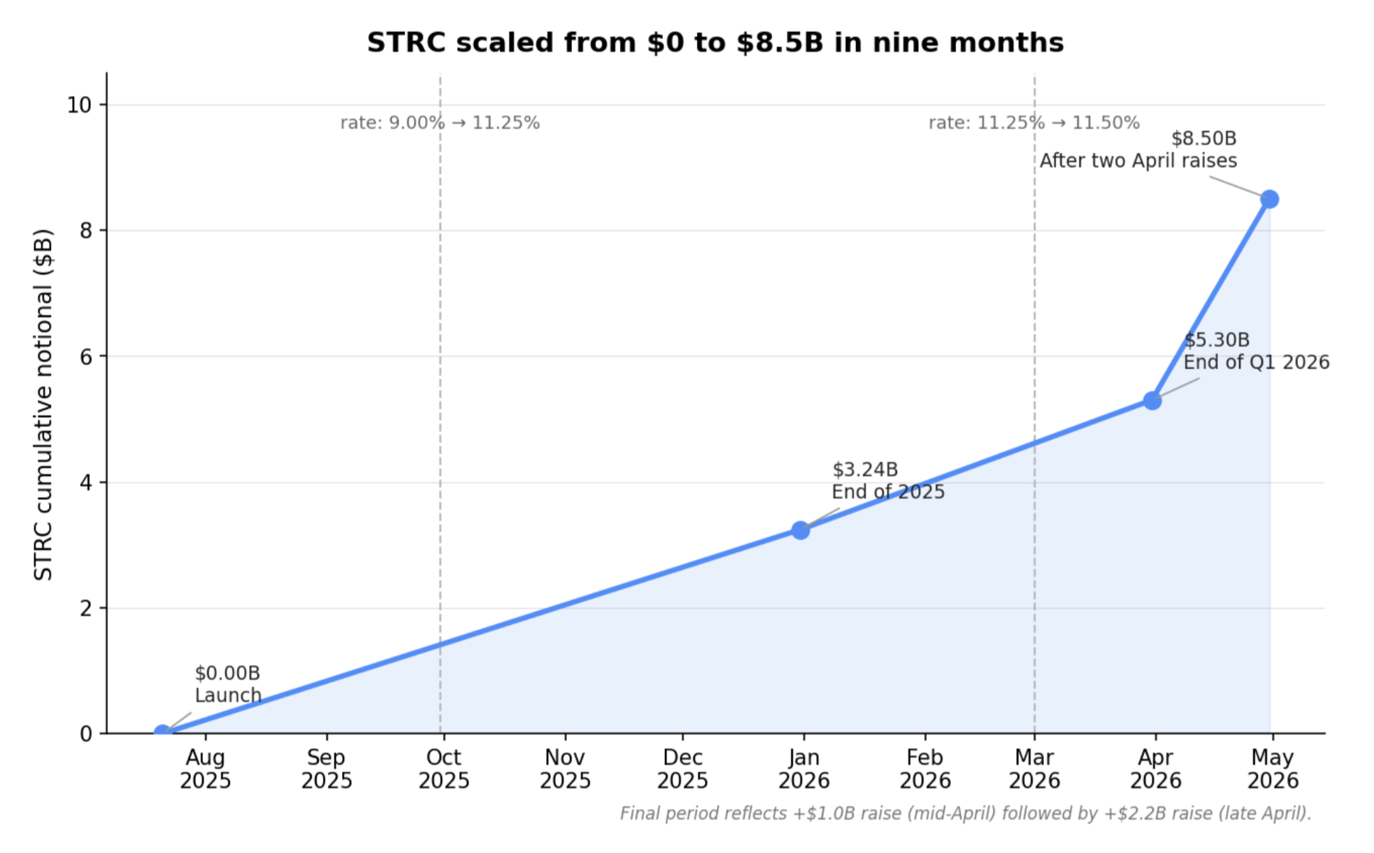
Cumulatively, STRC has reached $8.5B in nine months, which management describes as the largest preferred stock by market cap in the world. Across the preferred stack, total notional is $12.13B, with STRC accounting for more than 60% of the total.
Management is still tuning the product as it scales. STRC's dividend rate was raised from 11.25% to 11.50% effective March 1, 2026, and shareholders are being asked to approve a shift from monthly to semi-monthly dividends starting in July 2026 if approved. The quarter also showed issuance flexibility: January was 88% credit and 12% common, while April flipped to 17% credit and 83% common as the Bitcoin drawdown reweighted the mix.
That issuance mix is useful because it shows management is not treating the stack as static. The common and preferred channels are being adjusted in real time, but the preferred growth engine inside that stack is clearly STRC.
The market-share figures are now too large to ignore
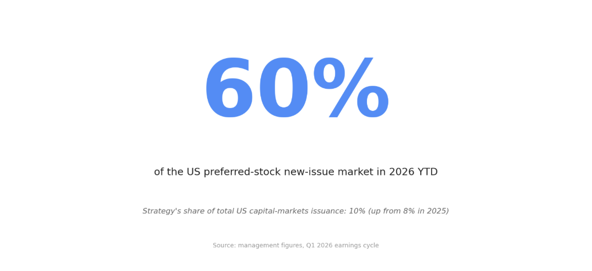
Management says Strategy's share of US capital-markets issuance rose from 8% in 2025 to 10% in 2026 year to date. Inside that, it claims 60% of the preferred-equity new-issue market and 6% of the common-equity market.
The microstructure signals line up with that claim. STRC daily liquidity rose from $54-120M in January to $360M in April, management says turnover is 10 times Wells Fargo preferred, and STRC is now the #2 holding in BlackRock's PFF, a $14B preferred ETF.
There is still a limit worth keeping explicit. Even the supplied work's closest candidate for a Treasury-like instrument, STRF, had a peak-to-trough drawdown of -21.76% over 37 weeks and traded at a +533 basis point spread versus the US 10-year in the November 15 reference snapshot. The stack is scaling, but it is still pricing as risk capital, not as a cash substitute.
Implications
Q1 makes the monitoring framework narrower and more concrete. Strategy now belongs on the radar as capital-markets infrastructure, especially through STRC, not just as a Bitcoin treasury story. The practical question from here is whether that preferred-market footprint holds as management works down the convert stack and keeps expanding the BTC balance.
What's in the research edition
The standing research edition goes deeper on:
The full layered capital structure: senior debt, the five preferred series, and how STRF, STRD, STRK, and STRE compare to STRC on yield, drawdown, and seniority.
Strategy's three-stage funding evolution since the 2020 Bitcoin pivot, and why management now wants to retire the convertible stack.
Management's forward guidance and the explicit rate-setting and ATM price-band rules that keep STRC clearing.
The capital-markets-disruption framing — Bitcoin as programmable capital, STRC as a credit-index inhabitant, and the comparison versus PFF, HY credit, and Treasuries.
Why STRF is the most Treasury-adjacent of the four preferreds but still not a Treasury substitute.
What to Watch
Whether STRC continues to take essentially all preferred issuance, because that remains the cleanest confirmation of the scaling story.
The shareholder vote on moving STRC from monthly to semi-monthly dividends, with first payment targeted for July 15, 2026 if approved.
Strategy's reported share of the US preferred new-issue market after Q2, since a meaningful drop from 60% would weaken the disruption claim.
STRC liquidity and its ability to stay in the stated $99-101 ATM band as additional supply comes to market.
Look out for next week’s newsletter for further insight into the forces shaping today’s markets.
Strategy Is Building a Bitcoin Credit Market
What we found in Strategy's Q1 2026 cycle is that the headline figures matter less than the structure they sit inside. Three findings stand out: STRC alone reached $8.5 billion in nine months, management says Strategy now represents 60% of the US preferred new-issue market, and STRC is already the #2 holding in BlackRock's PFF. For readers, the key implication is that Strategy now matters less as a quirky Bitcoin proxy and more as a live test of whether Bitcoin can be continuously securitized into credit and equity products that traditional markets will absorb.
Bottom Line
What we found in Strategy's Q1 2026 cycle is that the headline figures matter less than the structure they sit inside. Three findings stand out: STRC alone reached $8.5 billion in nine months, management says Strategy now represents 60% of the US preferred new-issue market, and STRC is already the #2 holding in BlackRock's PFF. For readers, the key implication is that Strategy now matters less as a quirky Bitcoin proxy and more as a live test of whether Bitcoin can be continuously securitized into credit and equity products that traditional markets will absorb.
Thesis
We approached this research by starting with Q1 and then zooming out. On the surface, the quarter offered familiar headline figures: 818,334 BTC held as of May 3, $11.7 billion raised year-to-date, software revenue of $124.3 million, and a management-reported mNAV, or market value of the total capital structure relative to Bitcoin net asset value, of 1.27x. But as we worked through the findings, what the research kept pointing back to was something more structural. Strategy is not easiest to understand as only a software company that bought a lot of Bitcoin, nor only as a leveraged equity wrapper around BTC. By management's own framing and by the shape of the issuance data, it is trying to become the securitization layer between Bitcoin and traditional capital markets. The path through that claim is straightforward: first who Strategy is today, then what the Q1 2026 earnings cycle actually said, then how those instruments are interacting with traditional markets.
Who Strategy Is Today
One company on paper, two activities in practice
We started by asking what Strategy actually is today as a company. The findings gave a clear answer: Strategy reports a single GAAP segment, but the business now clearly operates through two activities, Bitcoin treasury operations and AI-powered enterprise analytics software.
The software side is still real. FY2025 software revenue was $477.2 million, and Q1 2026 software revenue was $124.3 million, up 11.9% year over year, with subscription services up 59%. Leadership remains centered on Michael J. Saylor as Executive Chairman, Phong Le as President and CEO, Andrew Kang as CFO, and Thomas C. Chow as EVP and General Counsel.
We also found that the capital structure is broader than many readers may assume. As of February 13, 2026, Strategy had 314.1 million Class A shares, 19.6 million Class B shares, and five preferred series outstanding: STRK, STRF, STRD, STRC, and STRE. That fifth series matters because it shows the preferred stack is not a side project. Strategy is still an operating software company, but the organizational shape now supports a much larger capital-markets experiment.
The pivot became the company
We then asked how the company moved from enterprise software vendor to Bitcoin treasury vehicle. What the research found is that the shift was not a one-off balance-sheet decision. It became formal company strategy.
The strategic shift began in August 2020 with the first Bitcoin purchase. In September 2020, the board adopted a Treasury Reserve Policy making BTC the primary treasury reserve asset. By Q1 2021, raising capital to accumulate Bitcoin had become formal corporate strategy.
From there, the funding mix evolved in three stages. From roughly 2020 through 2023, Strategy relied on ATM, or at-the-market, common issuance, senior convertibles, and a collateralized term loan. In 2024, scale stepped up with $16.33 billion of Class A ATM proceeds plus multiple convertible offerings. In 2025, the architecture changed again: five preferred series were issued alongside 2030B converts and another $13.59 billion of Class A ATM proceeds.
The shift across instruments is easier to see in the picture below.
That sequence matters because, in our findings, it reads as intent rather than improvisation. By the FY2025 10-K, management described Strategy as a Bitcoin Treasury Company that "structures and securitizes Bitcoin." The software business is still there, but it is no longer the strategic frame. It now looks more like operating ballast beneath a balance sheet designed to manufacture investable BTC-linked instruments.
A capital stack that is large, layered, and moving away from converts
Once the strategic pivot was clear, we asked what the capital structure actually looks like now. The answer from the findings is that it is already large, layered, and increasingly organized around preferred equity rather than future convertible issuance.
As of March 31, 2026, Strategy had 314.1 million Class A shares and 19.6 million Class B shares, implying a common market cap of about $62 billion.
Above that common sits a sizeable preferred layer. The five preferreds total roughly $13.5 billion notional, with STRC alone at $8.5 billion, or more than 60% of the stack. There are also six convertible series due 2028-2032 with 0.625% to 2.25% coupons totaling $8.21 billion principal, plus $40.3 million of other long-term debt. Total indebtedness was $8.25 billion, and that debt sits senior to all preferreds, meaning the preferreds rank behind in payment priority if Strategy ever had to pay creditors out.
The chart below shows the layers to scale.
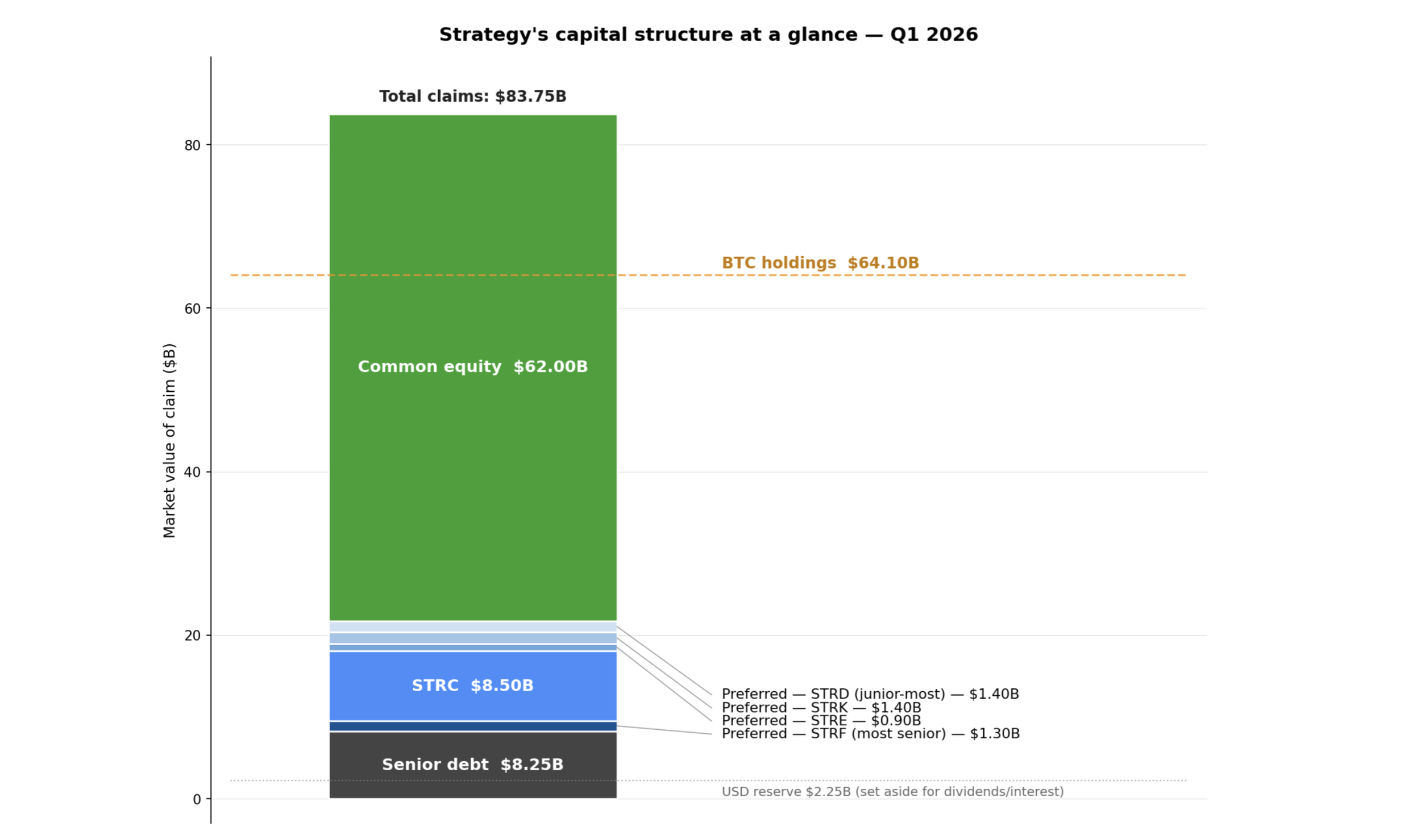
Against that sits the Bitcoin position: 818,334 BTC as of May 3, equal to 3.9% of total BTC supply and worth $64.1 billion at the cited market price, plus a dedicated USD reserve of $2.25 billion for preferred dividends and interest. We also found that management wants to equitize the convert stack over time and avoid new converts. The destination is not more debt complexity. It is common, preferred, BTC, and a cash reserve.
What the Q1 2026 Earnings Cycle Showed
Headline figures: continuity, with the machine still running
With that structure in view, we asked what Q1 itself actually showed. At the surface level, the findings looked familiar: more BTC, more capital raised, and another set of management KPIs.
Strategy reported 818,334 BTC as of May 3, worth $64.1 billion at $78,374 per BTC, with a cost basis of $61.81 billion and an average cost of $75,537.
The quarter's internally promoted performance metrics were softer than the prior comparison period. Q1 BTC Yield, the rate at which Strategy is growing Bitcoin per share, was 3.2% versus 11.0% in Q1 2025. Year-to-date 2026 BTC Yield was 9.4% versus 22.8% for FY2025. Bitcoin per share, measured against an expanded share count that includes preferreds and convertible bonds, still rose, but more slowly than a year earlier. BTC Gain was 21,329 BTC in Q1 versus 49,132 a year earlier, and BTC $ Gain was $1.45 billion versus $4.05 billion.
At the same time, the operating business remained visible. Software revenue was $124.3 million, up 11.9% year over year, with subscription revenue up 59% and gross profit at $83.4 million. Capital raised year-to-date reached $11.7 billion, split between $6.1 billion common and $5.6 billion preferred. The quarter did not change the story so much as confirm how large the machine has already become.
STRC dominated the quarter
When we asked what defined the quarter, the answer kept coming back to one instrument: STRC. The findings were decisive on that point.
Q1 2026 was decisively STRC-dominated: STRC ATM issuance raised $2.06 billion through 20.66 million shares, while Class A ATM raised $5.29 billion and STRK ATM was only $3 million. STRF and STRD ATMs were dormant.
Cumulatively, STRC reached $8.5 billion in just nine months. Management says that makes it the largest preferred stock by market cap in the world. The growth curve makes the pace clear.
The issuance mix also shifted sharply inside the quarter. In January, ATM activity was 88% credit and 12% MSTR common. By April, it had flipped to 17% credit and 83% MSTR common as the Bitcoin drawdown reweighted issuance.
Two April weeks still stand out in the findings: one $1.0 billion raise followed by a $2.2 billion raise the next week. STRC's dividend rate was also raised from 11.25% to 11.50% effective March 1, 2026. That combination of scale, active rate-setting, and sustained issuance is what makes STRC worth attention. It is no longer a concept product. It is functioning as a primary funding channel.
The dividend-frequency proposal is product iteration, not plumbing
We also wanted to know whether the proposed shareholder vote on STRC's dividend schedule was cosmetic or meaningful. The research pointed to the second reading: this looks more like product iteration than routine plumbing.
Strategy wants to move STRC from 12 dividend payments a year to 24, starting in July 2026 if approved.
The economics do not change. The proposal changes payment frequency from monthly to semi-monthly, with the first record date on June 30, 2026 and the first payment date on July 15, 2026. Management's stated reason is direct: improve attractiveness, enhance liquidity, and support better price stability.
That matters because, in the findings, STRC is being managed as an instrument whose market behavior can be tuned. The company is not simply issuing preferred stock and accepting whatever secondary-market profile follows. It is actively adjusting the user experience of the security in order to deepen demand and stabilize the channel. In that sense, the dividend-frequency proposal belongs in the same family as the coupon adjustments and price-band management. It is another signal that Strategy is iterating a market product, not merely maintaining a funding line.
Forward guidance reads like a balance-sheet blueprint
We then asked what management's forward guidance was really describing. The answer from the research is that it reads less like ordinary guidance and more like a blueprint for how the balance sheet is meant to scale.
Saylor's headline statement was the clearest version: Strategy expects to pass 1 million Bitcoin on the balance sheet within the next 36 months while funding all obligations with Bitcoin.
That sits inside a broader set of commitments. Management laid out a goal to double Bitcoin Per Share in seven years under a scenario assuming 16% Digital Credit issuance, a 9% dividend rate, and 1.75x mNAV. It also outlined six capital-markets principles: increase Bitcoin per share; grow STRC demand; reduce convertible debt proactively; size the USD reserve to credit demand and risk; adjust issuance scale to market conditions; and remain willing to sell BTC when advantageous.
The operating rule set for STRC was equally specific. If monthly average traded price falls below $95, management would recommend at least a 0.50 percentage-point rate increase; between $95 and $99, at least 0.25 percentage points; above $101, a rate decrease and/or follow-on offering. The message from the findings is straightforward: this is not passive treasury management. It is active balance-sheet engineering.
The macro framing was capital-markets disruption, not a Fed call
We also asked how management chose to frame the quarter. The findings here were notable because the central story was not the usual monetary-policy discussion. It was capital-markets disruption.
Strategy's own language was that it transforms "Digital Capital into Digital Credit and Equity," positioning itself as the securitization layer between a $1.6 trillion Bitcoin market cap and traditional preferred or fixed-income buyers.
Three threads carried that framing. First, Bitcoin was presented as programmable capital. Second, STRC was presented as a credit-index inhabitant, with Saylor stating that "Stretch is the #2 holding in BlackRock's PFF," the $14 billion preferred ETF. Third, management argued Bitcoin's risk-and-return profile can be split into a high-yield, lower-volatility credit product, STRC, and a higher-volatility equity product, MSTR common.
Phong Le also made the near-term demand point explicit: demand is more constrained by awareness and market development than by Fed moves. The quarter was therefore less a monetary-policy commentary than a product-distribution commentary.
In the Q&A, management treats the stack as a dynamic machine
Finally, we looked at what the analysts were actually asking and how management answered. That part of the research reinforced the same thread: management appears to treat the stack as a dynamic machine rather than a set of separate financing buckets.
Eight named analysts focused on five broad themes: proactive capital-stack management, the effect of lower rates, decentralized finance, or DeFi, products built on STRC, decentralization concerns as institutions accumulate BTC, and what lower BTC volatility would do to the model.
Across those answers, management's thread was consistent. It is willing to sell BTC for tax or optimization reasons, retire all convertible bonds, which can convert into shares under set conditions, via STRC, equity, or cash, and lean further into the use of leverage if BTC volatility falls. On the DeFi question, management said yield coins and leveraged yield products are already being built on STRC. On the relative-risk debate, Saylor said the market "does not yet agree."
That matters because it reveals the mindset behind the structure. Management does not appear to view the preferreds, converts, common ATM, and BTC position as separate financing buckets. It views them as coordinated levers. The quarter's educational value is not just in the numbers reported, but in how openly the company described the operating logic of the machine.
Where These Instruments Sit in Traditional Markets
Demand is strongest in STRC, but the spreads still say credit risk
Once the quarter's internal logic was clear, we asked how these instruments compare with traditional markets. The first answer was that demand is strongest in STRC, but the pricing still says credit risk rather than something Treasury-like.
The clearest demand signal is STRC: year-to-date 2026, all $5.6 billion of preferred ATM issuance came through that one series. Retail ownership is roughly 80%, and daily liquidity rose from $54-120 million in January to $360 million in April. Management says STRC turnover is 10 times that of Wells Fargo preferred.
The cross-section also matters. STRK carries an 8.00% fixed coupon, has returned -7.79%, and saw a -41.98% max drawdown. STRF carries a 10.00% fixed coupon, returned +23.18%, and had a -21.76% drawdown. STRD carries a 10.00% fixed coupon, returned +2.92%, and had a -29.09% drawdown. STRC, now at an 11.50% variable rate, returned +22.52% with only a -4.02% max drawdown.
But the yield and spread comparisons keep the framing honest. Versus PFF's typical roughly 6% distribution yield, MSTR preferreds run about 4 to 7 percentage points wider. Versus today's 2.79 percentage-point spread over Treasuries for high-yield corporate credit, they price 2 to 4 times wider than high-yield corporate credit.
STRF looks Treasury-adjacent but is not a Treasury substitute
We wanted to see whether any of the preferreds behaves like a Treasury substitute. STRF was the closest candidate, and the answer turned out to be subtler than we expected.
Within the preferred stack, it is the most senior preferred, cumulative, meaning missed dividends accrue and must be paid before common dividends resume, fixed at a 10.00% coupon, has no conversion feature, and no ordinary call. It also trades closest to par, at $100.55 latest and $105.58 on November 10, and delivered the best realized total return of the four at +23.18%.
The limits are just as important. STRF's peak-to-trough drawdown was -21.76% over 37 weeks, which is not compatible with literal "no-risk" language. Its spread versus the US 10-year at the November 15 anchor was +5.33 percentage points, firmly in high-yield-credit territory by spread. And structurally, it is subordinated to $8.25 billion of senior debt plus all subsidiary liabilities.
The right comparison from the findings is therefore not Treasury substitute. It is "treasury-spread fixed-coupon perpetual." That sounds like a narrower distinction than it is. STRF may be the most bond-like product in the stack, but the evidence still places it much closer to long-duration high-yield risk than to Treasury cash-equivalent behavior.
Strategy is already large enough to matter in the markets it touches
We then asked whether Strategy is actually large enough to influence the markets it touches, or whether the disruption framing is still mostly rhetorical. The research came back with a fairly clear answer: by management's own market-share figures and by the market-microstructure signals, it is already large enough to matter.
By management's figures, Strategy's share of US capital-markets issuance rose from 8% in 2025 to 10% in 2026 year-to-date.
Inside that, the preferred-equity figure is the eye-catching one: 60% of the US preferred new-issue market, alongside 6% of common-equity issuance. Since the Bitcoin pivot, cumulative issuance is estimated at $81.75 billion. The headline figure is the one worth keeping in mind.
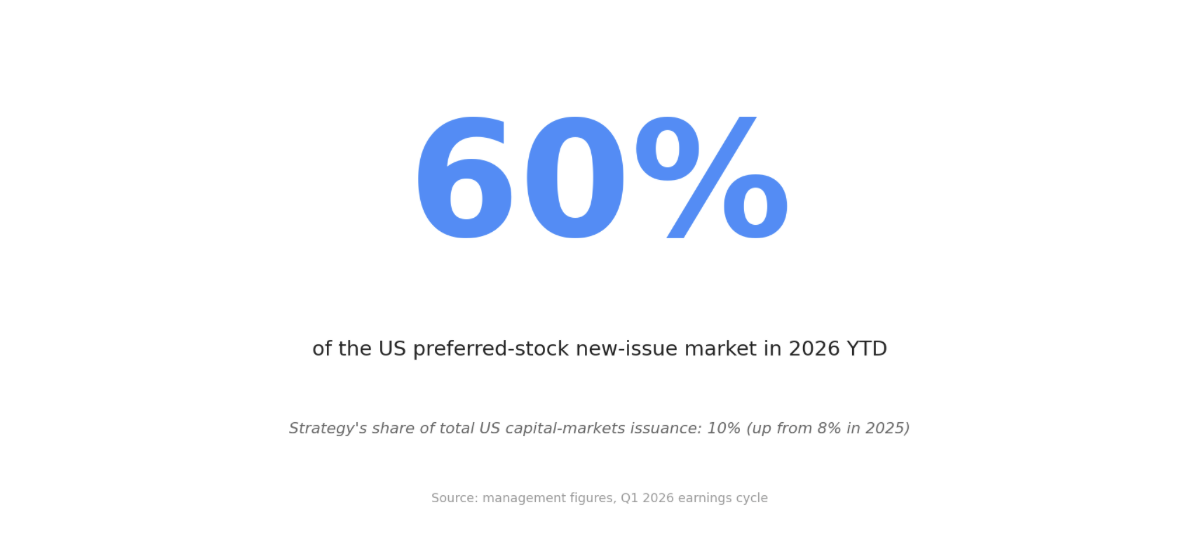
The market-microstructure evidence lines up with the issuance share. STRC daily liquidity rose from $54-120 million in January to $360 million in April, and management says turnover is 10 times that of Wells Fargo preferred. STRC is also said to be the #2 holding in BlackRock's PFF.
The direct-pricing signal remains the cleanest expression of that influence. STRC has held its $99-101 trading band 100% of the time since the ATM was anchored there, and management raised the coupon from 9.00% to 11.25% to 11.50% instead of letting the price slip during BTC drawdowns. The broader preferred-market impact is not fully verified, but the instrument-level influence is already material.
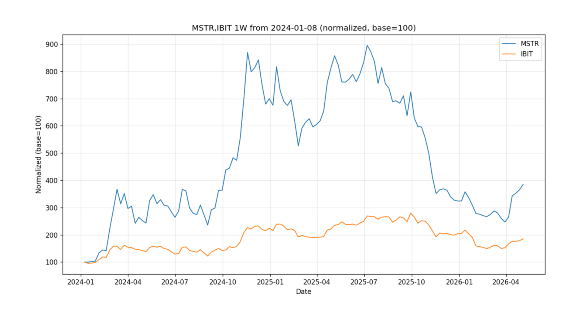
Implications
The research points to a simple but important conclusion: Strategy deserves attention now less because it owns a lot of Bitcoin and more because it is testing whether Bitcoin can support an enduring securitization layer across common equity, preferred equity, and eventually a simplified post-convert capital stack. For readers tracking capital markets, the relevant signal is not just BTC sensitivity. It is product acceptance. STRC's scale, liquidity growth, ETF penetration, and price-band mechanics suggest that at least one instrument has already crossed from concept into functioning market object. At the same time, the spreads, drawdowns, subordination, and the company's tax framing for preferred dividends suggest caution in how the products are interpreted. This is a live capital-markets innovation, not a cash-equivalent revolution. The interesting question the research leaves us with is not whether the products exist. It is whether demand remains durable enough for the issuance machine to keep compounding without a major break in the stack's risk pricing.
What to Watch
What the findings suggest is worth watching next is straightforward:
Whether STRC continues to hold the $99-101 trading band after the proposed move to semi-monthly dividends; that is the cleanest test of whether the product-design tweaks are still improving liquidity and price stability.
Whether preferred issuance remains concentrated in STRC or broadens again to STRF, STRD, or STRK; Q1's $5.6 billion preferred ATM being entirely STRC is a strong but narrow demand signal.
Whether management actually reduces the $8.21 billion convertible stack over coming quarters; the stated destination is common plus preferred plus USD reserve, so convert retirement is the key execution test.
Whether STRC retains meaningful benchmark-style demand, especially its stated position as the #2 holding in BlackRock's PFF; sustained ETF and retail absorption matters more than one quarter of issuance volume.
Whether BTC accumulation keeps tracking the stated 1 million BTC in 36 months goal without forcing a visible deterioration in pricing across the preferred stack, particularly given STRF's high-yield-like spread profile and the broader subordination beneath $8.25 billion of senior debt.
Look out for next week’s newsletter for further insight into the forces shaping today’s markets.
The Shape of the US Economy
A look through the latest GDP release shows a country powered by consumption, built around services, and still being reshaped by post-2000 and post-COVID shifts.
May 4th 2026
A look through the latest GDP release shows a country powered by consumption, built around services, and still being reshaped by post-2000 and post-COVID shifts.
Bottom Line
The 2025-Q4 GDP snapshot shows a US economy led by household consumption on the spending side and by services on the production side. Personal consumption expenditures, or PCE, account for 68.0% of nominal GDP, while Finance, Insurance, and Real Estate is the largest production supersector at 21.1%. The deeper story is that government's real share has been shrinking for years, distribution has climbed the economic rankings, and several post-COVID shifts now look durable enough to treat as part of the current structure.
High Level
The cleanest high-level view of the US economy starts with two ranked lists from 2025-Q4. The first shows how output is spent: by households, businesses, government, or through trade with the rest of the world. The second shows where output is produced: which sectors make up the economy underneath those spending flows. Read together, they show a country centered on consumption, dominated by services, supported by a notably large real-estate footprint, and shaped by structural changes that began well before 2026 but remain visible in the latest data.
Evidence
1) The spending ranking starts with the consumer
The expenditure breakdown is straightforward. In 2025-Q4, personal consumption expenditures, or PCE - the dollars households spend on goods and services - were 68.0% of nominal GDP. Gross private domestic investment, or GPDI, was 17.5%, government consumption expenditures and gross investment, or GCE, was 17.0%, and net exports were -2.5%
| Rank | GDP expenditure component | 2025‑Q4 nominal shareShare | 2025‑Q4 nominal value ($B)Value ($B) |
|---|---|---|---|
| 1 | Personal Consumption Expenditures | 68.0% | 21,363.4 |
| 2 | Gross Private Domestic Investment | 17.5% | 5,500.6 |
| 3 | Government Consumption Expenditures & Gross Investment | 17.0% | 5,343.5 |
| 4 | Net Exports | ‑2.5% | ‑785.0 |
That is the modern US economy in one table: consumption first, investment and government well behind it, and trade subtracting from total output because imports exceed exports. The historical work shows this is not a one-quarter quirk. PCE's real share stepped up from 62.95% to 67.41% after 2000, while GCE fell from 25.37% in 1975-1993 to 20.93% in 1994-2012 and then 17.38% in 2013-2025. Net exports also shifted lower, moving from -0.72% to -3.22% after 1999.
One accounting point matters here. GCE captures what government directly buys and invests in; it does not include transfer payments such as Social Security. Those transfers still matter economically, but they usually appear in GDP only when households spend that income, which then shows up through PCE. That is why the direct government line can shrink even while government remains economically important.
2) The production ranking shows how service-heavy the economy has become
If the spending side shows who drives demand, the production side shows what kind of economy meets it.
| Rank | Supersector | 2025‑Q4 nominal share |
|---|---|---|
| 1 | FIRE (Finance, Insurance, Real Estate) | 21.1% |
| 2 | Distribution & Hospitality | 18.5% |
| 3 | Education, Health, Social, Arts, Other (PUBSVC) | 14.8% |
| 4 | Professional & Business Services | 12.7% |
| 5 | Government | 10.7% |
| 6 | Manufacturing | 9.1% |
| 7 | Information & Communication | 5.4% |
| 8 | Construction | 4.1% |
| 9 | Utilities | 1.5% |
| 10 | Mining | 1.1% |
| 11 | Agriculture | 0.8% |
The immediate point is scale. Finance, Insurance, and Real Estate sits at 21.1%, making it the largest supersector in the economy. Distribution and Hospitality follows at 18.5%, then the broad education-health-social-services grouping at 14.8%, and Professional and Business Services at 12.7%.
All five goods-producing supersectors combined - Manufacturing, Construction, Mining, Agriculture, and Utilities - are only about 16.6% of nominal value-added. Manufacturing still matters, but it does not dominate the map. Agriculture is especially striking: at 0.8% of GDP, it holds an outsized place in the national imagination relative to its direct footprint.
Inside the production picture, real estate is one of the central structural features of the economy and worth tracking as such. More broadly, the ranking shows an economy layered through services rather than anchored in one old industrial core.
3) Government's shrinking share is real, but it is mostly a state and local story
That service-heavy structure makes the government trend easier to place. Government remains large in dollar terms, but its real share has been falling for years.
On the production side, the government supersector moved from 16.90% in 1997-2004 to 14.41% in 2005-2014 and then 11.08% in 2015-2025. On the expenditure side, GCE followed the same broad direction: 25.37% in 1975-1993, 20.93% in 1994-2012, and 17.38% in 2013-2025.
The more interesting finding is where that decline comes from. At the industry level, state and local government fell from 9.95% in 2005-Q2 through 2013-Q2, to 8.70% in 2013-Q3 through 2020-Q2, to 7.64% in 2020-Q3 through 2025-Q4. Federal government also declined, but less sharply, moving from 4.39% to 3.92% to 3.52%. State and local government fell 2.31 percentage points; federal government fell 0.87 percentage points.
So "government is shrinking as a share of the economy" is true, but incomplete. Most of the contraction comes through the state and local line, not the federal one.
4) Distribution and several post-COVID shifts now look structural
If government's share moved down, other parts of the economy moved up. One clear example is Distribution and Hospitality.
Distribution and Hospitality now accounts for 18.5% of nominal GDP. The structural-shift work found two clean break-points: 14.78% in 1997-2011, 17.43% in 2012-2020, and 20.29% in 2021-2025. That is a combined rise of about 5.5 percentage points. The research reads the 2012 break as consistent with the e-commerce era becoming large enough to register at the supersector level, and the 2021 break as consistent with the post-COVID logistics landscape.
Implications
Taken together, the two rankings describe an economy with a clear center of gravity. Demand still runs through the household sector. Production is overwhelmingly services-led, with real estate occupying a notably large place in the structure and goods production taking a smaller share than many older mental models assume. Government's direct real share has been trending lower, mostly through state and local government, while distribution has gained share in a way that lines up with e-commerce and post-COVID logistics. The result is a more precise portrait of the US economy at the end of 2025: consumption-heavy, services-dominated, and still being reshaped by regime changes that now look well established.
What to Watch
Whether PCE stays near its current share of GDP; if consumption gives up meaningful share, the basic map changes with it.
State and local government versus federal government in upcoming quarterly data; the shrinking-government-share story should keep showing up more clearly in the state and local line.
Distribution-linked industries such as wholesale trade, retail trade, transportation and warehousing, and accommodation and food services to see whether the 2012 and 2021 step-ups continue to hold.
Real Estate and Rental & Leasing as one of the economy's core structural pillars; any material change there would matter for the broader production mix.
Additional quarterly persistence in information, management, accommodation, retail, and health care; more time at current levels would further confirm that post-COVID is a regime rather than a temporary distortion.
Look out for next week’s newsletter for further insight into the forces shaping today’s markets.
A First Look at Bitcoin-Linked Credit
Something new is developing in financial markets.
For most of its history, Bitcoin has been understood in relatively simple terms. It is something you buy, hold, and, if needed, sell. It does not produce income. It does not generate cash flow. Its role has mostly been defined by what it is: a scarce digital asset.
But that framing is starting to expand.
April 27th 2026
Why markets are beginning to build financial products around Bitcoin-heavy balance sheets
Something new is developing in financial markets.
For most of its history, Bitcoin has been understood in relatively simple terms. It is something you buy, hold, and, if needed, sell. It does not produce income. It does not generate cash flow. Its role has mostly been defined by what it is: a scarce digital asset.
But that framing is starting to expand.
A small but important group of companies is now treating Bitcoin not only as an asset to hold, but as something financial markets can build around. The clearest example is Strategy, formerly MicroStrategy, which has developed a growing capital structure around its Bitcoin-heavy balance sheet.
This does not mean these products are “Bitcoin-backed loans” in the legal sense. Strategy’s own materials state that its preferred securities are not collateralized by the company’s Bitcoin holdings and only have a preferred claim on the residual assets of the company. (Strategy)
That distinction matters.
These products are better understood as Bitcoin-linked credit products: securities issued by a company whose balance sheet is heavily tied to Bitcoin.
And that makes them worth understanding.
Why would a company do this?
Start with the basic problem.
If a company holds Bitcoin, selling provides liquidity but reduces exposure. Holding preserves exposure but produces no cash. Traditional finance has long solved this problem by allowing companies and investors to raise capital around assets rather than selling them outright.
Strategy is applying that logic to Bitcoin.
Instead of selling Bitcoin, the company issues securities, raises capital, and keeps its Bitcoin exposure intact. Strategy has described STRC as a variable-rate preferred stock designed to trade near a $100 stated amount, with dividends adjusted to support that objective. (Nasdaq)
In plain English:
The company is trying to turn Bitcoin from a passive treasury asset into a financing base.
That is the real story.
Not yield. Not hype. A financing base.
The preferred stack: four products, different roles
Strategy’s publicly traded preferred securities give investors different ways to take exposure to the same broad issuer and balance-sheet story.
They are not all the same product.
STRF sits closer to the senior income layer. STRC is designed as a variable-rate preferred aiming to remain near par. STRK includes convertibility and therefore more upside participation. STRD sits further out on the risk spectrum as the more junior preferred layer. Secondary explainers describe the four series as differing in seniority, dividend structure, and convertibility, with STRF generally senior and STRD more junior. (Backpack Learn)
The simple version:
STRF is for investors who prioritize income and relative seniority.
STRC is for investors focused on income with a product designed around price stability near par.
STRK is for investors who want income plus more upside participation through convertibility.
STRD is for investors willing to accept more risk within the preferred stack.
The key idea is that Strategy is not just issuing one instrument. It is building something closer to a capital stack around a Bitcoin-heavy balance sheet.
Different investors can choose different layers depending on what they want: income, stability, upside, or risk.
Why this is not simply a pyramid
At first glance, the structure can raise an obvious question.
If a company raises money, buys more Bitcoin, and then raises more money against a larger Bitcoin balance sheet, is that just a self-reinforcing loop?
It is a fair question.
But the cleaner answer is this:
Investors are not funding earlier investors. They are pricing risk around a company with a large Bitcoin-heavy balance sheet.
That does not make the structure risk-free. It does make it different from a pyramid dynamic.
There are real assets on the balance sheet. There are real market constraints. There are real dividend obligations. And there is no guarantee that capital markets will continue to accept new issuance on attractive terms.
That last point is important.
A structure like this only works while investors are willing to price the securities, buy the products, and trust the issuer’s balance sheet. If demand weakens, issuance becomes harder. If Bitcoin falls materially, balance-sheet confidence can weaken. If dividend obligations grow too large, the structure becomes more fragile.
So this is not magic.
It is capital markets engineering.
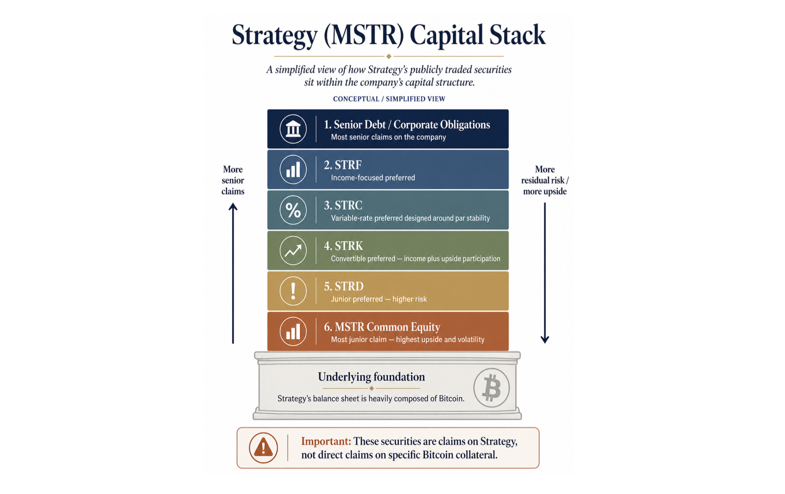
The mechanism: borrow around Bitcoin instead of selling it
The core mechanism is simple.
Strategy holds Bitcoin. It issues securities against the company. Investors buy those securities for income, stability, or upside participation. Strategy raises capital while preserving Bitcoin exposure.
That creates a new role for Bitcoin.
It is no longer just an asset sitting on the balance sheet.
It becomes part of how the company structures capital.
Why this matters: adoption looks like infrastructure
The importance of these products is not that they prove a bullish Bitcoin thesis.
They do not.
The importance is that they show financial markets beginning to build around Bitcoin.
That is typically what happens as an asset matures. Markets create wrappers, financing tools, derivatives, income products, hedging instruments, and structured exposures. The asset becomes less isolated. It becomes part of a broader financial system.
Bitcoin appears to be moving through a version of that process.
First, it was a speculative asset. Then it became a store-of-value candidate. Then it moved onto corporate balance sheets. Now, at least in early form, markets are building financing products around Bitcoin-heavy companies.
That is a development worth observing.
Not because it tells us where Bitcoin trades next week.
But because it shows how adoption can appear in market structure.
What could go wrong
The risks are real.
The first is legal and structural. These products are not directly collateralized by Bitcoin. Preferred holders rely on the company, not a segregated claim on specific BTC holdings. Strategy states this directly in its own preferred security materials. (Strategy)
The second risk is Bitcoin volatility. If Bitcoin falls materially, the balance sheet weakens, market confidence can decline, and new issuance may become more difficult.
The third risk is dividend burden. Preferred securities create obligations. Those obligations need to be serviced, and market reporting has highlighted investor focus on Strategy’s preferred dividend and debt servicing costs.
The fourth risk is complexity. These products may look like income instruments, but their behavior is tied to a company whose financial structure is heavily connected to Bitcoin.
That combination can be powerful.
It can also be misunderstood.
What to watch
The first thing to watch is whether issuance continues to grow. If more capital is raised through these structures, it suggests investors are willing to keep funding the model.
The second thing to watch is STRC.
STRC matters because it is designed to trade near a $100 stated amount, with a variable dividend mechanism intended to help maintain price stability. Strategy has specifically referenced STRC’s variable dividend mechanism and its role in maintaining price near the stated amount.
That makes STRC a useful pressure gauge.
If STRC remains stable near par, it suggests demand is strong enough for the structure to function as intended. If it breaks away from par for a sustained period, that may signal stress in investor demand, pricing, or confidence.
The third thing to watch is how these products behave during a sustained Bitcoin drawdown.
That is the real test.
The structure is easiest to understand when Bitcoin is stable or rising. The more important question is how it behaves when Bitcoin falls, capital markets tighten, or investor appetite weakens.
Final thoughts
Something new is forming.
Not in a way that requires immediate action.
And not in a way that offers easy conclusions.
But in a way that is worth understanding.
Companies are beginning to raise capital around Bitcoin-heavy balance sheets. Markets are creating different securities for different investor needs. And Bitcoin is slowly becoming something financial products can be built around.
That is what adoption often looks like.
Not just price movement.
Infrastructure.
And right now, we may be watching the early stages of that infrastructure being built.
Look out for next week’s newsletter for further insight into the forces shaping today’s markets.
Liquidity Tailwinds, Emerging Constraints
Liquidity has been the dominant driver of markets in recent weeks.
At the same time, key funding conditions are beginning to shift — introducing constraints that have not yet shown clear effects in market behavior.
April 20th 2026
Bottom Line
Liquidity has been the dominant driver of markets in recent weeks.
At the same time, key funding conditions are beginning to shift — introducing constraints that have not yet shown clear effects in market behavior.
The Setup
Over the past three weeks, markets have moved higher in a fairly consistent way.
Equities are at all-time highs
Bitcoin has recovered toward recent highs
Market breadth has improved meaningfully
Volatility has compressed
Taken together, this has been a strong environment for risk assets.
The question is not what has happened.
The question is:
What is driving it — and is that still intact?
Liquidity Has Been the Driver
The recent move in markets has been supported by a clear liquidity tailwind.
One of the most important developments over the past few weeks has been the behavior of the Treasury General Account (TGA).
The TGA has declined meaningfully from recent highs
This effectively releases liquidity back into the system
In practical terms, it increases available reserves and supports risk-taking
This is a mechanical relationship that is worth paying attention to.
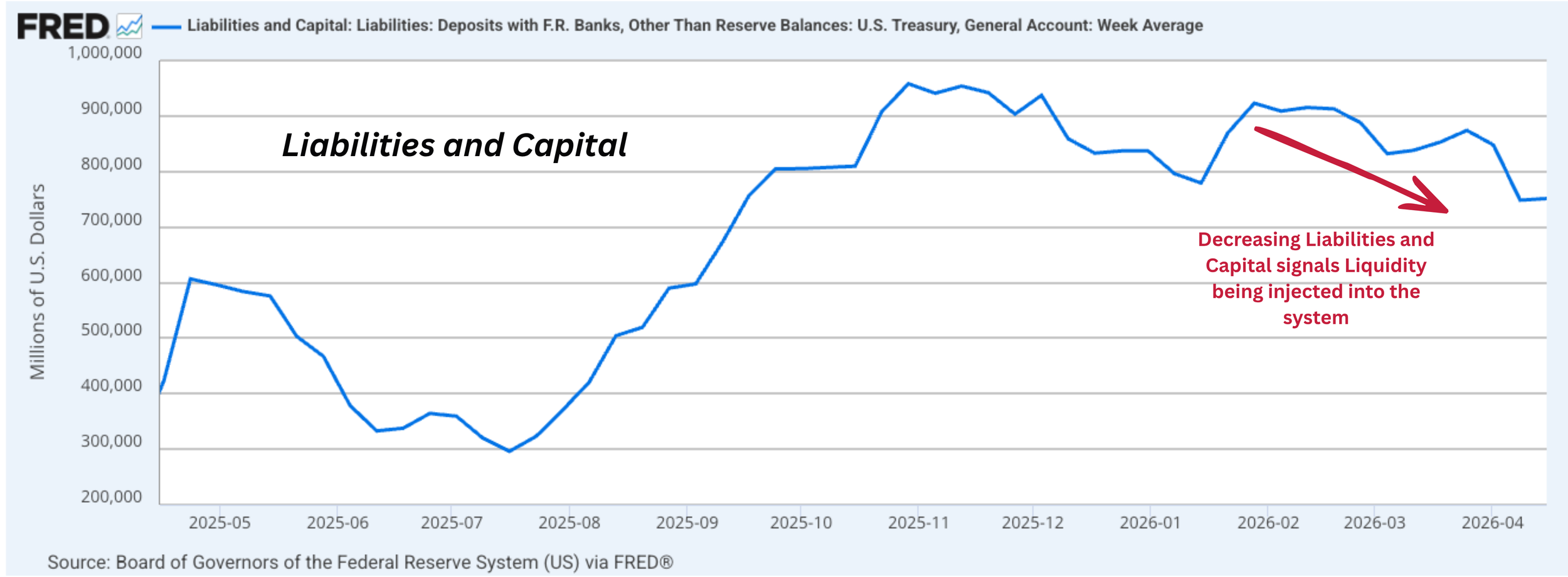
And the timing aligns closely with what we’ve seen across markets:
SPX pushing to new highs
Bitcoin recovering alongside broader risk
Breadth improving (62% of stocks above 200DMA vs ~45% several weeks ago)
VIX declining sharply from recent elevated levels
This does not require a strong improvement in fundamentals.
When liquidity expands, markets tend to respond.
At a high level, the past few weeks can be understood as a liquidity-supported advance.
A New Constraint Is Emerging
While domestic liquidity has improved, cross-border funding conditions are becoming less accommodative.
The spread has tightened to its lowest level in roughly 12 weeks
This is a meaningful shift in a key global funding channel
Why this matters:
Global capital often flows toward higher-yielding USD assets
A wider spread supports this dynamic
A tighter spread reduces that incentive at the margin
This affects:
Carry trade economics
Cross-border capital flows
The broader transmission of global liquidity
Importantly:
This is not yet an outcome — it is a change in conditions.
The System Is No Longer One-Directional
Over the past few weeks, the setup was relatively straightforward:
Liquidity improving → markets moving higher
Now, the picture is becoming more balanced.
Two forces are beginning to coexist:
| Force | Direction | Status |
|---|---|---|
| Liquidity (TGA) | Supportive | Active |
| Funding (UST–JPY) | Tightening | Emerging |
At this stage:
Liquidity remains supportive
Funding conditions are becoming less so
There is no clear evidence yet that this shift is impacting markets directly.
But the system is no longer uniformly moving in one direction.
Are There Early Signs of Change?
Conditions remain stable, but the structure beneath the rally is worth monitoring.
1. Markets at highs in a complex backdrop
SPX is trading at all-time highs
This is occurring alongside ongoing geopolitical tension
The market is showing resilience, but also leaves less margin for error
2. Volatility has compressed
VIX has moved down significantly from recent peaks
This reflects stability — but also reduces the buffer against shocks
3. Breadth has improved
Participation has broadened (now ~62% above 200DMA)
This is constructive, though not yet indicative of extreme expansion
It’s a market to:
• Observe behavior
• Compare relative positioning
• Act selectively
4. Credit remains stable
High yield spreads are contained
No signs of stress — but also no strong signal of accelerating growth
Taken together:
There is no clear deterioration — but also no strong evidence of underlying acceleration.
What Would Confirm This Matters
The key question is whether the emerging constraint begins to translate into market behavior.
We can define this in observable terms.
Signals that would suggest the constraint is becoming impactful:
Continued tightening in the UST–JPY spread
Slowing or reversal in TGA drawdown
Weakening in equity breadth
A sustained move higher in volatility
Widening in credit spreads
Signals that would suggest conditions remain supportive:
Continued liquidity injection via TGA
Stabilization or widening of the UST–JPY spread
Ongoing improvement in breadth
Stable volatility and credit conditions
What We’re Watching Next
Direction of the TGA balance
Behavior of the UST–JPY spread
Market breadth (% of stocks above 200DMA)
Volatility regime (VIX levels and trend)
Credit spreads (high yield OAS)
Closing Thought
Markets have moved higher in recent weeks, supported by improving liquidity conditions.
That remains true.
But at the same time, parts of the system are beginning to shift in a different direction.
The key question going forward is not whether liquidity has been supportive —
but whether it can continue to offset the constraints that are now beginning to emerge.
Look out for next week’s newsletter for further insight into the forces shaping today’s markets.
From Stabilization to Early Confirmation
Something is starting to take shape.
For the second week in a row, markets moved higher—while volatility declined across both equities and bonds.
At the same time:
The Treasury General Account (TGA) has drawn down for two consecutive weeks
Funding conditions remain stable
Global signals show early signs of stabilizing
The system is not just stabilizing—it is beginning to respond to improving liquidity conditions.
But this is still early.
And not everything has reset.
April 13th 2026
What stands out when liquidity returns—and markets begin to respond
Bottom Line
Something is starting to take shape.
For the second week in a row, markets moved higher - while volatility declined across both equities and bonds.
At the same time:
The Treasury General Account (TGA) has drawn down for two consecutive weeks
Funding conditions remain stable
Global signals show early signs of stabilizing
The system appears to be stabilizing and beginning to respond to improving liquidity conditions.
However, not everything has reset. We are still in the early stages of confirmation.
5-Layer Macro Matrix
Current readings are color-coded based on week-over-week change. Historical columns are shown as neutral reference points for trend context.
Color applies to the Current column only.
Layer 1 · Risk Appetite & Positioning
| Signal | Current 4/11/26 |
1W Ago 4/4/26 |
4W Ago 3/14/26 |
8W Ago 2/13/26 |
11W Ago 1/20/26 |
|---|---|---|---|---|---|
| BTC Spot | $73,352 | $67,087 | $70,744 | $68,812 | $88,310 |
| SPX | $6,817 | $6,583 | $6,632 | $6,836 | $6,797 |
| % of S&P 500 above 200DMA | 54% | 49% | 49.80% | 66.60% | 65.40% |
| Nasdaq 100 | $25,116 | $24,046 | $24,321 | $24,700 | $24,972 |
| VIX Index | 19.23 | 23.87 | 27.18 | 20.59 | 20.08 |
| MOVE Index | 72.15 | 81.78 | 91.17 | 70.10 | 66.67 |
| Gold | $4,761.90 | $4,651.50 | $5,018.10 | $5,042.00 | $4,763.00 |
Layer 2 · Funding & Liquidity Stability
| Signal | Current | 1W Ago | 4W Ago | 8W Ago | 11W Ago |
|---|---|---|---|---|---|
| SOFR | 3.57% | 3.65% | 3.65% | 3.66% | 3.64% |
| Effective FFR | 3.64% | 3.64% | 3.64% | 3.64% | 3.64% |
| 3M Treasury Bill Yield | 3.685% | 3.700% | 3.692% | 3.679% | 3.658% |
| SOFR - T-Bill Spread | -0.115% | -0.050% | -0.042% | -0.019% | -0.018% |
| DXY | 98.697 | 100.185 | 100.494 | 96.884 | 98.559 |
| US10Y - JP10Y Spread | 1.870% | 1.923% | 2.035% | 1.841% | 1.9190% |
| 90-Day AA Financial CP Rate | 3.73% | 3.73% | 3.68% | 3.66% | 3.58% |
| Commercial Paper Spread | 0.045% | 0.030% | -0.012% | -0.019% | -0.078% |
| Overnight Reverse Repo | $0.507b | $0.327b | $0.427b | $0.377b | $3.506b |
| Standing Repo Facility | $0.0b | $0.0b | $0.0b | $0.0b | $0.0b |
Layer 3 · Credit Conditions & Transmission
| Signal | Current | 1W Ago | 4W Ago | 8W Ago | 11W Ago |
|---|---|---|---|---|---|
| US High Yield OAS | 2.90% | 3.17% | 3.17% | 2.95% | 2.73% |
| US Corporate OAS | 0.83% | 0.86% | 0.91% | 0.79% | 0.75% |
| HY-IG Spread Differential | 2.07% | 2.31% | 2.26% | 2.16% | 1.98% |
| HYG ETF | $79.96 | $79.56 | $79.20 | $80.85 | $80.88 |
| LQD ETF | $109.20 | $109.12 | $108.17 | $111.59 | $109.90 |
Layer 4 · Global Capital & Cross-Border Flows
| Signal | Current | 1W Ago | 4W Ago | 8W Ago | 11W Ago |
|---|---|---|---|---|---|
| Emerging Markets ETF (EEM) | $60.56 | $56.59 | $56.80 | $61.12 | $57.31 |
| MSCI World ex-US (ACWX) | $72.29 | $68.93 | $68.20 | $73.25 | $69.03 |
| DXY | 98.697 | 100.185 | 100.494 | 96.884 | 98.559 |
| US10Y - JP10Y Spread | 1.870% | 1.923% | 2.035% | 1.841% | 1.9190% |
| China Credit Impulse Proxy | 4637 | 4441 | 4687 | 4660 | 4719 |
| Global PMI (major economies) | — | — | — | — | — |
Layer 5 · Fiscal & Structural Macro Conditions
| Signal | Current | 1W Ago | 4W Ago | 8W Ago | 11W Ago |
|---|---|---|---|---|---|
| Treasury Issuance Volume | — | — | — | — | — |
| Treasury General Account (TGA) Balance ($m) | $748,376 | $847,718 | $838,186 | $915,306 | $869,261 |
| TGA Delta (%) | -11.72% | -3.02% | 0.74% | 0.72% | 12.15% |
| Federal Deficit Trajectory | — | — | — | — | — |
| Initial Jobless Claims | — | 219,000 | 205,000 | — | — |
| ISM New Orders | — | — | — | — | — |
| Bank Lending Survey | — | — | — | — | — |
The System Responds to Liquidity
Last week, we observed stabilization. This week, that stabilization has continued to extend further.
Not aggressively. Not decisively.
But enough to begin noticing a pattern.
Equities moved higher again
Bitcoin followed through
Market breadth improved
Volatility declined across both equities and bonds
This is not a breakout.
But it is no longer a one-week event.
It is beginning to look like a response.
Liquidity — The Key Driver
If there is one thread connecting these developments, it is liquidity.
The Treasury General Account has now declined for two consecutive weeks. That is valuable signal.
Because when the TGA draws down:
Liquidity is released back into the system.
As Treasury spends down its balance, reserves move back into the private sector.
And when that happens, even modestly, the system feels it.
What we’re observing
Over the past two weeks, that relationship has become more visible:
Markets drifting higher
Volatility easing
Participation broadening slightly
Nothing extreme. But directionally consistent.
Rather than attributing this to a sudden shift in fundamentals, a simpler explanation may be more appropriate:
Liquidity has improved—and markets are responding to it.
Funding Conditions — Still Stable
At the same time, funding markets remain well-behaved.
SOFR has moved lower
Short-term funding spreads remain contained
There are no signs of stress building beneath the surface.
Why that matters
Even during the recent period of volatility, funding never became a problem.
Now, with liquidity being added:
The system is not tightening—it is slightly loosening at the margin.
Our Interpretation
This is an important backdrop.
Because it allows markets to respond to improved conditions without friction from the funding layer.
In other words:
The system is functioning smoothly enough to transmit liquidity into asset prices.
Global Signal — A Small but Notable Change
One additional development worth noting:
The China credit impulse proxy moved higher this week.
After several weeks of decline, this marks a change in direction.
Why that matters
This is not yet a trend.
But in macro, direction often matters more than level.
A stabilization—or even a pause—in deterioration can be enough to influence expectations.
Our Interpretation
At a minimum, it suggests:
The global backdrop may be stabilizing—at least marginally.
Putting It Together
If we step back, a pattern begins to emerge:
Liquidity has improved (TGA drawdown)
Funding conditions remain stable
Volatility has declined
Markets have responded
What this is, and what it isn’t
This is not a full system reset.
It is not a confirmed new cycle.
It is better described as:
A system responding to improved liquidity conditions, while underlying structure remains largely unchanged
Look out for next week’s newsletter for further insight into the forces shaping today’s markets.
Stabilization Without Resolution
Something stands out.
For the first time in nine weeks, major asset classes moved higher together—while volatility declined across both equities and bonds.
At the same time:
• The yield curve shifted higher across all maturities
• Credit conditions remain largely unchanged
• The China credit impulse continues to weaken
April 6th 2026
What stands out when markets move but the system doesn’t fully reset
Bottom Line
Something stands out.
For the first time in nine weeks, major asset classes moved higher together—while volatility declined across both equities and bonds.
At the same time:
• The yield curve shifted higher across all maturities
• Credit conditions remain largely unchanged
• The China credit impulse continues to weaken
So we’re left with something slightly unusual:
The system deployed capital—but the underlying conditions didn’t meaningfully improve.
This doesn’t feel like resolution. It feels more like stabilization.
Part 1 — The System Moves Together
Something shifted this week.
Not in a dramatic way—but in a way that becomes more noticeable the more you step back.
For the first time in several weeks, markets moved together.
• Equities pushed higher
• Bitcoin participated
• Gold held steady
• Volatility declined—both in equities and in bonds
It wasn’t aggressive. But it also wasn’t defensive.
It felt more like the system collectively took a step forward.
A quiet change in behavior
When prices rise while volatility falls, it usually signals one thing:
The system is no longer under immediate pressure.
That doesn’t mean conditions are strong. It means the urgency to defend has eased. And when that happens, behavior shifts. Capital starts to move—not because conviction is high, but because pressure is low enough to allow it.
But beneath the surface, little has changed
Looking deeper, the structure remains largely intact:
• Credit spreads are still elevated
• Funding conditions haven’t meaningfully improved
• There’s no clear signal of easing
Nothing broke. But nothing resolved either.
Rates — a repricing, not a signal
One area that does stand out is rates.
Over the past month, the entire yield curve has shifted higher.
Not just one segment—everything moved. There is some steepening relative to the very front end, but not across the curve in a clean way.
So this doesn’t read as a directional signal.
It reads more like:
The system is repricing the cost of capital across maturities.
Why that matters
Higher yields introduce friction. They raise the hurdle for investment, tighten financial conditions, and quietly pressure valuations.
Which creates a tension in the system:
Capital is being deployed… while the cost of capital is rising.
Participation broadens—slightly
Looking beyond core markets:
• Emerging markets moved higher
• Higher beta areas saw some demand
Not aggressively—but noticeably.
It suggests that capital isn’t just stabilizing. It’s beginning to explore.
Liquidity — a small release
The Treasury General Account (TGA) declined this week.
Not dramatically, but directionally consistent with what we’re seeing elsewhere.
A small amount of liquidity re-entering the system.
But one signal continues to diverge. The China credit impulse proxy continues to move lower and now sits at its weakest level in recent weeks.
Putting it together
So what do we actually have?
• Markets moved higher
• Volatility declined
• Participation broadened
• Liquidity improved slightly
But at the same time:
• Credit didn’t confirm
• Yields moved higher
•Global credit signals weakened
How to interpret this
This is not a system that is improving.
It’s a system that is:
stable enough to function—but not strong enough to confirm a trend.
And that distinction matters. Because in this kind of environment strength can exist—but it’s not yet reliable.
Part 2 — What Looks Compelling on a Relative Basis
If Part 1 defines the environment, Part 2 is about how to operate within it.
The question shifts from:
“Where is the market going?”
To:
“Where does pricing already reflect too much pessimism?”
Real Estate & Health Care
Both sectors stand out on a relative basis.
Across multiple comparisons—against the S&P 500, against gold, and across longer-term ranges—they sit at historically compressed levels.
What we’re noticing
Not strength. Not a confirmed reversal.
But:
• stabilization
• reduced downside momentum
• and extended underperformance already priced in
Why that matters
In environments like this, broad market direction is less reliable.
But relative positioning becomes more important.
And these sectors appear:
closer to being under-owned than overextended.
Are they discounted for a reason—or becoming attractive as pressure subsides?
We don’t need to answer that yet. But recognizing where positioning is stretched defines where opportunity can emerge.
Gold vs Oil — Back to Range
The gold/oil ratio has now retraced back toward its historical range.
After a period of imbalance, it no longer looks stretched.
What that suggests
The system may be approaching a temporary equilibrium point between:
• defensive positioning
• and growth-sensitive exposure
But context matters
This normalization is happening while:
• credit hasn’t improved
• China impulse is weakening
• and the broader system remains unresolved
So the question becomes
Is this balance… or just a pause before the next move?
Final Thoughts
Something stands out.
Not because the system has turned—but because it has stabilized enough to allow movement.
• Markets rose
• Volatility declined
• Capital was deployed
But:
• The cost of capital increased
• Credit didn’t confirm
•Global signals remain weak
Investor Takeaway
This is not a market to blindly chase direction.
It’s a market to:
• observe behavior
• compare relative positioning
•and act selectively
Look out for next week’s newsletter for further insight into the forces shaping today’s markets.
When Liquidity and Markets Begin to Move Together
There are moments where individual data points matter less than how they begin to interact.
Over the past several weeks, markets have already been adjusting.
Equities have continued to drift lower, participation has narrowed, and credit spreads have begun to widen. None of these moves are extreme—but the direction has been consistent.
At the same time, another development has quietly re-emerged.
After appearing to stabilize—and even ease—the U.S. Treasury’s cash balance has now begun to rise again.
March 30th 2026
Markets are already adjusting — while liquidity conditions are beginning to shift alongside them
There’s Something Worth Noting
There are moments where individual data points matter less than how they begin to interact.
Over the past several weeks, markets have already been adjusting.
Equities have continued to drift lower, participation has narrowed, and credit spreads have begun to widen. None of these moves are extreme—but the direction has been consistent.
At the same time, another development has quietly re-emerged.
After appearing to stabilize—and even ease—the U.S. Treasury’s cash balance has now begun to rise again.
On its own, that might not stand out. But in the context of already-softening markets, it becomes more interesting.
And it leads us to a simple question:
If markets are already under some pressure, what happens if there’s simply less liquidity available to go around?
What We’re Actually Seeing
Let’s anchor this in the data.
The Treasury General Account (TGA)—effectively the government’s cash balance at the Federal Reserve—has now increased for three consecutive weeks, rising back toward recent highs.
Current level: ~$874B
Recent peak (8 weeks ago): ~$974B
A few weeks ago, the trajectory suggested liquidity might be easing back into the system. That direction has, at least for now, reversed.
At the same time:
Equities (S&P 500, Nasdaq) continue to trend lower
Market breadth continues to deteriorate
Credit spreads (High Yield vs Investment Grade) are widening
Emerging markets and China credit have rolled over
Individually, none of these are definitive.
Together, they suggest that markets are already adjusting to tighter conditions.
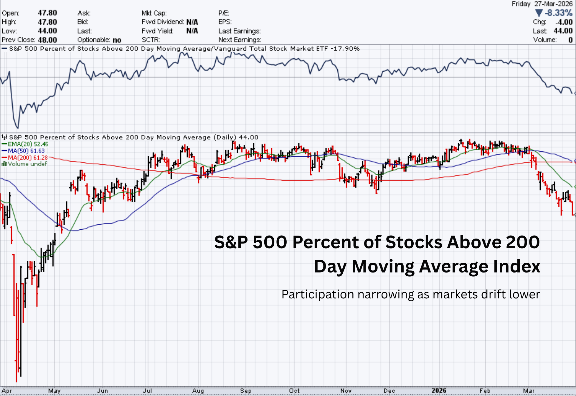
What the TGA Actually Does
To understand why this matters, we need to understand what the TGA represents.
The Treasury General Account is the pool of cash the U.S. government holds at the Federal Reserve.
When that balance rises, cash is effectively pulled out of the private financial system.
When it falls, that cash is released back into the system.
This is not a directional policy signal—it’s operational.
But mechanically, it influences how much liquidity is available across markets.
It’s less about intention, and more about where cash is sitting at a given moment in time.
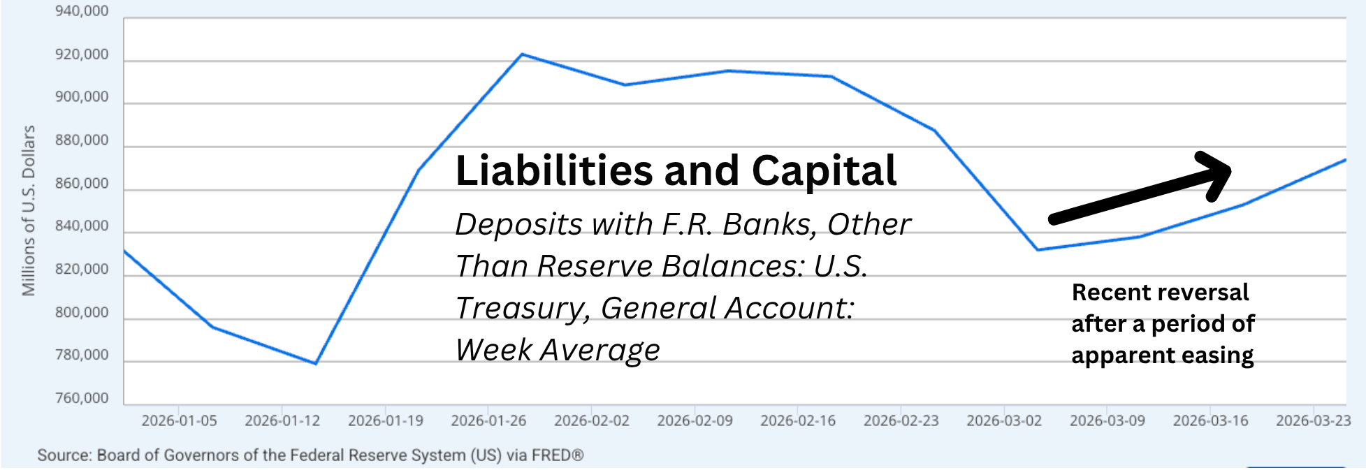
Why This Moment Stands Out
What makes this moment notable is not the TGA in isolation—and not market weakness in isolation.
It’s the overlap.
Markets have already begun adjusting—gradually, but consistently.
At the same time, liquidity—at least at the margin—is no longer clearly easing.
These developments are occurring at the same time—and that overlap is worth paying attention to.
We are not seeing stress.
But we are beginning to see alignment across different layers of the system.
Exploring the Question
So we return to the question:
If markets are already under some pressure, what happens if there’s simply less liquidity available to go around?
Rather than jumping to conclusions, it’s more useful to think through how this dynamic works.
Markets Are Sensitive to Liquidity—Especially at the Margin
Markets are not driven by fundamentals alone—they are heavily influenced by the availability of capital.
When liquidity is abundant:
Risk is more easily absorbed
Volatility tends to compress
Credit flows more freely
When liquidity becomes more limited:
Markets become more sensitive
Positioning becomes more cautious
Buyers become more selective
This doesn’t create immediate stress—but it changes behavior.
Liquidity Doesn’t Need to Collapse to Matter
Even small shifts can:
Reduce excess cushion
Increase sensitivity to new information
Amplify existing trends
This becomes more relevant when markets are already in a fragile or adjusting state.
This Is About Interaction—Not Direction
It’s tempting to simplify:
“Liquidity down → markets down”
But that misses the point.
What matters is that markets and liquidity are now interacting, rather than moving independently.
That interaction is where insight lives.
The System Remains Stable
Despite all of this:
Funding markets are functioning
No signs of systemic stress
No breakdown in financial plumbing
The system itself remains stable.
And that’s an important anchor.
What This Means for Investors
Understanding this dynamic changes how we interpret the environment.
It’s no longer just about direction—it’s about conditions.
Right now:
Markets are adjusting
Liquidity is no longer clearly easing
Credit is beginning to reflect caution
But the system remains stable
That combination matters more than any single signal.
Closing Thought
Markets are already moving.
At the same time, liquidity conditions are beginning to shift at the margin.
Neither development alone defines the moment—but together, they begin to shape it.
For now, that interaction is simply something worth paying attention to.
Look out for next week’s newsletter for further insight into the forces shaping today’s markets.
From Signals to Confirmation
Risk in markets is often described in terms of asset prices — equities, bonds, commodities.
But in practice, risk is not defined by assets alone. It is defined by how those assets relate to liabilities.
For any investor — whether an individual, a corporation, or a financial institution — the true question is not simply “what is this asset worth,” but:
“Will this asset reliably meet the obligations I have coming due?”
In periods of uncertainty, that question becomes more important.
And the answer often leads to a shift in behavior.
Instead of simply rotating into traditionally “defensive” assets, markets can begin to favor liquidity itself — assets that can directly meet liabilities without conversion risk.
Over the past several weeks we have been observing a set of signals forming across markets.
This week, those signals are no longer isolated — they are beginning to confirm.
March 22nd, 2026
Markets are increasingly favoring liquidity itself, while early stress begins to reach corporate credit.
Risk in markets is often described in terms of asset prices — equities, bonds, commodities.
But in practice, risk is not defined by assets alone. It is defined by how those assets relate to liabilities.
For any investor — whether an individual, a corporation, or a financial institution — the true question is not simply “what is this asset worth,” but:
“Will this asset reliably meet the obligations I have coming due?”
In periods of uncertainty, that question becomes more important.
And the answer often leads to a shift in behavior.
Instead of simply rotating into traditionally “defensive” assets, markets can begin to favor liquidity itself — assets that can directly meet liabilities without conversion risk.
Over the past several weeks we have been observing a set of signals forming across markets.
This week, those signals are no longer isolated — they are beginning to confirm.
Three developments stand out:
Risk appetite continues to compress
Credit conditions are beginning to respond
Capital behavior is shifting toward liquidity preference
Markets Are Choosing Liquidity
The shift we are observing did not begin with a move into liquidity.
Earlier in the process, capital rotated toward traditional defensive assets — most notably gold — as markets began to price in higher uncertainty.
That phase reflected a classic risk-off response.
What we are observing now is a continuation of that process — but with a meaningful shift in emphasis.
Equity markets have continued to weaken, with both the S&P 500 and Nasdaq reaching recent lows.
Market breadth has deteriorated further, with a declining share of stocks holding above long-term averages.
Volatility remains elevated, not as a sudden spike, but as a persistent feature of the environment.
At the same time, bond market volatility continues to rise, suggesting that uncertainty at the macro level remains unresolved.
Gold — one of the primary defensive assets — has retraced meaningfully over the past couple of weeks.
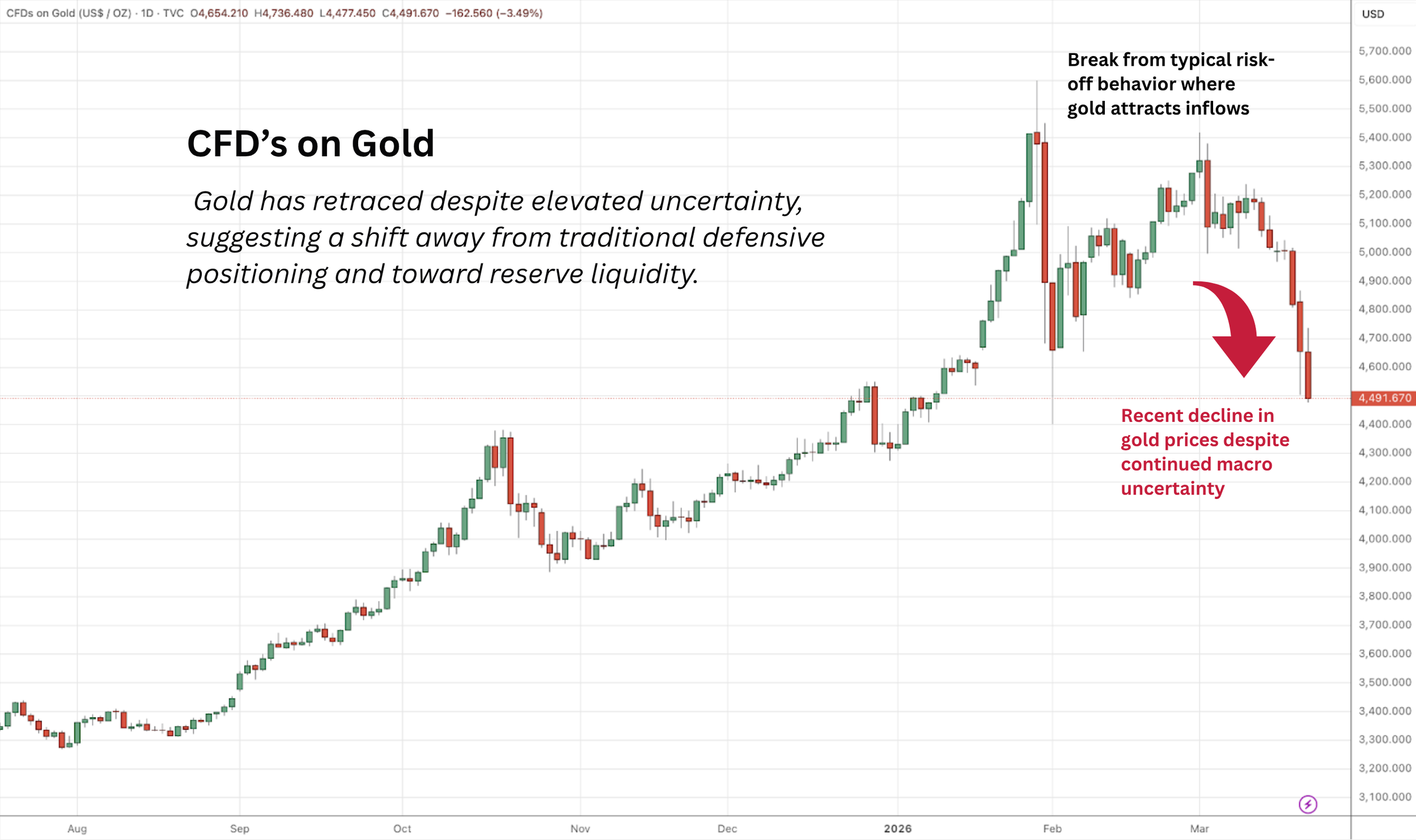
This combination of risk assets and defense assets both selling off suggests that markets are no longer simply seeking defense.
They are increasingly seeking liquidity itself.
In practical terms, this reflects a shift toward assets that can directly meet obligations — rather than assets that must first be converted under uncertain conditions.
When uncertainty rises far enough, the question is no longer:
“Which asset will perform best?”
It becomes:
“Which position leaves me most flexible if conditions change?”
At the same time, fiscal dynamics are playing a more active role in the liquidity environment.
The Treasury General Account — effectively the government’s cash balance — is not just a passive indicator, but an active participant in the system.
When the Treasury builds its balance, it is effectively drawing liquidity out of the financial system.
In the last week, the Treasury has been absorbing liquidity rather than adding it.
In that sense, the Treasury itself is competing for liquidity alongside market participants.
In an environment where investors are already prioritizing flexibility and reserves, that additional demand for liquidity can reinforce the broader shift in behavior. The shift is not abrupt, and it is not absolute.
Markets rarely move cleanly from one regime to another. Instead, what we are observing is a gradual evolution —
market participants adjusting their behavior as underlying conditions change.
What began as a rotation into defensive assets is now developing into a broader preference for liquidity.
Credit Is Beginning to Confirm
If changes in risk appetite are the first signal, credit markets are often where those changes begin to confirm .
The spread between high-yield and investment-grade corporate bonds has continued to widen and now sits at its highest level in recent weeks.
The move remains gradual, but the consistency is notable.
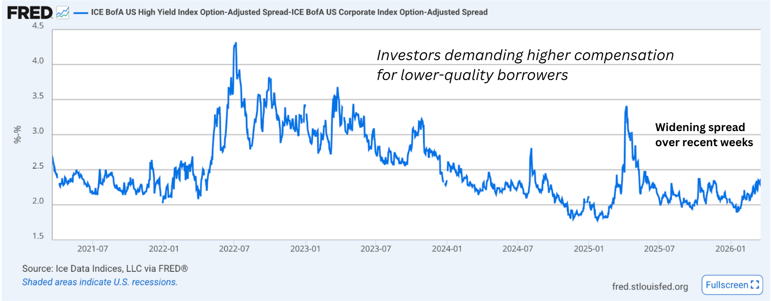
The spread between high-yield and investment-grade debt continues to widen, signaling increasing selectivity in credit markets.
When this gap increases, it typically means investors are becoming more selective about the credit risk they are willing to take.
In other words, capital is beginning to differentiate more clearly between stronger and weaker balance sheets.
This is where market signals begin to move beyond pricing and into behavior.
When credit conditions tighten:
Investors rotate toward higher-quality debt
Lower-quality borrowers face higher financing costs
New issuance becomes more difficult or more expensive
For companies, this can translate into:
delayed capital investment
slower hiring decisions
more cautious expansion plans
What began as a shift in market sentiment is now beginning to touch corporate financing conditions.
This is the transition from signal to confirmation.
The Shift Is Not Local
The developments we are observing are not confined to a single market.
Emerging markets have declined meaningfully over the past several weeks, reaching their lowest levels in the current observation window.
At the same time, measures of Chinese credit activity have also weakened, pointing to a broader slowdown in global credit impulse.
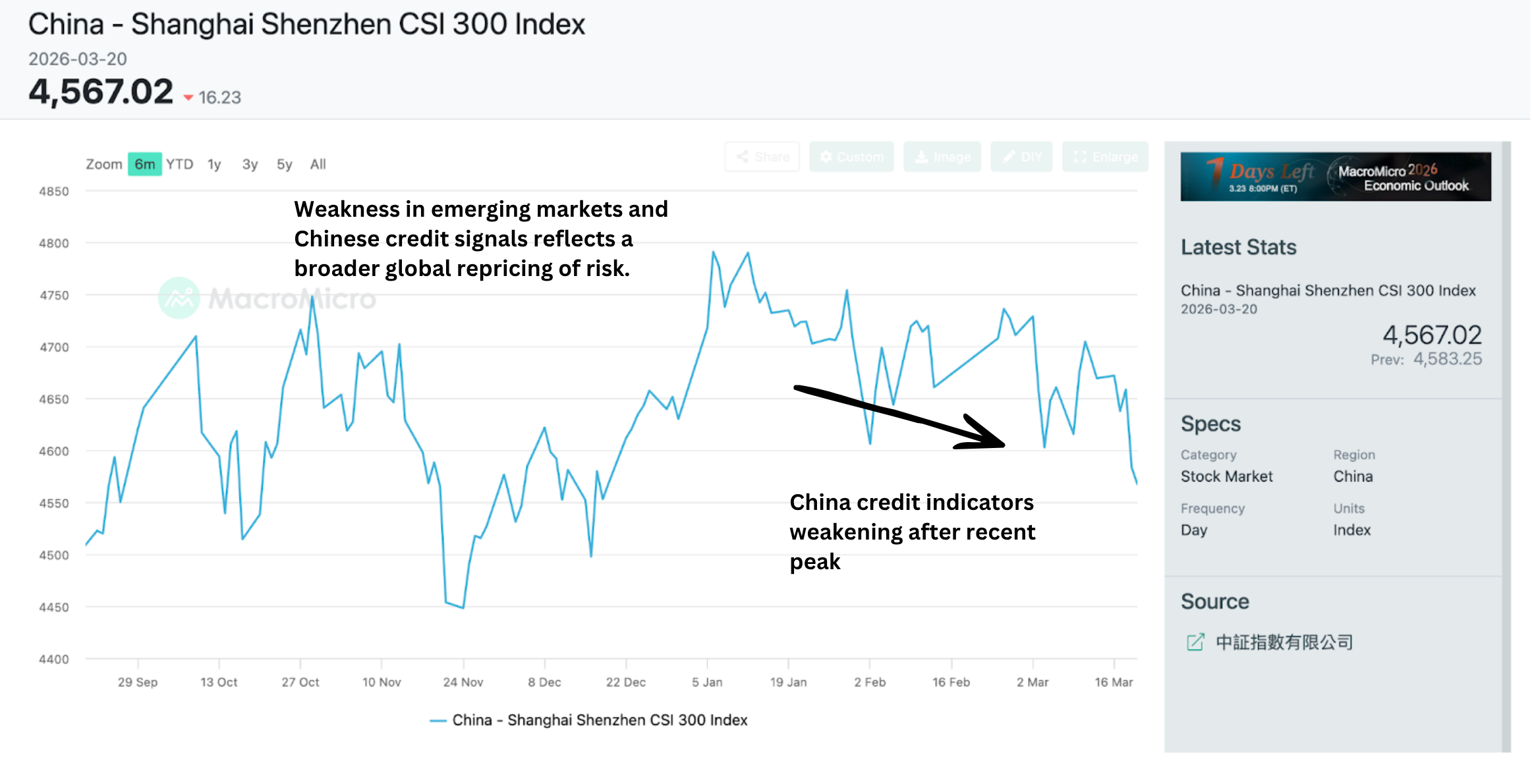
These moves suggest that the shift we are observing is not isolated to U.S. equities or U.S. credit markets.
Instead, it reflects a broader, cross-market adjustment in how capital is being allocated.
The alignment across regions reinforces the idea that this is a coordinated repricing of risk — not a localized event.
The System Is Absorbing It — For Now
Despite these developing pressures, the core of the financial system continues to function.
Short-term funding markets remain stable.
Key funding rates have not shown signs of stress.
Short term liquidity channels — the underlying plumbing of the system — remain intact for now.
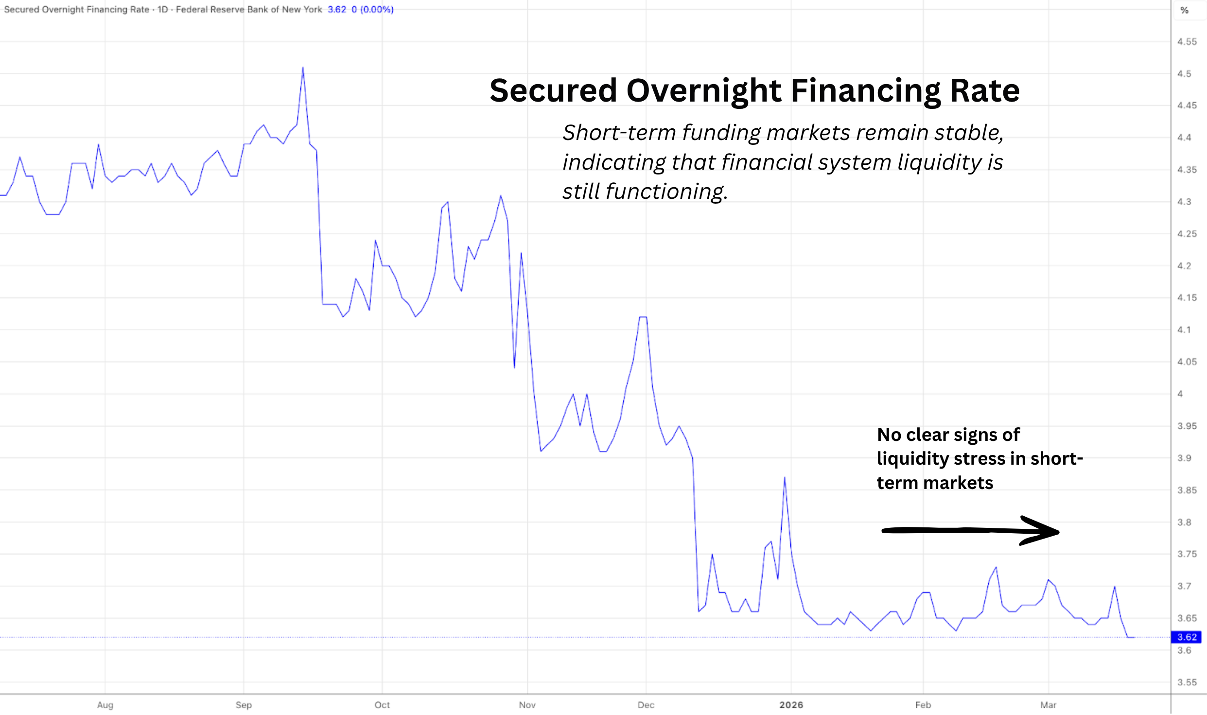
Credit markets determine how expensive it is to borrow.
Funding markets determine whether the system can continue to operate smoothly.
At present, we are seeing pressure in the former — but not disruption in the latter.
That means:
no forced deleveraging
no liquidity freeze
no systemic break
At the same time, the accumulation of signals across volatility, credit, and global markets suggests that the system is absorbing a growing amount of pressure.
The system is holding —
but it is no longer as untested as it was just a few weeks ago.
What This Means Now
The most important development this week is not any single market move, but where those moves are beginning to show up.
What we are observing is the early stage of market dynamics beginning to move beyond asset prices and into corporate conditions.
As credit spreads widen:
financing becomes more expensive
investment decisions become more cautious
economic activity begins to adjust at the margin
This is how financial conditions transmit into the real economy — gradually, and often before it is visible in traditional economic data.
The shift taking place is subtle, but meaningful.
Markets are increasingly prioritizing liquidity even over traditional defensive assets,
and that shift is beginning to make its way into the real economy.
Look out for next week’s newsletter for further insight into the forces shaping today’s markets.
The System Is Beginning to Show Its Hand
Volatility is settling in, credit conditions are tightening, and liquidity signals are quietly shifting beneath the surface.
Each week we monitor a set of macro indicators across several layers of the financial system. These indicators help us track where stress, liquidity, and capital flows are developing beneath the surface of markets.
Rather than focusing on any single market move, our objective is to observe how the system as a whole is evolving.
Over the past several weeks a number of signals have been forming. This week those signals became clearer.
March 16th, 2026
Each week we monitor a set of macro indicators across several layers of the financial system. These indicators help us track where stress, liquidity, and capital flows are developing beneath the surface of markets.
Rather than focusing on any single market move, our objective is to observe how the system as a whole is evolving.
Over the past several weeks a number of signals have been forming. This week those signals became clearer. Volatility is settling in, credit conditions are tightening, and liquidity signals are quietly shifting beneath the surface.
Three patterns now stand out:
Volatility is settling in as the baseline market environment
Credit spreads are gradually widening
Liquidity conditions are evolving through fiscal channels
None of these signals alone determines where markets will move next. But taken together, they help illuminate how the system is adapting to uncertainty.
Volatility Is Becoming the Baseline
The story in markets right now is not that volatility has suddenly appeared. It’s that volatility is increasingly becoming the baseline environment. Instead of isolated spikes, markets have now spent several consecutive weeks adjusting to larger daily swings and greater uncertainty around macro conditions.
The interesting detail in the data is where this volatility is coming from.
While equity volatility — captured by the VIX — has been rising, the move has been even more pronounced in the bond market. The MOVE Index, which tracks volatility in U.S. Treasury markets, has surged significantly in recent weeks. Equity volatility typically reflects uncertainty about corporate earnings or economic growth.
Bond market volatility reflects something deeper: uncertainty about the structure of the macro environment itself — inflation, fiscal policy, liquidity conditions, and the future path of interest rates. When volatility begins to embed itself in the bond market, it tends to ripple outward across the financial system.
Put differently:
The volatility we are observing today is not confined to equities — it appears to be increasingly anchored in the bond market as well. That dynamic often produces a more persistent volatility regime than a typical equity correction.
Credit Is Quietly Tightening
If volatility is usually the first signal that risk appetite is changing, credit markets are often where that shift begins to show more clearly. The metric we are watching most closely here is the spread between high-yield and investment-grade corporate bonds.
This spread represents the additional yield investors demand to lend to lower-quality borrowers rather than stronger ones. Over the past several weeks that spread has been gradually widening.
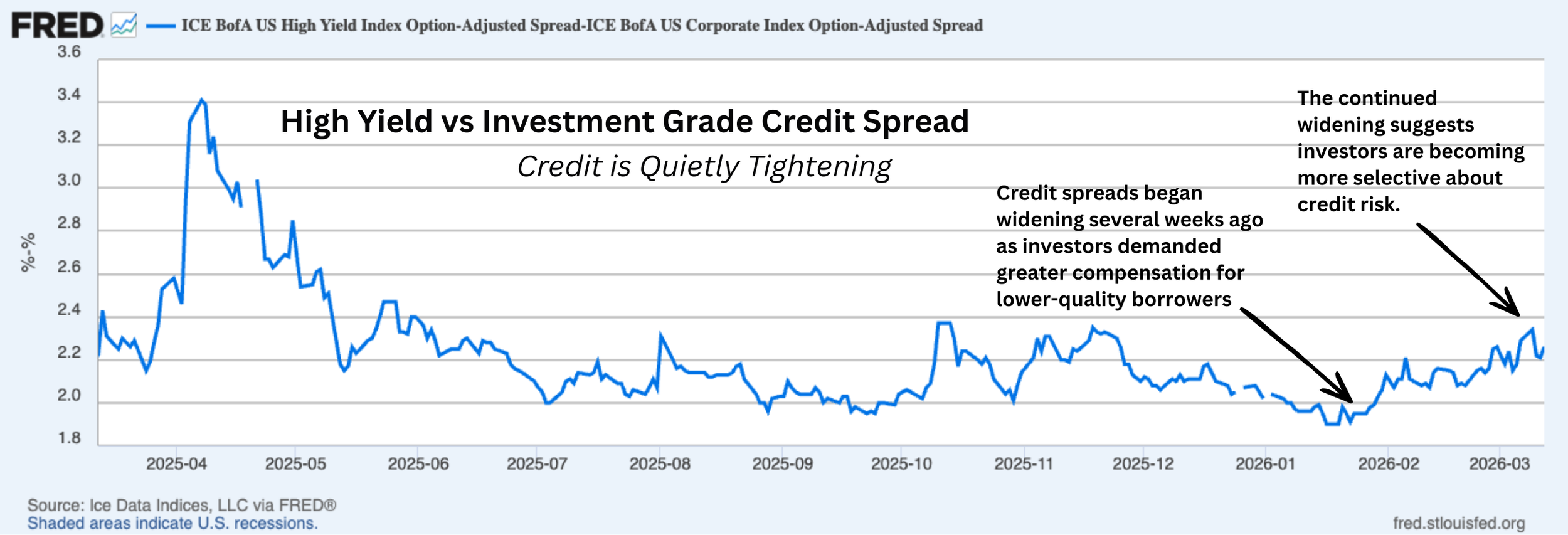
The move is not dramatic, but the consistency is notable.
When this gap increases, it typically means investors are becoming more selective about the credit risk they are willing to take.
In other words, capital is beginning to demand higher compensation for weaker balance sheets.
What this means in the real economy
Credit spreads are not just market statistics — they influence real corporate decisions.
When spreads widen:
Investors rotate toward safer bonds
Riskier borrowers face higher interest costs
New debt issuance becomes more expensive
For companies, this can translate into:
delayed capital investment
slower hiring plans
postponed expansion projects
This is one of the primary ways financial tightening eventually works its way from markets into the real economy.
A quick framework check-in
Several weeks ago we introduced a framework describing how financial stress tends to move through markets.
In simplified form, the sequence often looks something like this:
Volatility rises → risk appetite weakens → credit spreads widen → funding markets tighten
What we are currently observing is broadly consistent with the early credit-tightening stage of that sequence.
At this stage the shift is gradual, but it is a development worth watching closely.
Beneath the Surface: The Financial Plumbing
While credit markets are beginning to tighten, the core funding markets remain stable.
This distinction is important because credit markets and funding markets play very different roles in the financial system. Credit markets determine how expensive it is for companies to borrow. Funding markets determine whether financial institutions can obtain short-term liquidity to operate.
In other words:
Credit markets affect economic activity
Funding markets affect financial system stability
What the indicators show
Some of the indicators we monitor suggest that funding conditions remain calm.
Short-term funding rates are stable.
The spread between repo funding and Treasury bills remains minimal.
Commercial paper markets continue to function normally.
The Federal Reserve’s liquidity facilities remain largely unused.
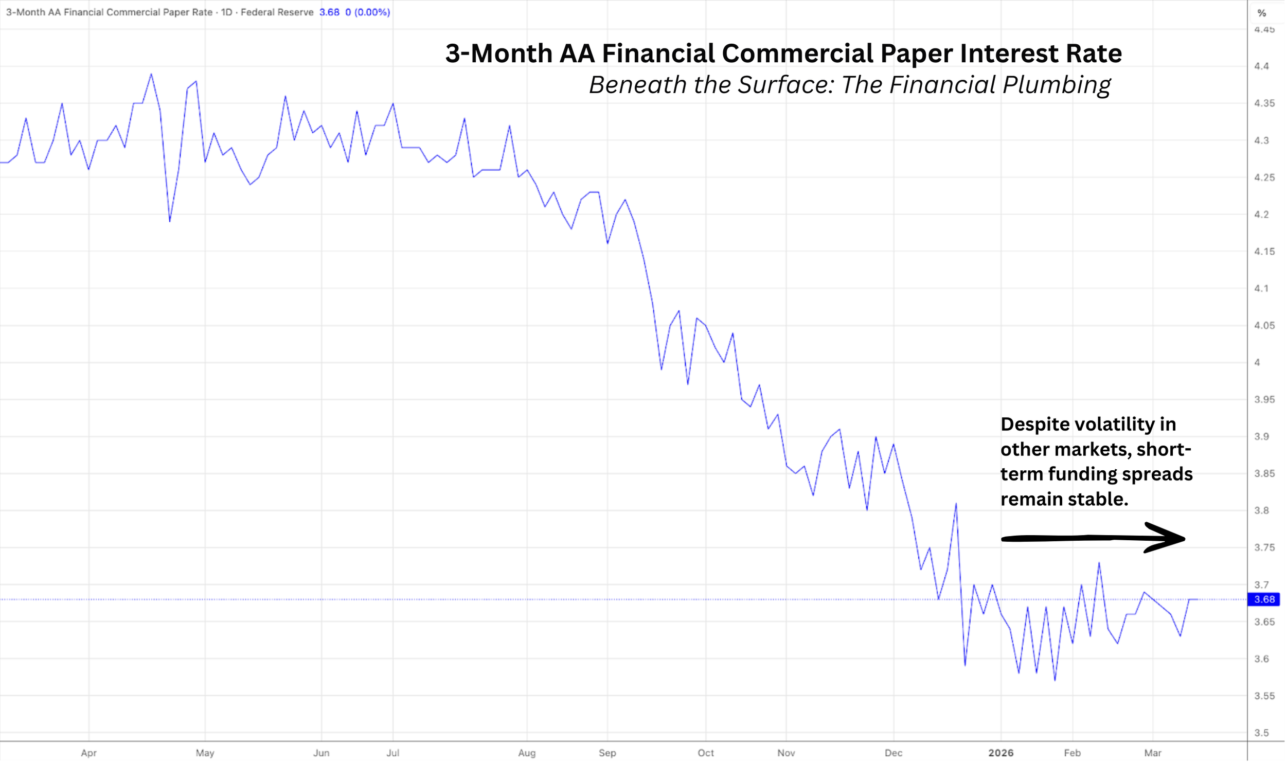
Why This matters:
Historically, volatility becomes dangerous only when it begins to disrupt the plumbing of the financial system. That is when forced selling can emerge, leverage unwinds rapidly, and liquidity disappears.
At the moment, the fact that funding markets remain stable suggests something important. The financial system itself is still functioning normally, even as volatility and credit conditions evolve.
That distinction is one of the most important signals we track.
Liquidity Watch: The Treasury General Account
The final signal comes from a different layer of the system — fiscal liquidity.
The Treasury General Account (TGA) is essentially the U.S. government’s account at the Federal Reserve.
When the Treasury spends from this account, funds flow into the banking system, increasing overall liquidity.
Over the past six weeks the balance of the TGA has been on a light gradual decline.
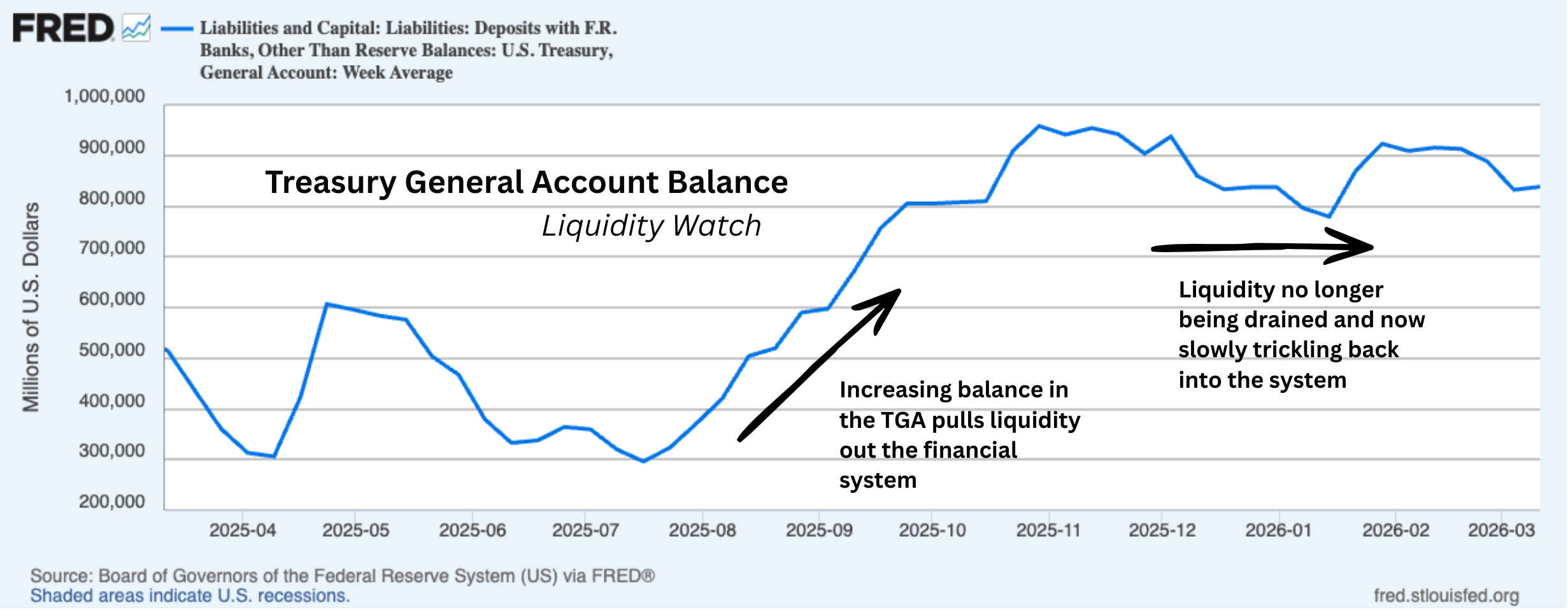
This slight decline suggests Treasury spending has been injecting liquidity into the financial system.
So far the magnitude of the drawdown has been light, and it has not meaningfully altered broader financial conditions.
However, if the drawdown were to accelerate, the resulting liquidity could begin to influence asset prices across multiple markets.
Where that liquidity ultimately flows — equities, commodities, credit markets, or digital assets — is difficult to predict.
For now, the signal simply reminds us that fiscal dynamics remain an important part of the liquidity environment.
What This Means for Investors
For investors, the current environment argues less for bold directional bets and more for careful risk management.
Three practical implications stand out.
First, volatility may remain elevated.
The combination of bond market uncertainty, geopolitical risk, and evolving fiscal conditions suggests that larger market swings could remain a feature of the environment for some time.
Second, credit markets deserve close attention.
Credit spreads often provide some of the earliest warnings of deeper financial tightening. If the widening trend accelerates meaningfully, it could signal broader pressure developing within the economy.
Third, liquidity still matters.
Even as markets adjust to higher volatility, structural liquidity flows — including Treasury spending and fiscal balances — continue to shape the overall financial landscape.
Understanding how volatility, credit conditions, and liquidity interact can help investors distinguish between temporary market turbulence and genuine systemic stress.
A Quick Note on Bitcoin
Bitcoin’s recent price behavior adds an interesting layer of ambiguity to the current market environment.
While several traditional indicators of risk appetite have weakened, Bitcoin has seen a modest rise over the past week. This move is not large enough to clearly signal resilience, nor sustained enough to indicate a structural shift in behavior.
Two interpretations remain possible:
Bitcoin may be attracting some capital as investors search for alternative macro assets during periods of uncertainty
Or the recent rise may simply represent a short-term countertrend move within a broader risk-off environment
At this stage the signal remains ambiguous.
But it is worth watching whether Bitcoin continues to move independently from traditional risk assets in the weeks ahead.
Look out for next week’s newsletter for further insight into the forces shaping today’s markets.
War, Volatility, and the Repricing of Risk
Geopolitical tensions escalated this week following attacks affecting energy infrastructure in the Persian Gulf, injecting a new layer of uncertainty into global markets. Because of its central role in global energy supply, even the possibility of disruption can ripple quickly through financial markets.
That ripple was visible almost immediately.
Volatility surged across both equity and bond markets, emerging market assets weakened, and energy prices began adjusting to the possibility of tighter global supply. These movements may appear disconnected at first glance but they reflect a pattern that often appears when markets are forced to reassess risk.
March 9th, 2026
Geopolitical tensions escalated this week following attacks affecting energy infrastructure in the Persian Gulf, injecting a new layer of uncertainty into global markets. Because of its central role in global energy supply, even the possibility of disruption can ripple quickly through financial markets.
That ripple was visible almost immediately.
Volatility surged across both equity and bond markets, emerging market assets weakened, and energy prices began adjusting to the possibility of tighter global supply. These movements may appear disconnected at first glance but they reflect a pattern that often appears when markets are forced to reassess risk.
Periods of geopolitical stress tend to move through financial markets in recognizable ways. Investors first respond by adjusting risk tolerance and pricing uncertainty before deeper financial stress emerges.
This week’s developments offer a clear example of that process unfolding in real time. Later in this edition, we examine the global energy market as a case study for how geopolitical shocks move through financial markets and influence asset prices.
But first, we begin with the signals currently appearing across markets.
Market Signals: Where the Shock Appears First
One of the earliest indicators of rising uncertainty in financial markets is a sharp increase in volatility.
That pattern was clearly visible this week.
The VIX index — which measures expected volatility in the S&P 500 — jumped from roughly 20 last week to nearly 30. At the same time, the MOVE index, a widely followed measure of volatility in the U.S. Treasury market, climbed from the low 70s to above 80.
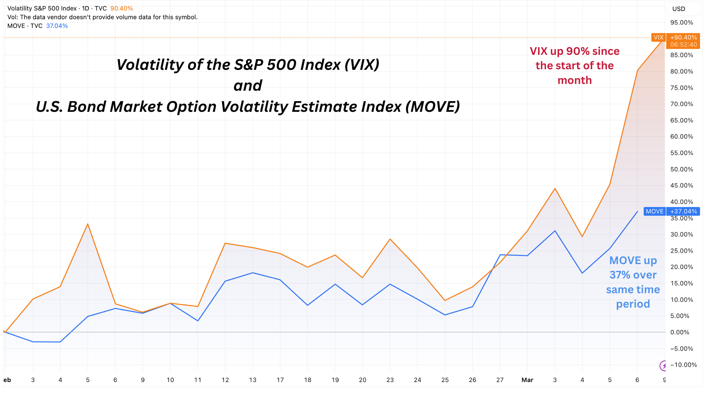
Volatility spikes reflect a simple but important reality: when future outcomes become more difficult to predict, investors demand greater compensation for bearing risk. Markets respond by rapidly repricing uncertainty.
Beneath the surface of equity markets, additional signs of weakening risk appetite began to emerge.
The percentage of S&P 500 companies trading above their 200-day moving average declined from roughly 67% last week to about 57% this week. While the headline index moved only modestly, this deterioration in market breadth suggests that weakness is spreading across a wider share of the market.
At the same time, global capital flows showed a clear shift toward perceived safety.
Emerging market equities fell sharply during the week, with the Emerging Markets ETF (EEM) declining from around $62 to roughly $57.
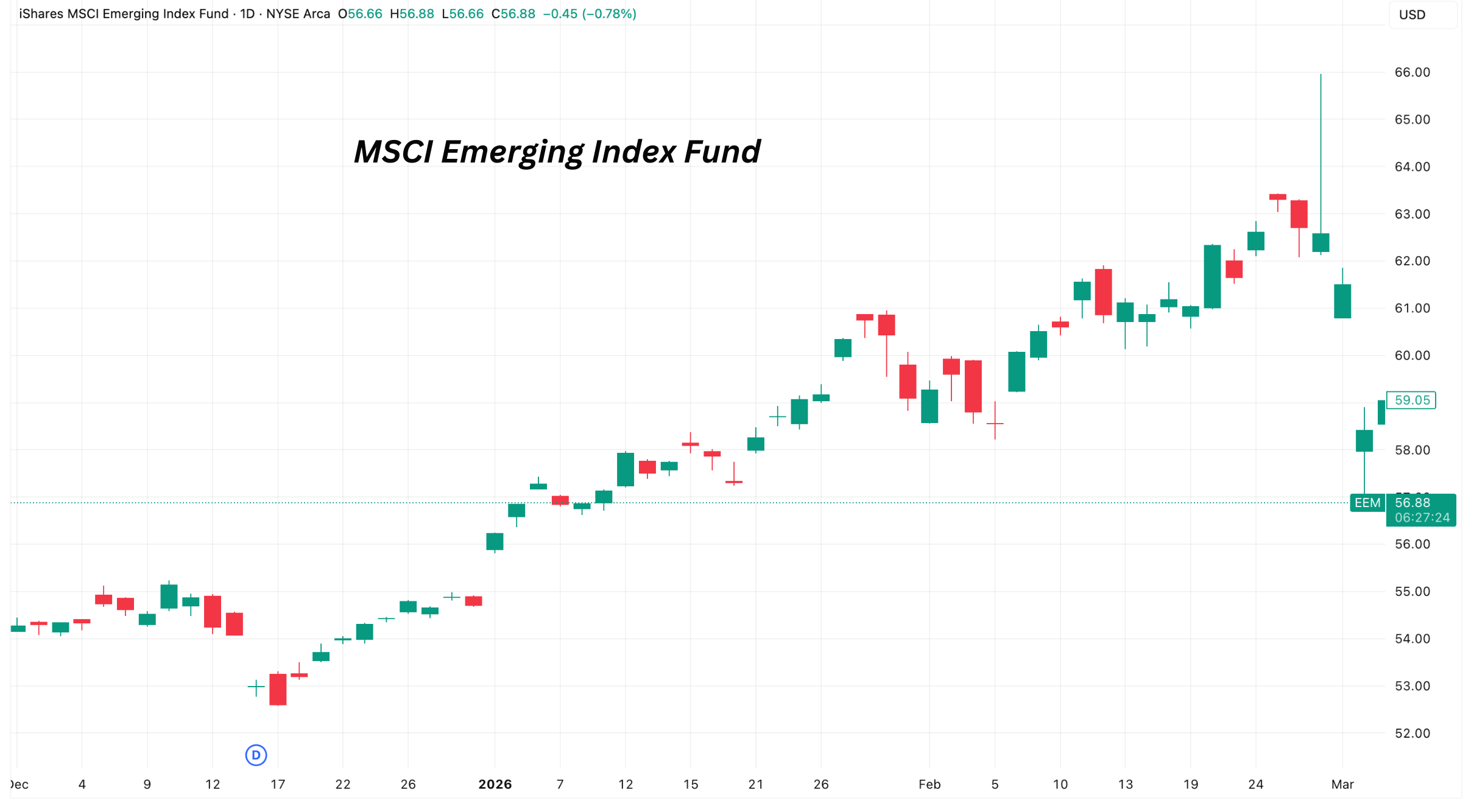
This type of movement is typical during periods of geopolitical uncertainty. When risks rise, capital often rotates away from regions perceived as more vulnerable and toward assets viewed as safer — particularly U.S. dollar assets and developed markets.
Taken together, these signals suggest that markets are currently responding primarily through risk repricing and volatility expansion, rather than through stress in credit or financial funding markets.
These developments are broadly consistent with the framework we discussed in last week’s edition, where stress tends to appear first in risk assets and volatility before moving deeper into credit markets or the financial system itself.
Short Case Study: The Energy Shock
Recent geopolitical developments have raised concerns about potential disruptions to energy supply in the Persian Gulf — one of the most strategically important regions in the global energy system. At the center of this concern is the Strait of Hormuz, a narrow shipping corridor through which a significant portion of the world’s oil and liquefied natural gas exports travel. Because such a large share of global energy supply passes through this route, even the possibility of disruption can quickly influence energy prices.

When tensions rise in this region, markets immediately begin reassessing the risk that supply flows could be interrupted. Energy markets are particularly sensitive to this type of uncertainty. Unlike many other industries, energy supply chains operate with limited short-term flexibility. If markets begin to anticipate tighter supply conditions — even temporarily — prices often adjust quickly.
But the market reaction is not driven solely by headlines. It reflects deeper economic mechanics embedded in global energy trade.
One important dynamic involves the structure of liquefied natural gas (LNG) markets and the role of U.S. exporters within that system. U.S. LNG producers typically purchase natural gas domestically, most commonly priced off the Henry Hub benchmark, and export liquefied natural gas to international markets where prices are frequently higher.
When geopolitical events tighten global supply expectations or increase demand for LNG shipments, international prices can move rapidly relative to domestic U.S. gas prices. In practical terms, this widens the economic spread between domestic input costs and international selling prices.
What matters in this situation is not simply the geopolitical event itself, but the economic mechanism it activates. When markets begin to anticipate tighter supply conditions, pricing dynamics shift throughout the global energy system. These changes affect producers, exporters, and energy-related equities as market participants adjust to new expectations around supply, demand, and profitability.
In this way, geopolitical shocks often act less as isolated events and more as catalysts that accelerate price adjustments already embedded in the structure of global commodity markets.
What This Episode Teaches Us About Markets
The developments of this week highlight several broader lessons about how financial markets respond to global shocks.
First, volatility tends to move before credit.
When uncertainty rises, markets typically react by repricing risk expectations. This often appears as spikes in volatility and adjustments in risk-sensitive assets before deeper financial stress develops.
Second, capital rotates toward perceived safety.
Periods of geopolitical tension frequently lead investors to reduce exposure to emerging markets and risk-sensitive assets while increasing allocations to assets viewed as more stable.
Third, real economic incentives ultimately drive market behavior.
While headlines may trigger the initial reaction, sustained market movements usually reflect underlying economic mechanisms — changes in supply expectations, shifts in pricing dynamics, or adjustments in capital flows.
Understanding these dynamics helps explain why markets often respond to global events in stages rather than through immediate system-wide dislocations.
Look out for next week’s newsletter for further insight into the forces shaping today’s markets.
From the Edges to the Core: How Deleveraging Moves from Risk Assets into Credit
Financial stress usually does not start at the core of the system. It begins where risk taking is highest, in the most speculative and leveraged trades. Over the past month, high volatility risk assets have compressed, rate volatility has risen, and credit spreads have begun to widen modestly. Those are early signs of pressure building at the edges.
When speculative positions unwind, price swings increase and volatility rises. If that pressure continues, it can spread into credit markets. That is when borrowing becomes more expensive and lenders grow more cautious. Companies that rely on refinancing debt may face higher interest costs or reduced access to capital. To adjust, they may cut spending, delay expansion, or slow hiring. As financing tightens, growth loses momentum.
What begins as stress in the outer layers of the market can gradually move inward. If it reaches the center, it shifts from a market disturbance to a broader economic slowdown.
March 2nd, 2026
Financial stress usually does not start at the core of the system. It begins where risk taking is highest, in the most speculative and leveraged trades. Over the past month, high volatility risk assets have compressed, rate volatility has risen, and credit spreads have begun to widen modestly. Those are early signs of pressure building at the edges.
What to Take Away from This Week's Edition:
When speculative positions unwind, price swings increase and volatility rises. If that pressure continues, it can spread into credit markets. That is when borrowing becomes more expensive and lenders grow more cautious. Companies that rely on refinancing debt may face higher interest costs or reduced access to capital. To adjust, they may cut spending, delay expansion, or slow hiring. As financing tightens, growth loses momentum.
What begins as stress in the outer layers of the market can gradually move inward. If it reaches the center, it shifts from a market disturbance to a broader economic slowdown.
The Transmission Path of Deleveraging
Deleveraging does not appear all at once. It moves inward in stages, starting where risk is most concentrated, then works its way toward the core of the system.
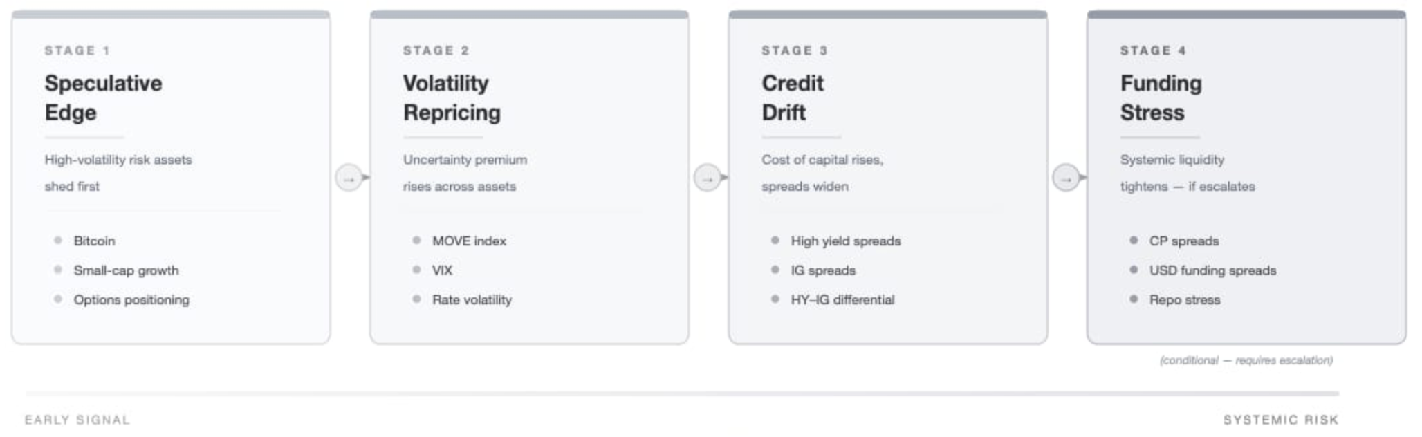
The typical sequence looks like this:
Speculative risk assets compress.
Volatility reprices.
Credit spreads drift wider.
Funding markets tighten (if escalation occurs).
Not every episode progresses through all four stages. But when deleveraging becomes meaningful, it tends to follow this path.
This week, markets appear to be between stages two and three.
Stage One: Compression at the Edges
Bitcoin often reflects changes in speculative risk appetite before broader markets react because it is more exposed to changes in liquidity and sentiment than traditional assets.
BTC is down roughly 26% over the past 30 days — a meaningful compression at the speculative edge.
Equities, by contrast, are relatively stable. The S&P 500 is only modestly lower over the same period, and market breadth has remained steady. This divergence is important to understand..
When deleveraging begins, it usually shows up first in the highest-volatility exposures. That appears to be the case now.
This is a narrowing of risk tolerance at the margin.
Bitcoin’s move tells us that appetite for high-volatility exposure has cooled. Equities have not followed in kind -meaning speculative compressing is still selective and has not yet reached systemic levels.
Stage Two: Volatility Repricing
While equities have held relatively firm, rate volatility has not. The MOVE Index has risen materially over the past month. MOVE measures volatility in the Treasury market — effectively the price of uncertainty around interest rates.
Rising rate volatility signals uncertainty about where policy is headed and how the macro outlook will unfold. It means investors are less confident about the path of interest rates and growth.
Even if asset prices look calm on the surface, higher volatility changes behavior. Hedging becomes more expensive. Investors reduce position size. Conviction weakens because the range of possible outcomes feels wider.
When volatility resets higher, financial conditions tighten in subtle ways. Capital becomes more cautious. Risk taking slows, even without a dramatic selloff.
That appears to be where we are now.
Stage Three: Risk Discrimination Begins in Credit
Over the past month, high yield spreads have widened more than investment grade spreads. The gap between the two has increased by roughly 18 basis points.
When deleveraging begins to move inward, lower-quality borrowers tend to reprice first. Investors demand additional compensation for weaker balance sheets before they reprice stronger issuers.
The widening gap between high yield and investment grade spreads is not a crisis signal. But it is a signal of growing selectivity. Capital is becoming more cautious.
That is how early-stage credit drift typically appears.
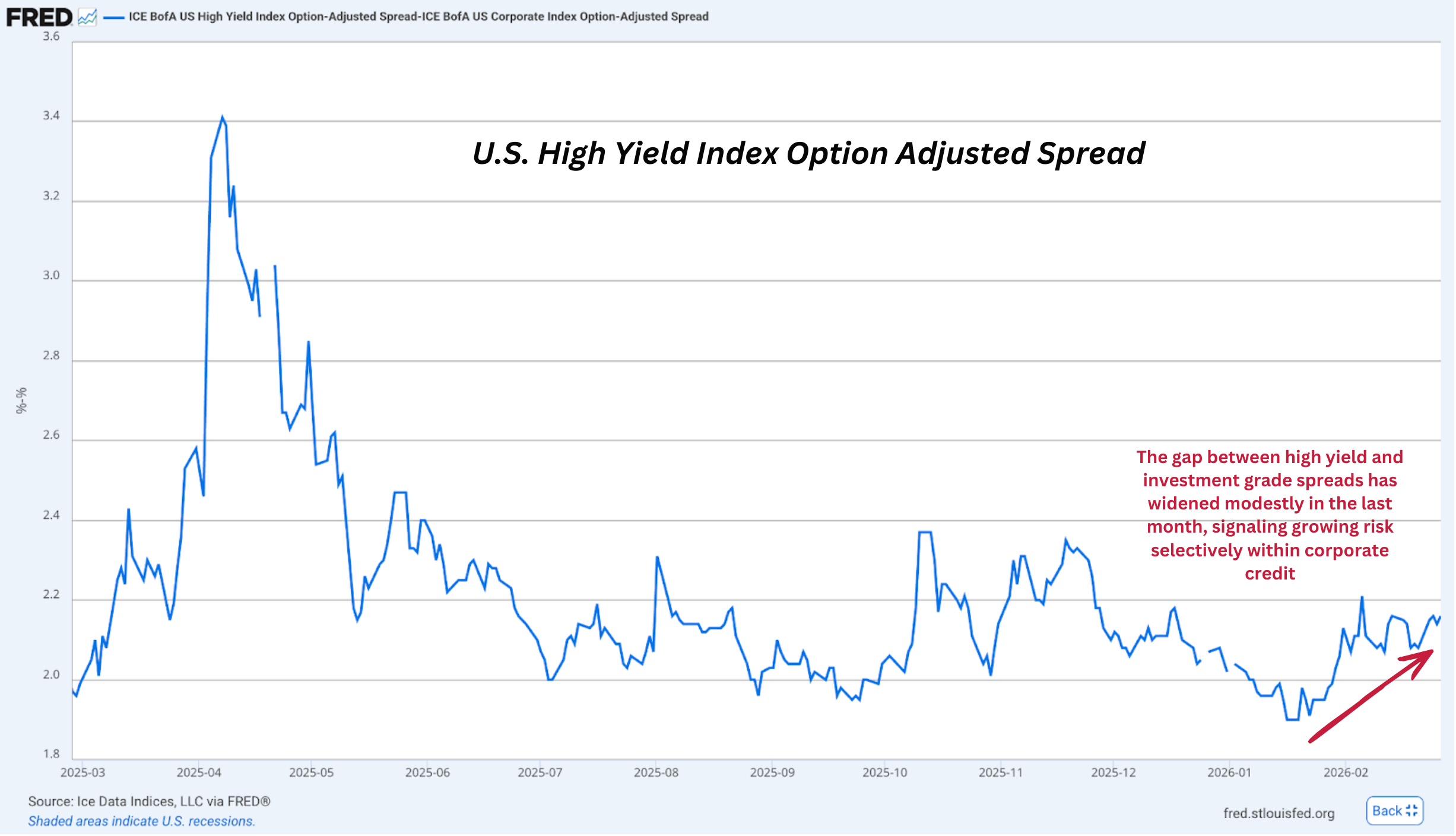
What Has Not Happened
Importantly:
Commercial paper spreads remain stable.
SOFR and short-term funding rates are steady.
The USD is not surging.
Repo facilities are not signaling strain.
The system’s plumbing is holding steady. That distinction matters.
Deleveraging at the edges does not automatically become systemic. It must move through credit and into funding to become something larger.
We are not there.
Hard Value and Positioning
Gold has risen roughly 3% over the past week and nearly 2% over the past month.
That is not explosive, but it is steady.
In an environment where volatility is elevated and credit is drifting, capital often rotates toward monetary durability rather than speculative upside. Gold’s behavior fits that pattern.
Again, this is caution - not crisis.
What Would Signal Escalation
To move from credit drift to broader stress, we would need to see:
High yield spreads widen materially beyond current levels.
Repo facility usage surge meaningfully.
Equity breadth deteriorate sharply.
Until those conditions appear, the progression remains contained.
The Larger Lesson
Deleveraging rarely announces itself with a headline.
It begins quietly - with compression at the edges.
It moves through volatility.
It shows up gradually in credit.
Only later, if at all, does it challenge funding markets.
This week’s data suggests we are between volatility repricing and early credit drift.
Measured. Not dramatic. But worth watching.
Look out for next week’s newsletter for further insight into the forces shaping today’s markets.
Tariff Whiplash and the Market’s Rising Uncertainty Premium
Markets are being asked to price rapidly shifting policy decisions. Volatility is increasing and the premium to hold risk is rising.
Over the past several days, trade policy has moved quickly and dramatically. A Supreme Court ruling declared prior tariffs unconstitutional. Within days, the executive branch announced a 10% global tariff under Section 122 authority — and shortly thereafter raised that figure to 15%. At the same time, discussion has emerged that previously collected tariff revenues might need to be refunded.
Regardless of one’s political view, this sequence matters for markets.
When the legal status, size, and permanence of tariffs can change within days, businesses face planning uncertainty. Investors must then price not just economic impact, but policy unpredictability.
This week’s market behavior reflects that shift.
February 23rd, 2026
Over the past several days, trade policy has moved quickly and dramatically. A Supreme Court ruling declared prior tariffs unconstitutional. Within days, the executive branch announced a 10% global tariff under Section 122 authority — and shortly thereafter raised that figure to 15%. At the same time, discussion has emerged that previously collected tariff revenues might need to be refunded.
Markets are being asked to price rapidly shifting policy decisions. Volatility is increasing and the premium to hold risk is rising.
Regardless of one’s political view, this sequence matters for markets.
When the legal status, size, and permanence of tariffs can change within days, businesses face planning uncertainty. Investors must then price not just economic impact, but policy unpredictability.
This week’s market behavior reflects that shift.
Volatility Is Being Priced More Explicitly
Bottom Line
Uncertainty is no longer episodic — it is being embedded in bond markets.
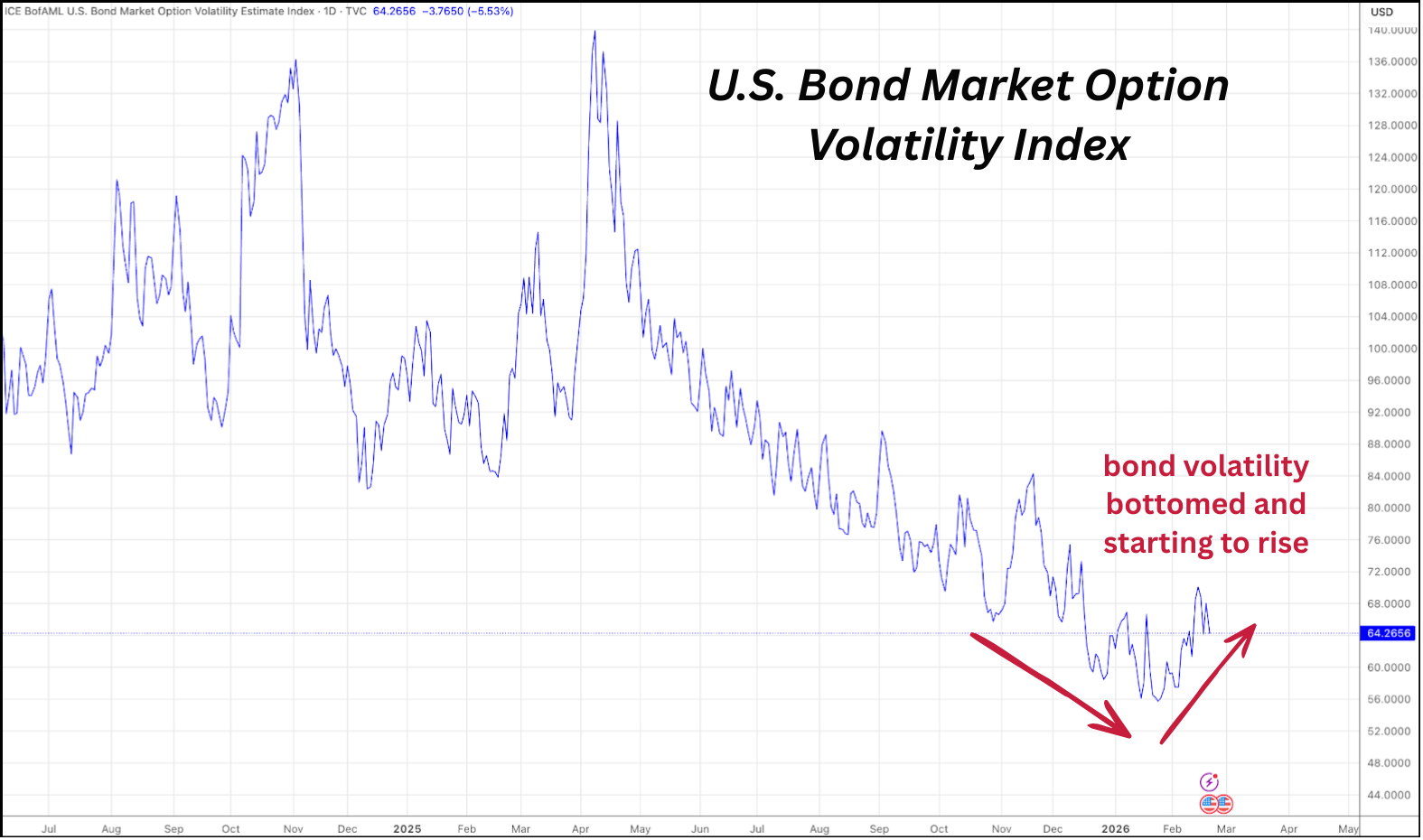
The MOVE index, a measure of bond market volatility, has risen over the past month. At the same time, the 10-year Treasury yield has fallen by approximately 16 basis points.
Falling yields typically signal growth concerns or defensive positioning. Rising bond volatility signals something different: uncertainty about the policy path itself.
When yields fall but volatility rises, it suggests markets are repositioning while remaining unsure about the stability of the forward trajectory.
That dynamic is consistent with a higher volatility premium.
Defensive Rotation Is Emerging
Bottom Line
Capital is rotating toward duration and hard value rather than exiting the system altogether.
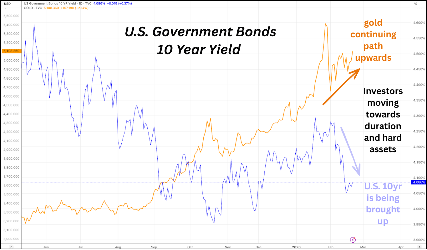
Over the past 30 days:
Gold is up nearly 6% - hard assets being bought up
The 10-year yield has declined - duration being bought up
This is not liquidation behavior. It is repositioning.
Investors appear to be trimming exposure to more speculative areas while adding exposure to assets traditionally viewed as more durable under uncertainty — duration and hard value.
Gold, in particular, continues to act as a hedge against fiat and policy instability rather than a signal of systemic panic.
Risk Appetite Is Narrowing - Not Fully Breaking
Bottom Line
The more speculative corners of the market continue to weaken, but broad participation remains steady.
Bitcoin has declined roughly 23% over the past 30 days and remains near recent lows. Meanwhile, the S&P 500 index itself is largely unchanged over the same period. The percentage of S&P 500 stocks trading above their 200-day moving average currently sits near 67% - roughly where it stood a month ago.
That tells us something important. Participation has not collapsed. Breadth has not deteriorated meaningfully. Credit markets remain orderly.
This is not systemic collapse, it is selective compression - the trimming of speculative risk at the edges while the core remains comparatively steady.
Bringing It all Together
The system’s piping appears steady for now — but uncertainty is increasing, and volatility premiums are rising accordingly.
The market is digesting three simultaneous forces:
Rapidly shifting trade policy and legal uncertainty.
Defensive capital rotation toward duration and gold.
Continued compression in speculative assets.
So far, financial plumbing is holding. Credit is stable. Equity breadth is steady. There are no clear signs of broad disorder. But markets are demanding greater compensation for uncertainty. That distinction matters.
Risk is not being abandoned completely. It is being repriced more carefully.
What We’re Watching Next
Does bond volatility continue rising even if yields stabilize?
Does equity breadth begin to deteriorate meaningfully from current levels?
Does policy messaging stabilize — or continue shifting rapidly?
The answers to those questions will determine whether this remains a controlled rotation — or evolves into something more consequential.
For now, the adjustment appears disciplined.
But the volatility premium is no longer negligible.
Markets are not repricing at random. What we are witnessing is a coordinated adjustment across currencies, assets, and sectors as leverage is worked down through revaluation.
USD easing plays a central role in this process, allowing real assets to reprice without destabilizing balance sheets. Sector behavior — from real estate to health care to emerging markets — reflects this same mechanism expressing itself in different forms.
This deleveraging process is likely to be long and uneven. Periods of calm may persist, but they coexist with the potential for sharp, discrete repricing steps as constraints are reached and pressure is released.
Understanding the mechanism, rather than reacting to headlines, remains the key to navigating what lies ahead.
Look out for next week’s newsletter for further insight into the forces shaping today’s markets.
Policy Posture Meets Structural Constraint
This week we review how markets are navigating a growing tension between policy tone and economic reality.
A recent conservative tone from the future Federal Reserve chairman, Kevin Warsh, suggests policymakers may be slower to ease, even as economic softness becomes more visible. At the same time, global funding dynamics are tightening the room for maneuver.
The result is not a clear tightening cycle, nor a clean easing regime. It is something more complex: a constrained system where each adjustment carries external consequences.
Gold, more than any single policy speech or data release, appears to be revealing how this tension is resolving.
February 16th, 2026
This week we review how markets are navigating a growing tension between policy tone and economic reality.
A recent conservative tone from the future Federal Reserve chairman, Kevin Warsh, suggests policymakers may be slower to ease, even as economic softness becomes more visible. At the same time, global funding dynamics are tightening the room for maneuver.
The result is not a clear tightening cycle, nor a clean easing regime. It is something more complex: a constrained system where each adjustment carries external consequences.
Gold, more than any single policy speech or data release, appears to be revealing how this tension is resolving.
The Fed: Conservative Posture, Uncertain Path
“The Fed’s balance sheet is trillions larger than it needs to be. A smaller balance sheet could actually allow for lower interest rates.”
Structural Insight:
Recent comments from the incoming Fed leadership emphasize balance-sheet discipline and a preference for monetary orthodoxy.
This does not amount to an announced tightening campaign. Nor does it imply immediate quantitative tightening. What it does signal is caution — a reluctance to lean quickly toward accommodation.
That tone matters. The Fed is not clearly easing, but neither is it clearly tightening. The signal is conservative posture amid rising macro tension.
Why This Matters:
When central bank leadership emphasizes restraint, markets interpret that as a higher hurdle for accommodation. This shapes expectations and risk pricing — even if no policy change has occurred.
Bottom Line
The Fed’s conservative posture suggests policymakers may be slower to ease, even as economic softness becomes more visible.
Labor Data: Softness Beneath the Surface
The labor picture has become less convincing.
A substantial downward revision to 2025 employment figures, along with falling inflation-adjusted entry-level wages, suggests that underlying conditions may be weaker than headline data previously implied.
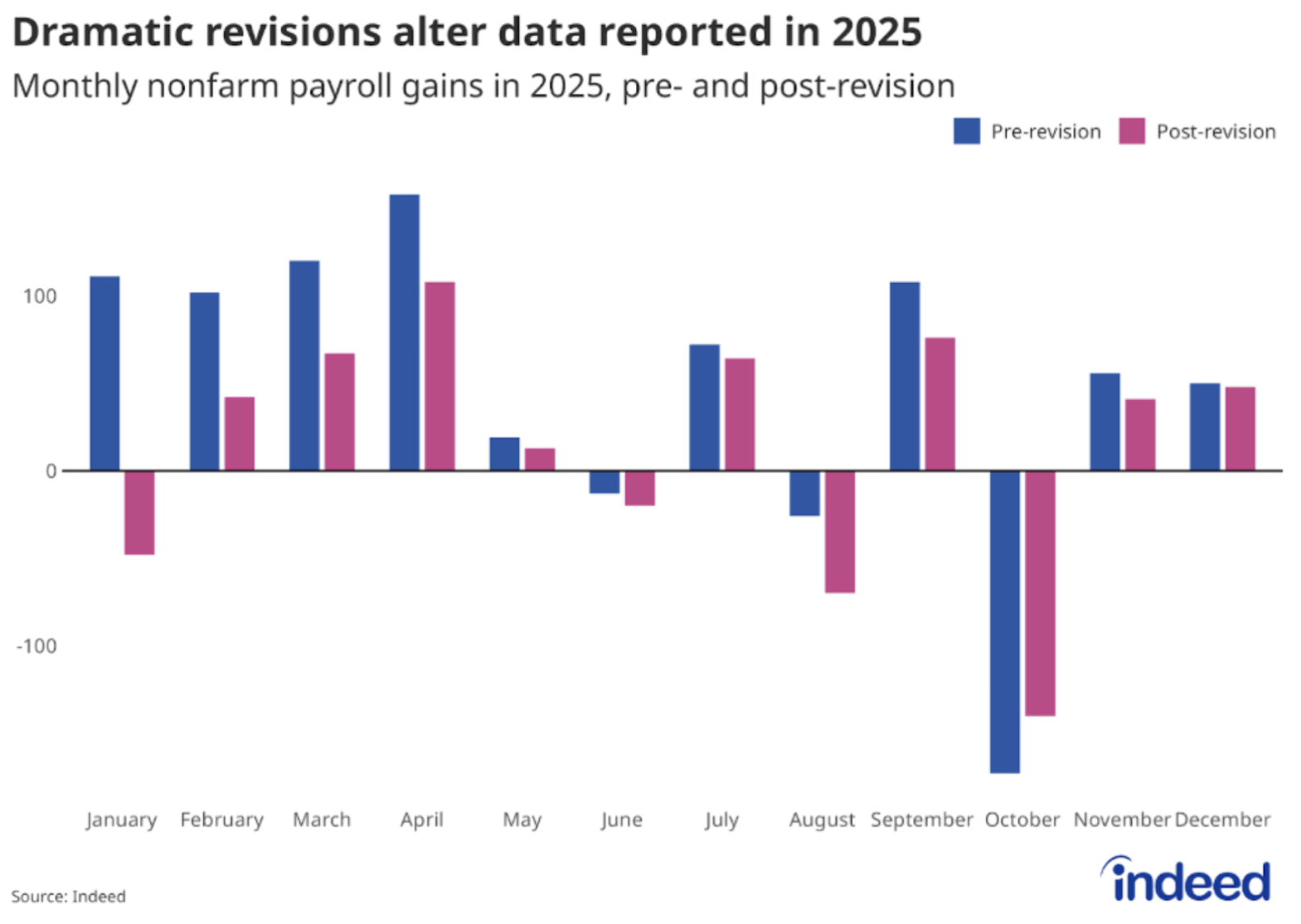
This combination is important:
Slower job growth
Real wage compression
Weakening entry-level purchasing power
These are not signs of an overheating economy.
They are signs of strain.
Why This Matters:
Under normal conditions, weaker labor data would increase the probability of easing. But with policy tone cautious and global funding constraints tightening, accommodation is not straightforward.
Bottom Line
Labor data revisions and real wage compression point to a softer economy than popular belief.
The US–Japan Spread: A Global Constraint
If yields decline too quickly, yen carry trades unwind, potentially pressuring U.S. asset markets and complicating monetary adjustments.
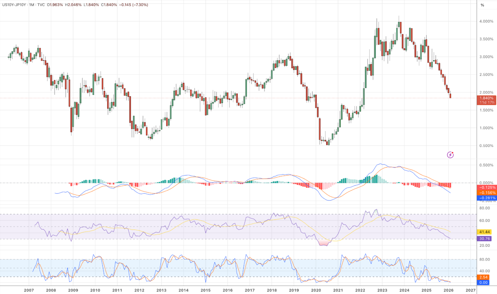
Market Structure Insight:
Complicating the picture further is the narrowing gap between U.S. and Japanese 10-year yields.
As this spread compresses:
The incentive to maintain yen-funded carry trades diminishes.
Capital can repatriate toward Japan.
U.S. asset markets face potential selling pressure.
This creates a structural constraint.
If U.S. Treasury yields fall aggressively, the carry unwind can accelerate. If yields remain elevated, domestic financial conditions stay restrictive.
In other words:
Policy choices are not made in isolation. Global capital flows limit how smoothly rates can adjust.
In Other Words:
Policy choices are not made in isolation. Global capital flows limit how smoothly rates can adjust.
Bottom Line
The narrowing US–Japan yield spread creates a structural constraint on how far U.S. rates can fall.
Gold: The Clearest Scorecard
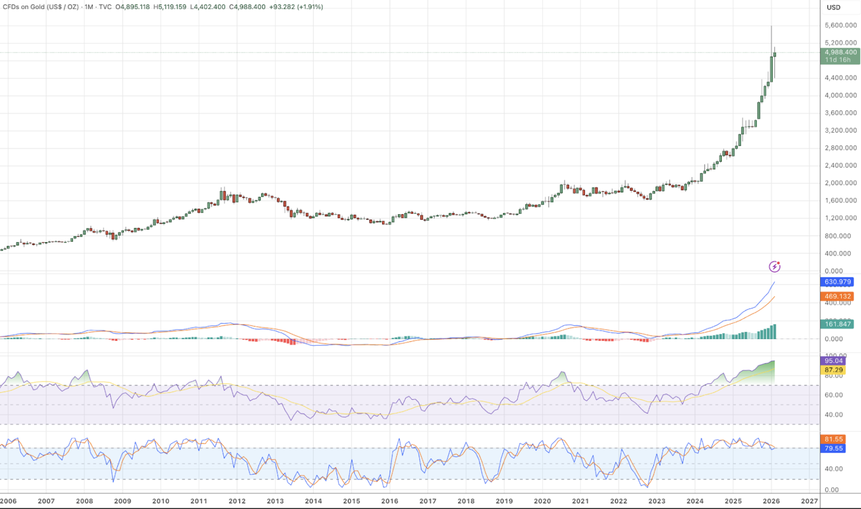
Amid these mixed signals, gold has continued to attract institutional attention, with major banks, Citi Bank and UBS, raising price forecasts.
Gold does not respond to rhetoric alone. It responds to:
Real rates
Currency credibility
Policy uncertainty
Structural leverage
Its resilience suggests that markets are assigning incremental risk to fiat stability — not panic, but gradual repricing.
When gold strengthens alongside conservative central bank messaging and soft labor data, it implies that markets are hedging against policy constraints rather than celebrating policy clarity.
Gold is functioning as a neutral scoreboard.
Bottom Line
Gold is acting as the clearest scoreboard of rising fiat risk and policy uncertainty.
Closing Thoughts:
This week’s edition does not present a clean directional story.
It presents a constrained one.
The economy shows signs of strain.
The incoming Fed Chairman signals caution and discipline.
Global funding dynamics limit the ease with which yields can fall.
Gold continues to firm as a quiet hedge against fiat risk.
In such an environment, smooth adjustments become more difficult.
When policy flexibility narrows and external constraints tighten, markets tend to absorb the pressure through higher volatility rather than through orderly repricing alone.
The system is constrained — and in constrained systems, volatility risk tends to rise.
Look out for next week’s newsletter for further insight into the forces shaping today’s markets.
Risk Appetite Is Compressing. Volatility Likely Rises
Over the past two weeks, we’ve focused on how deleveraging is unfolding through asset revaluation rather than purely outright liquidation. Real assets have been under pressure to reprice higher in fiat terms, and currency easing acts as the mechanism allowing that adjustment to proceed without destabilizing balance sheets.
This week’s edition adds an important layer to that framework: risk appetite itself appears to be tightening.
February 9th, 2026
Over the past two weeks, we’ve focused on how deleveraging is unfolding through asset revaluation rather than purely outright liquidation. Real assets have been under pressure to reprice higher in fiat terms, and currency easing acts as the mechanism allowing that adjustment to proceed without destabilizing balance sheets.
This week’s edition adds an important layer to that framework: risk appetite itself appears to be tightening.
This does not invalidate the broader deleveraging thesis. Instead, it reflects how stress often migrates through the system. Even as some assets continue to reprice higher in nominal terms, markets can simultaneously become less willing to absorb risk. When that happens, volatility tends to rise, not because the system is breaking, but because risk is being redistributed.
Bitcoin: Early Signal of Risk Compression
Bitcoin is often among the first assets to reflect shifts in risk appetite. It sits outside traditional cash-flow valuation frameworks, is highly sensitive to liquidity conditions, and lacks the earnings buffers that support equities during periods of uncertainty.
The magnitude of Bitcoin’s recent drawdown - roughly a 50% retracement from its highs - is notable not because it predicts outcomes, but because it reflects a withdrawal of marginal risk-taking. Historically, similar moves have coincided with periods when investors were becoming less willing to warehouse volatility, even if broader equity markets had not yet adjusted.
This does not imply panic or systemic stress. It suggests that the market is reassessing how much risk it is comfortable carrying as deleveraging progresses.
Bottom Line
Bitcoin is signaling a contraction in risk appetite, consistent with a transition toward a more volatile market environment.
Equities: Lagging Risk Repricing
One useful way to frame equities is through relative performance versus gold. If risk appetite continues to compress, equities are more likely to underperform hard-value benchmarks rather than collapse outright. This would represent a repricing of risk rather than a failure of the system.
In deleveraging regimes, equities are not required to fall dramatically — but they are often required to reprice in relative terms as capital becomes more selective.
Leadership Concentration as a Late-Cycle Signal:
Index-level strength can mask internal fragility, particularly when leadership is narrow or concentrated. As a result, equities may appear resilient even as underlying risk tolerance is declining.
Bottom Line
Equity risk has not yet fully adjusted to the tightening in risk appetite, increasing the likelihood of volatility and relative underperformance.
Metals: A Neutral Reference Point
Rather than signaling fear, metal leadership often reflects a shift in how value is being measured. When risk tolerance declines, capital seeks benchmarks that are less sensitive to earnings assumptions, leverage, or financial engineering.
The continued strength of metals alongside weakness in high-beta assets reinforces the view that markets are transitioning into a phase where risk is being priced more carefully.
As risk appetite compresses, markets often gravitate toward assets that sit outside both growth expectations and credit structures. Metals - particularly gold - tend to serve as a neutral reference point in these environments.
Bottom Line
Metals continue to act as a stabilizing reference point as risk appetite tightens elsewhere.
Industrials: Second-Order Effects Emerging
Industrial equities offer a useful second-order lens. As metals and raw materials reprice, downstream industries begin to reflect changes in input costs, capital expenditure expectations, and real-economy constraints.
Recent industrial outperformance may be an early indication that markets are starting to price these dynamics more explicitly. It reflects selective positioning in areas tied to physical production and infrastructure. If volatility rises, dispersion within equities is likely to increase — with sectors linked to real assets behaving differently from long-duration growth exposures.
Bottom Line
Bitcoin is signaling a contraction in risk appetite, consistent with a transition toward a more volatile market environment.
Closing Thoughts:
In the last few newsletters we have focused on how deleveraging is occurring - through asset revaluation enabled by currency easing. Today we begin to make sense of how that process is interacting with risk appetite.
As leverage is worked down and relative valuations adjust, markets often become less tolerant of risk before they become outright defensive. Bitcoin’s recent behavior suggests that this transition may already be underway. Equities have not fully reflected this shift yet, increasing the likelihood of higher volatility and sharper, more selective price movements ahead.
This is not a signal of imminent crisis. It is a reminder that deleveraging is rarely smooth. Periods of calm can coexist with abrupt repricing as the system continually tests how much risk it is willing - or able - to absorb.
Understanding that distinction remains essential as the cycle evolves.
Look out for next week’s newsletter for further insight into the forces shaping today’s markets.
USD Easing as the Mechanism of Deleveraging
Across global markets, risk is increasingly being reassigned away from fiat currencies and toward real assets. This shift is not ideological or cyclical in nature, it is a structural response to over-levered balance sheets across both the public and private sectors.
As capital migrates toward real assets, relative prices adjust. Assets reprice higher in fiat terms, while liabilities remain fixed. In effect, balance sheets are repaired through revaluation rather than default. This is how deleveraging is unfolding in the current cycle. However, this process cannot proceed indefinitely without accommodation.
February 2nd, 2026
Across global markets, risk is increasingly being reassigned away from fiat currencies and toward real assets. This shift is not ideological or cyclical in nature, it is a structural response to over-levered balance sheets across both the public and private sectors.
As capital migrates toward real assets, relative prices adjust. Assets reprice higher in fiat terms, while liabilities remain fixed. In effect, balance sheets are repaired through revaluation rather than default. This is how deleveraging is unfolding in the current cycle. However, this process cannot proceed indefinitely without accommodation.
Rising real-asset prices tighten financial conditions if currency and credit availability do not adjust. As a result, USD easing becomes less a policy choice and more a mechanical requirement. A release valve that allows revaluation to continue without destabilizing the system.
This week’s signals suggest that this easing process is very much underway.
The U.S. Dollar: On the Edge of Adjustment
What we are paying attention to on the chart below: DXY is in the middle of its long term historical range. Momentum indicators suggest more likelihood of beginning to move toward low end of range rather than high end.
The U.S. dollar currently sits near the middle of its long-term historical range. Momentum indicators increasingly favor movement toward the lower end of that range rather than a renewed push higher.
Importantly, this aligns with the broader macro regime. Elevated leverage increases the perceived risk of holding fiat liabilities, while rising real-asset prices require currency flexibility to avoid excessive tightening. Trump's continuous call for a weaker dollar and Powell’s statement that there will be no more hikes have reinforced this reality, but the underlying driver is structural rather than rhetorical.
A weaker USD does not signal economic strength elsewhere; rather, it reflects the system’s need to accommodate ongoing balance-sheet repair.
Bottom Line
USD appears to be on a path toward continued easing as part of the broader deleveraging process.
Real Estate: Repricing Requires Room to Breathe

On Thursday, President Trump made a statement that suggests what we are seeing is a controlled debasement of the USD. The White House seems to be the orchestrator of how repricing is to be carried out at a macro sector level. The political narrative agrees with our current top story: USD debasement will continue and scarce assets will continue to reprice higher.
Historically, gold tends to lead during periods of uncertainty, with real estate lagging before eventually re-aligning through higher nominal prices.
Relative valuation measures suggest that this divergence may be nearing exhaustion. Gold has already repriced meaningfully, while real estate has yet to fully reflect the same adjustment in USD terms. As currency conditions ease, the pressure for real estate to reprice higher increases.
This dynamic is less about immediate catalysts and more about restoring long-term balance between assets and liabilities.
Bottom Line
Real estate is positioned to begin participating more meaningfully in the revaluation process as USD easing provides relief to financing conditions.
Health Care: Capital Rotation into Stability
What we are looking at on the chart: The health care sector has reached historically attractive valuation levels relative to the broader equity market. MACD and RSI momentum indicators show that the pivot in health care’s favor has already begun.
Health care occupies a uniquely advantaged position in the current macro environment. The sector offers stable, recurring cash flows at a time when leverage sensitivity and earnings durability are increasingly valued. Importantly, those cash flows are not purely cyclical — they are structurally supported by large and persistent federal spending programs.
As fiscal pressures rise alongside demographic trends, government-backed health care expenditures are unlikely to contract meaningfully. This places the sector downstream of sustained fiscal outlays, providing a level of cash-flow visibility that few other equity sectors can match during periods of balance-sheet repair and currency adjustment.
In a regime where capital is rotating away from concentrated growth narratives and toward resilience, health care combines low relative valuation with structural revenue support, making it particularly well positioned as deleveraging continues.
Bottom Line
Health care offers an attractive combination of depressed relative valuation and durable, fiscally supported cash flows in an environment increasingly defined by risk repricing.
Technology: Concentration Risk in a Repricing World
What we are looking at on the chart: In 2020, tech’s valuation relative to the broad stock market reached levels not seen since the dot com bubble. They have stayed around there since.
Technology valuations remain elevated relative to both the broader equity market and real assets. When measured against gold, tech appears to be undergoing a prolonged mean-reversion process, with no clear sign of stabilization yet.
This reflects more than valuation excess. Highly concentrated, long-duration cash flows are particularly sensitive in an environment where real assets are repricing and currency accommodation becomes necessary. As capital reallocates toward tangible inputs and balance-sheet resilience, tech’s relative dominance is likely to continue unwinding.
Bottom Line
Technology appears vulnerable to continued relative underperformance as real-asset repricing progresses.
Closing Thoughts:
Markets are not repricing at random. What we are witnessing is a coordinated adjustment across currencies, assets, and sectors as leverage is worked down through revaluation.
USD easing plays a central role in this process, allowing real assets to reprice without destabilizing balance sheets. Sector behavior — from real estate to health care to emerging markets — reflects this same mechanism expressing itself in different forms.
This deleveraging process is likely to be long and uneven. Periods of calm may persist, but they coexist with the potential for sharp, discrete repricing steps as constraints are reached and pressure is released.
Understanding the mechanism, rather than reacting to headlines, remains the key to navigating what lies ahead.
Look out for next week’s newsletter for further insight into the forces shaping today’s markets.
Broad Price Discovery In A Deleveraging World
What we are observing across markets is not a collection of isolated moves, but a broad repricing of assets against fiat currencies. This process reflects long-term debt-cycle deleveraging, where balance sheets are gradually repaired and capital is forced to re-evaluate relative value rather than nominal price levels.
In such environments, price discovery does not unfold smoothly. Long stretches of apparent calm are often interrupted by sharp, nonlinear adjustments as leverage is reduced, funding conditions shift, or relative valuations snap back into alignment. These moves can be sudden and dramatic, even though they are part of a much longer structural process.
January 26th, 2026
What we are observing across markets is not a collection of isolated moves, but a broad repricing of assets against fiat currencies. This process reflects long-term debt-cycle deleveraging, where balance sheets are gradually repaired and capital is forced to re-evaluate relative value rather than nominal price levels.
In such environments, price discovery does not unfold smoothly. Long stretches of apparent calm are often interrupted by sharp, nonlinear adjustments as leverage is reduced, funding conditions shift, or relative valuations snap back into alignment. These moves can be sudden and dramatic, even though they are part of a much longer structural process.
Because fiat prices alone can obscure this dynamic, we focus on cross-asset relationships — how assets behave relative to one another — to better identify where repricing has already occurred and where pressure continues to build.
Rates & Liquidity: The Anchor Point
What we are paying attention to on the chart: The U.S. is reaching a decision point for credit markets. Upward momentum is starting to fade, and we’re monitoring for a potential pivot.
Recent rate behavior suggests U.S. credit conditions remain broadly stable, though momentum appears to be maturing. Yield-curve dynamics are approaching levels that historically warrant closer attention, particularly if they begin to roll over in a sustained way. A meaningful downturn would likely signal renewed recessionary pressure and accelerate deleveraging forces.
We are also monitoring the U.S.–Japan rate spread as a barometer of global funding stress. As this spread narrows, yen-funded carry trades become less attractive, increasing the risk of forced selling in U.S. assets. While much of the compression has already occurred, recent stabilization suggests near-term pressure may be easing — for now.
Why Rates and Liquidity come first:
The cost of capital defines risk tolerance, governs leverage, and ultimately determines how aggressively assets can be held on balance sheets.
Bottom Line
U.S. credit markets appear broadly stable, though rate signals are nearing levels that warrant closer monitoring.
Energy: Repricing the Physical Economy
What we are paying attention to on the chart: We are expecting eventual mean reversion on the gold-oil ratio. We are on the lookout for RSI and stochastic indicators to provide the first signal of pivot.
When measured against gold rather than USD, oil appears deeply compressed. Historically, during periods of macro stress and balance-sheet repair, energy tends to reassert itself as capital rotates away from financial leverage and toward scarce, productive inputs. These relationships rarely resolve through prolonged stagnation; instead, they tend to correct via repricing.
Current cross-asset ratios suggest energy has lagged materially behind both precious metals and equities, creating conditions consistent with future mean reversion. If broader deleveraging continues, energy prices are likely to adjust higher in nominal terms to restore long-run real relationships.
Why Energy Comes Next:
Energy is best understood not as a standalone trade, but as a foundational input that must ultimately preserve its relationship to other real assets.
Bottom Line
Energy remains under-repriced relative to other real assets, leaving it vulnerable to sharp upward adjustments during repricing phases.
Bitcoin: The Cross-Asset Stress Lens
Bitcoin occupies a unique position at the intersection of liquidity, energy, and risk appetite. For that reason, we treat it as a stress lens rather than a standalone signal.
What we are paying attention to on the chart: The same momentum indicators of multiple cross-asset ratios are signaling that bitcoin might be close, though not yet quite all the way at the bottom of it’s downtrend. We are monitoring for downward momentum to finalize its cycle. The middle chart stands out, showing that Bitcoin may still have substantial repricing ahead relative to oil, particularly when contrasted with its positioning against gold or the S&P 500.
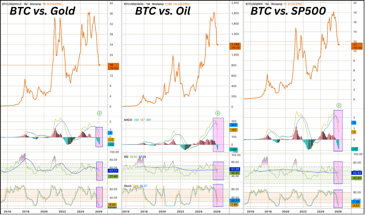
Market Structure Insight:
Relative comparisons show Bitcoin has retraced meaningfully against gold and equities, while remaining less compressed versus oil. This asymmetry implies that either Bitcoin weakens further relative to energy, or energy prices rise to rebalance the relationship — or some combination of both.
Importantly, viewed through a non-fiat lens, Bitcoin’s downside risk appears increasingly limited compared to earlier stages of the cycle. While volatility remains a feature, its relative positioning is becoming more consistent with an environment where real inputs are reasserting value and leverage is being worked off.
Bottom Line
Bitcoin supports the broader message of ongoing price discovery, while appearing increasingly attractive on a long-duration, relative-value basis.
Real Estate: Lagging, Not Broken
Real estate typically lags early-stage repricing in real assets, largely due to financing constraints and slower turnover. Gold often outperforms real estate during periods of uncertainty, but this divergence has historically resolved through real estate appreciation rather than sustained underperformance.
Current gold-to-real-estate ratios suggest that divergence may be nearing exhaustion. While real estate is unlikely to lead the next phase of repricing, relative valuations are becoming more constructive as financing conditions gradually adjust.
Defense Equities: Late-Cycle Expression of Risk
Defense equities tend to perform best once geopolitical risk is broadly acknowledged rather than merely anticipated. Recent outperformance reflects elevated uncertainty already priced into markets.
While structural demand remains intact, relative valuations suggest risk-adjusted returns are becoming less compelling. At this stage, defense appears more indicative of risk already recognized than a source of asymmetric opportunity.
Closing Thoughts:
Taken together, these signals point to a market environment defined by ongoing balance-sheet repair and broad price discovery. Assets are increasingly communicating through their relationships with one another rather than through headline price moves alone.
This deleveraging process is likely to be long and uneven. Periods of stability can coexist with sudden, forceful repricing as leverage is reduced and relative value is re-established. Understanding where those pressures are building, before they surface in nominal prices, is essential for navigating the cycle ahead.
Look out for next week’s newsletter for further insight into the forces shaping today’s markets.